Chinese Grand Prix talking points: Stroll has become the most hated F1 driver in a long time - but that's simply an unfair call!
The absolute vitriol against the Canadian that has come from the incident is beyond reprehensible.

When you think Ferrari, words like ‘passion’ and ‘spirit’ are likely evoked from some deep recess of your consciousness.
The brand has been meticulously built to represent excitement and emotion, and its efforts were rewarded with two consecutive ‘world’s most powerful brand’ ratings in a row.
The happy, if ambiguous, trend abruptly ended in 2015. Ferrari has fallen to ninth in the brand power (no, not that Brand Power) rankings, largely thanks to a lack of ability on the race track.
Ferrari has been complaining that modern-day Formula One lacks the qualities that drive their brand. They says it creates little enthusiasm for those who aren’t engineers or engine builders and is losing touch with the average fan as a result. That their complaints started at the same time their form on track took a massive downturn is only a coincidence, they assure us.
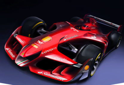
It was timely, then, that the week it was confirmed Ferrari was a less enticing marque than a number of fashion and cosmetic brands (and Red Bull, as it happens), their conceptual design department released a dramatic computer-generated image of what they believes the future of Formula One should look like.
The design is something of motorsport mullet: it’s all F1 at the front and WEC at the back, with elements from Speedracer, the F1 car from Cars 2, and that crazy videogame intro used on Brazilian TV’s F1 coverage in the early 2000s.
Love it or loathe it, it definitely stirs some primal, fast-car loving emotions.
On Tuesday the Formula One commission voted to introduce rules from 2017 to make elements of the concept car a reality. On the wish list are fatter tyres, more power, more noise, and more downforce, and all are being billed as magic bullet solutions to the sport’s current state of fan and sponsorship decline, no matter how much they might cost.
This isn’t the first time Formula One has billed a solution to cure all its ills, and it similarly isn’t the first time the spending of money teams scarcely have has been a major component.
There’s something fantastically Formula One about choosing the most expensive option while overlooking a far more simple and economical alternative.
If we play another round of the Ferrari Word Association game, I’m willing to say ‘red’ was among the terms that popped into your head, and for good reason: there are few racing concepts in the world more iconic than the Italian rosso corsa.
But what was the last time a car livery genuinely captured the imagination of the fans in the same sort of way the colour red draped over a car that will likely never be built has done this week?
Lotus, by reviving the livery of a team with which it shares minimal lineage? Maybe.
Williams, when it sprung its partnership with Martini on the paddock late in the 2014 pre-season? Perhaps.
If not them, who? Force India has removed the splashes of green and orange that made it so identifiable. In their place is a dreary blend of silver, grey, and black, with just a hint of burnt orange around the edges.
Sauber, despite having the opportunity to create its first defining brand since BMW left it, has made a mess of its livery by doing little more than selecting blue and hitting the fill tool on any garden variety photo editing program.
Red Bull Racing and Toro Rosso have run colour schemes dictated by the brand of their parent company for years (though Red Bull says it has a new livery in the works for this season).
Most disappointing of all is McLaren, which has chosen to use a near-identical livery to last year – with the addition of a brief lick of red paint around the nose – and in doing so squandered the opportunity to capitalise on the considerable anticipation for its reunification with Honda after their 20-year separation.
“So what do you do, do you create an aesthetically pleasing design?” McLaren chief Ron Dennis asked, bafflingly rhetorically.
“But for what purpose? It won’t change just to make a few people in the company happier because they want it orange or they want it yellow.”
And so the trick was missed.
More than anything else, Formula One has a serious brand problem, and while breaking out the paint and brushes isn’t going to fix it, a bit of artistic flair will go a long way to creating an image fans might actually want to engage with, which is the critical first step.
Lotus abandoned the bright yellow. Caterham folded and took its green paint with it. Orange remains out of favour. Gone are striking designs, and in their places is an array of colours amounting to beige.
Until any other team throws off the shackles of conservatism in design, Ferrari will continue to rightly attract eyeballs on the race track.
Red, after all, is fastest. How many other teams can be defined at succinctly as that?
The absolute vitriol against the Canadian that has come from the incident is beyond reprehensible.

The Long Beach Grand Prix is the Monaco of American motorsport, and this past weekend, the IndyCar Series reminded everyone exactly why. We witnessed…


New Zealand made a triumphant return to the Supercars championship calendar since the demise of the much-loved Pukekohe Park Raceway – as Taupō delivered…


Ricciardo was forced to retire after the Aston Martin driver slammed into the back of his car during a safety car restart but Stroll…

It’s time that serious questions are asked of his Lance Stroll and his future in the team.
Five-years is a long time in motorsport, let alone the general state of the world – especially given the impact of the Covid-19 pandemic…