The game they play in heaven: A 'Dream XV' made up of unforgettable players
Unfortunately, the only criteria for this Dream XV are that you had to have passed away. During my research, I thought of potential players…
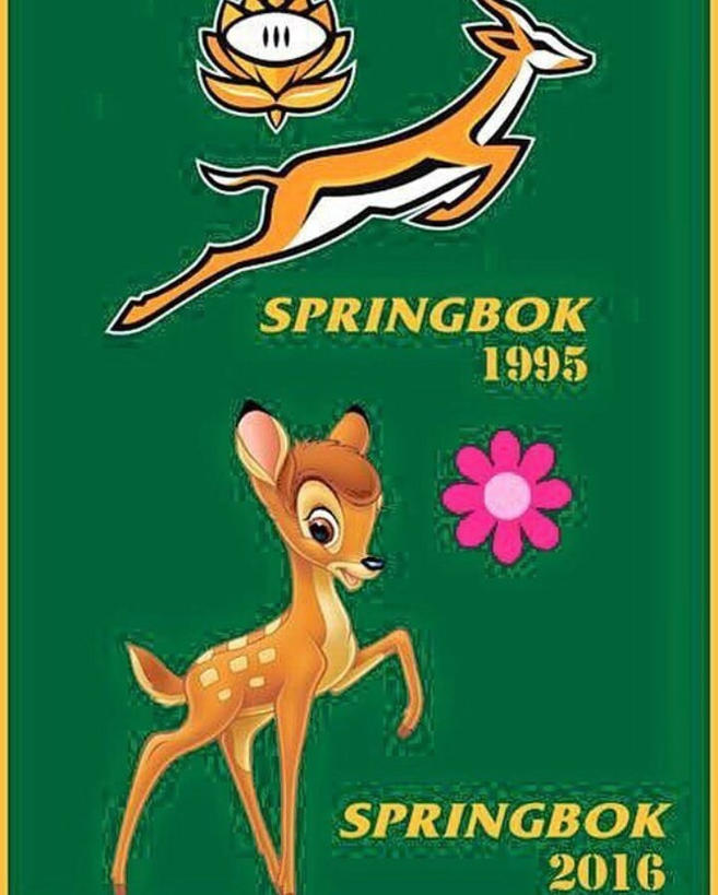
In light of the *ahem* recent poor run of form displayed by the Springboks, one of their own fans has taken to Reddit to suggest a slight amendment to their current logo.
Reddit user ‘Alexei17’ uploaded his take on a possible way the South African board could get the logo of the national side more up to date.
 The Springbok new logo updated for 2016’s form. (Alexei17/Reddit)
In his rendition, the galloping Springbok is replaced by Disney character Bambi whilst the famous Protea was left out in lieu of a pink cartoon flower.
An upgrade befitting the style of rugby they’ve displayed of late?
In their recent tour of Europe, the ‘Boks didn’t manage a single victory – drawing with the Barbarians and going down at the hands of England, Italy and Wales respectively.
Their latest loss extended their losing streak to five straight games, with their most recent victory coming over the Wallabies on 1 October at Loftus Versfeld in Pretoria.
Prior to that, you have to go as far back as August 20 to find a game in which the South Africans emerged victorious – when they beat Argentina 30-23.
We think that ‘Alexei17’ should pitch his idea to the South African Rugby Board, and that it could go a long way to aiding universal recognition of just how bad the Springboks are at the moment. And maybe even inspire the players to not suck quite as much.
With any luck, they might just take it and run with it. Unlike the ‘Boks with the footy.
Join The Roar rugby editor Christy Doran, former Wallaby Matt Toomua and a cast of regular and special guests as they look at the biggest issues in the game on The Roar Rugby Podcast. If you’re looking for great odds on the next game check out Aussie bookmaker PlayUp. Chances are you’re about to lose. Set a deposit limit.
Unfortunately, the only criteria for this Dream XV are that you had to have passed away. During my research, I thought of potential players…
Rassie Erasmus will coach champions South Africa to the 2027 Rugby World Cup, with former Ireland hooker Jerry Flannery added to the technical team…
What goes up must come down, right? As the kicking game in rugby has continued to progress and progress over the last few years,…
South Africa's director of rugby Rassie Erasmus has been admitted to hospital after a freak accident left him with chemical burns. Erasmus, who has…
Rugby has had some ridiculous kickers. The ability and skill with the boot can turn the course of a play, a scoreline, or a…
Thieves have touched the William Webb Ellis trophy during a break-in at South African Rugby Union's HQ but thankfully decided against swiping the World…