NBL Grand Final: Breakers bullish about upsetting Kings in royal rumble - 'Best-of-five's a different animal'
News from on and off court around the NBL.

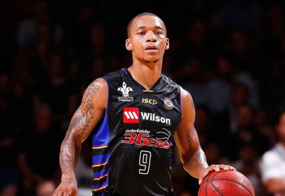
Whether the fans like it or not – and it seems that they don’t – the Adelaide 36ers have finally rebranded.
Gone are the days of the Microsoft Paint logos, with basketball clipart found from a Google search.
The 36ers have instead finally entered a bold, new era, with a professional logo for a professional sports team.
Unveiled at the team’s MVP gala dinner, where Jerome Randle took home the top award (to no surprise), the rebrand no longer features the red, yellow and blue that many South Australians know and love – perhaps that is why it has been criticised on social media.
A struggle that the 36ers faced from day one with their identity is that they have a team with no mascot. Perth have a wildcat in their logo, Cairns have a taipan, the list goes on. But for years the 36ers were stuck in a cycle that involved the state colours and Wordart.
However, now they have controversially involved the state bird, a fierce piping shrike (some will argue a magpie), which not only puts an image to the team brand, but more importantly gives Fox Sports something interesting with which to cut to in-game replays.
[latest_videos_strip]
Talking about the shrike, I say ‘controversially’ as a lot of fans have compared the logo to that of the New Orleans Pelicans; even the players have admitted the similarities. For now, we’ll call it ‘taking inspiration’ from New Orleans, but if it means moving on from the Microsoft Paint era, then take as much inspiration from American sports as you like.
Perhaps management thought adding the piping shrike would allow them to move on from the state’s colours. An interesting decision nonetheless, it currently has not been accepted by fans, and that may not change before the season rolls around.
The difference between changing the logo and changing the colours is that the logo was last changed in 2013, whereas the colour scheme has not been touched since 1983, so this one could take some getting used to for the fans, especially those who bought overpriced 2016-17 merchandise.
The new logo was well overdue, and has finally given the team an identity of which they can be proud. Hopefully, this logo can be placed in the middle of Brett Maher Court, rather than the NBL or Telstra logo, and not only can the 36ers enter a new era, but the league too.
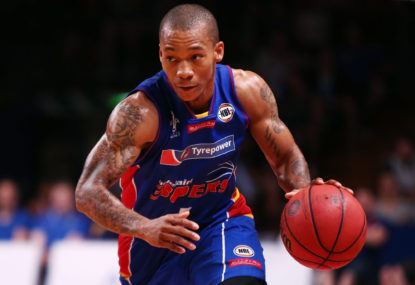
With Matt Hodgson extending his contract for another two years, perhaps the best way to win the fans over with the new rebrand is to have fan favourites Eric Jacobsen, Nathan Sobey and Jerome Randle all back and wearing the new navy blue jersey, with the Pelicans-inspired logo front and centre.
Build your own ultimate team! Pick your key players and take a shot at big cash prizes every day with Draftstars. For great odds on NBA games every day head on over to PlayUp. Imagine what you could be buying instead. Set a deposit limit.
News from on and off court around the NBL.

Josh Giddey's Oklahoma City Thunder brought Adelaide back to earth with a thud.
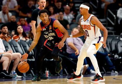
The Adelaide 36ers have shocked the star-studded Phoenix Suns 134-124 in an historic NBA pre-season victory for the touring NBL club. Adelaide have beaten…
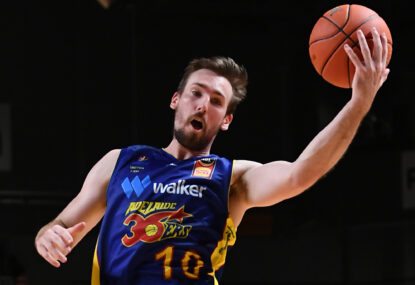
Mitch McCarron's captain's knock and a dominant second-half performance have guided the Adelaide 36ers to a 83-57 thumping of the Cairns Taipans.
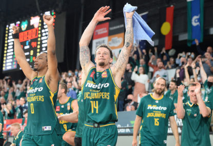
The Tasmania JackJumpers have banished their fourth-quarter hoodoo, claiming a 76-71 NBL win over the Adelaide 36ers behind a late blitz from guards Josh…

After a 28-match 2019-20 NBL season, these are my player rankings for the seventh-placed Adelaide 36ers. Jerome Randle: 7.5/10 Jerome Randle is believed to…