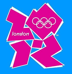

There’s been a lot of talk about the London 2012 logo. Some say it’s a fresh, creative logo that reflects the dynamism of the great city of London. Others describe it as ‘most unpopular logo in British marketing history’.
Then there’s the fact that Wolff Olins, a brand consultancy, was paid £400,000 for designing the logo which resulted in an online petition with 50,000 + signatures to change it, motions from MPs, and the embarrassing withdrawal of a promotional video that caused seizures among epilepsy sufferers. Is this great marketing, or another example of creativity gone mad?
The Crowd Says:
© 2024 The Roar
Colton
Guest
This logo looks like exactly what it spells
Malik Anas
Guest
I'm really trying hard to find any reason why I shouldn't be upset by this design disaster, I find none I really hoped that they will do something about it and change it along with this inappropriate font, color...logo! I think that London 2012 deserves a much better effort. How can someone be sooooo wrong!
Ben
Guest
Nicce work if you can get it. Simply charge a huge amount and then the night before it is due, simply have your 8 year old daughter scribble a design in crayon which can be tidied up by a graphic designer in the morning and presented to the client along with a whopping great tax invoice. Makes me think I am in the wrong profession.
Zac Zavos
Editor
I heard from someone who knows, that the ICC paid $3 million to a Melbourne based design consultancy for the Cricket World Cup logo below.

Searly
Guest
Agreed it is completely rubbish, but they won't change it. Rule number one always seems to be "don't back down lest you look weak" and of course there'd be a backlash over the 400,000 quid down the drain. More importantly, I can't wait to see the mascot(s)! Or will they spare us from even more inane crap?
Mungo Amanda
Guest
Eh, I don't see what the fuss it about. Logos and mascots are necessary evils. They're always varying degrees of terrible, I thought people just took that for granted these days. As long as you have a Roy and HG who can skewer it a la Fasto the Fat Arsed Wombat, some good can even come of it.
DaniE
Guest
In a world where image is supreme (what with media and PR agencies etc manipulating so much of what we see and hear)... I am amazed that the organising committee allowed this piece of **** to be used as the London Olympic logo. It's appalling that they believe this... thing... to be representative of England and of London. I hope that they decide to change it soon... otherwise I will be cringing through all of the broadcast of the 2012 Olympics!!!
Zac Zavos
Editor
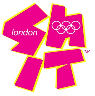
This is perhaps a more apt image for the logo (s h i t)!