


- Video
-
Club Roar
Captured a great grassroots sporting moment? We want to see it!Content Collections
The Roar Community
- Join
- Login
It was once all so simple. The old VFL clubs had worked out 12 or so guernsey designs involving various combinations of blue, red, white and black. Horizontal dark and white stripes versus vertical dark and white stripes solved all problems.
Sure, the similarly attired North Melbourne and Collingwood both did their damnedest to throw away the 1977 grand final, but generally the colours worked. The system worked.
“Bad hueing is bad football.” Every footy fan worth their salt knows Jack Dyer’s famous quote about footy’s intangibles. Hawthorn tried gold and brown – and yes, we know what those colours remind us of. They didn’t reach the finals for the first 32 years of their existence and their history has been a cavalcade of misery ever since.
But it all came undone in 1987. I am Victorian, and might be accused of anti-whatever bias. In truth I quite liked Brisbane’s ‘no rules’ team of 2001-04, West Coast’s ‘yeah there are rules, but whatever’ team of 2006, Sydney 2012 and Freo’s ‘everyone just run towards the ball at all times’ 2013. But 1987 murdered footy.
Why? Because it introduced the Brisbane Bears guernsey.
This gold and maroon monstrosity killed the Bears before a ball had been kicked in anger, or the sort of anger semi-retired, last pay-day veterans could muster. The Bears were a joke until that one Brisbane afternoon in 1995 that Hawthorn gave their three-quarter time talk in the shade. With an 88-43 lead on a 45-degree day, what on Earth were they thinking?
The metrosexual, green-matches-brown Illuminati will have you believe that Brisbane’s massive, instantaneous improvement came about through ‘team spirit’ and such furphies. In truth, the Bears were able to throw off the shackles of their past because their jumper had ditched the koala and been converted to a simple maroon with gold V across the breast.
Then, when they became the Lions, their shirts had become the lovely blue, maroon and gold lion and they won three premierships.
Green? Purple? Orange? Fluoro? Go back to your psychedelic trip-cave. But by then the can of worms of expansion had well and truly been opened. But again, I’m not referring to the expansion of the Adelaide Crows, Fremantle Dockers, Port Adelaide Power and so on, because footy is great and Australia is great and we should share both things around.
I’m talking about the expansion of colouring! Principles of design!
Fremantle was another club condemned by creativity gone mad. An anchor to match Fremantle’s stevedore roots? Why not a gust of wind to signify the Fremantle Doctor? Green, purple and red? And “Freo-heave-ho?” As a mate once said about weird names to give your kids, “Just call him Jonathan and give him a chance at life.”
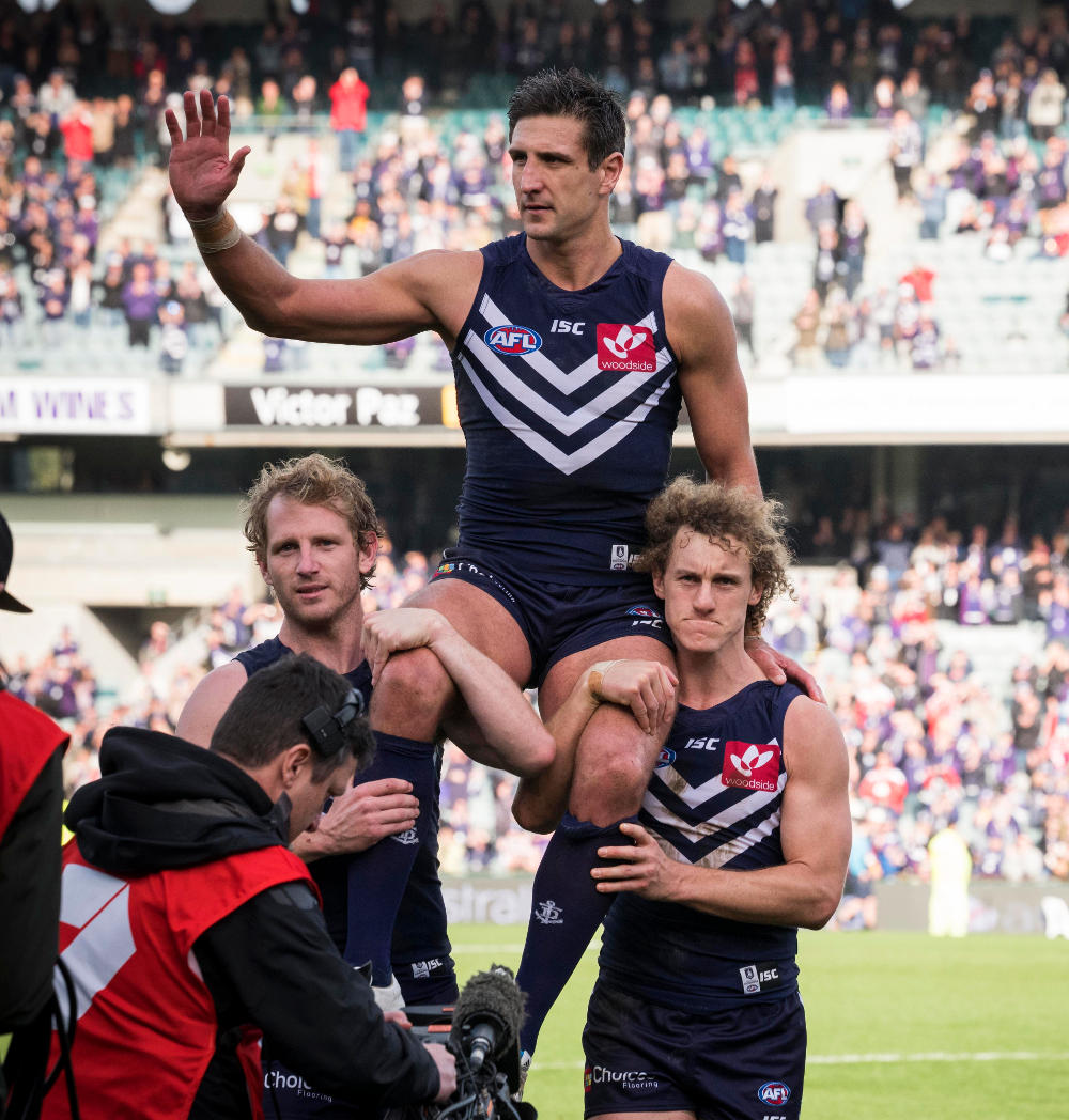
Freo finally gave themselves a chance in 2012. You think I’m talking about recruiting Ross Lyon? Dead wrong again. I’m talking about them embracing the Purple Haze and making themselves a one-colour team. Like the Bears, they converted their guernsey to a simple white V across the chest. Suddenly they were grand final-bound.
We move on to Port Adelaide, who kept it real colour-wise but for historical reasons needed to stick it to the AFL for denying them their Magpie roots and surreptitiously include a small corner of irregular black and white stripes. It was dashing. But was it dignified?
Port battled through many demons through their early finals series, including throwing away minor premierships in 2002 and 2003 for a 2-7 finals record before breaking through the next year.
Take this quote from their captain of those years, Matthew Primus: “We’d line up for the anthem in front of Hawthorn or Collingwood and I couldn’t help think that the straight, vertical stripes were slimming. Sometimes in footy the old adages are inescapable. The spirit of Jack Dyer and all that. Then I’d look down at our wonky stripes. We were beaten before the first bounce.”
The next time I paid any attention to Port Adelaide was the 2014 preliminary final (yes, I know, Victorians are just the worst). Once again they were against Hawthorn, but this time had no need to feel inferior. Like Brisbane and Fremantle, they had converted to a simple black jumper with a teal and white V on the chest. This time – as always – it was the Hawks knocked off their stride, sartorially speaking.
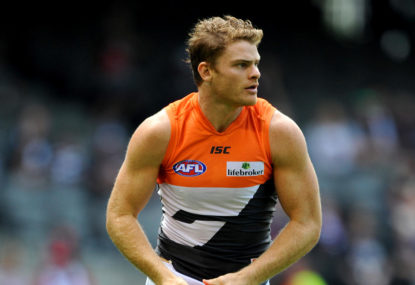
You know where I’m going with this. While Greater Western Sydney’s guernsey remains the corporate horror show of orange and a big G on the front, they will never win the flag. File the G in with the koala, the anchor and whatever the hell Port’s first jumper was.
Orange with a white V crest will surely be the way to go in the coming years if their organisation has any ambition to speak of.
Who’s in your ultimate team? Pick the best team and compete with other fans for daily prizes on Draftstars. For the best odds on the game try out Aussie bookmaker PlayUp. Think. Is this a bet you really want to place? Set a deposit limit.