


- Video
-
Club Roar
Captured a great grassroots sporting moment? We want to see it!Content Collections
The Roar Community
- Join
- Login
Which club has the best logo, who has the worst logo and where does your team come in the final standings?
There have been articles ranking logos in other leagues around the world, but surprisingly, when I did a Google search for A-League logo rankings nothing came up.
To put things right I’ve decided to write one myself going from worst to first.
Most articles along these lines are quite bare on detail, mine however is about twice as long as I don’t want to just zip through them with little thought or consideration, with 800 words I would have just 80 for each. They deserve better than that.
So without further ado, here they are starting at number 10.
10 – Adelaide United
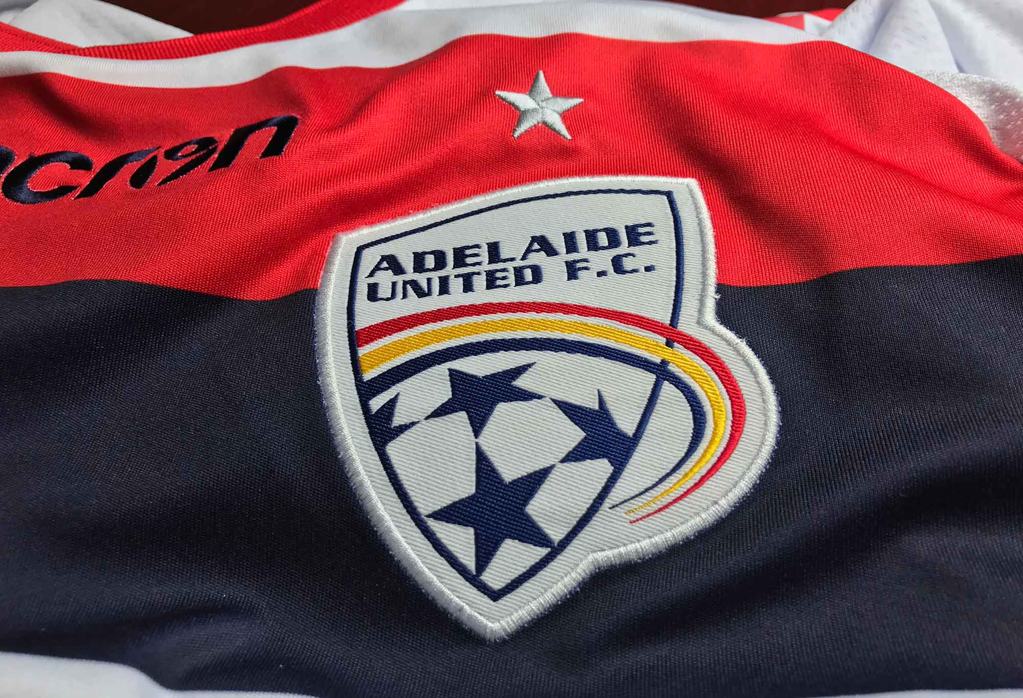
Adelaide United FC shirt and logo (Supplied)
For a club like Adelaide United, this badge is a huge disappointment. The asymmetrical sides of the shield in the design are similar to those of Sydney FC’s old badge and the club’s name looks like it’s been shoved into the space with little thought or care. The three colour “swoosh” in the colours of South Australia looks like something from another planet.
There’s a lot of empty white space and the ball at the base of the logo is barely recognisable. It would be better to use something iconic on their badge, like the Piping Shrike.
Ice hockey club Adelaide Adrenaline have done a much better job with their secondary logo and show what might be possible for Adelaide United.
Adelaide United, go home and do it again.
9 – Perth Glory
Another unremarkable logo is that of Perth Glory. There isn’t much to separate this design from that of Adelaide United, but the main differences in its favour are that the ball on Perth’s logo is actually clearly identifiable as a football and that the name fits better into the symmetrical shield.
Again, like Adelaide, it would be nice to see something iconic and recognisably Western Australian on the badge. As the city that stands on the Swan River and with the Black Swan as the state’s official emblem the obvious choice would be to feature a swan.
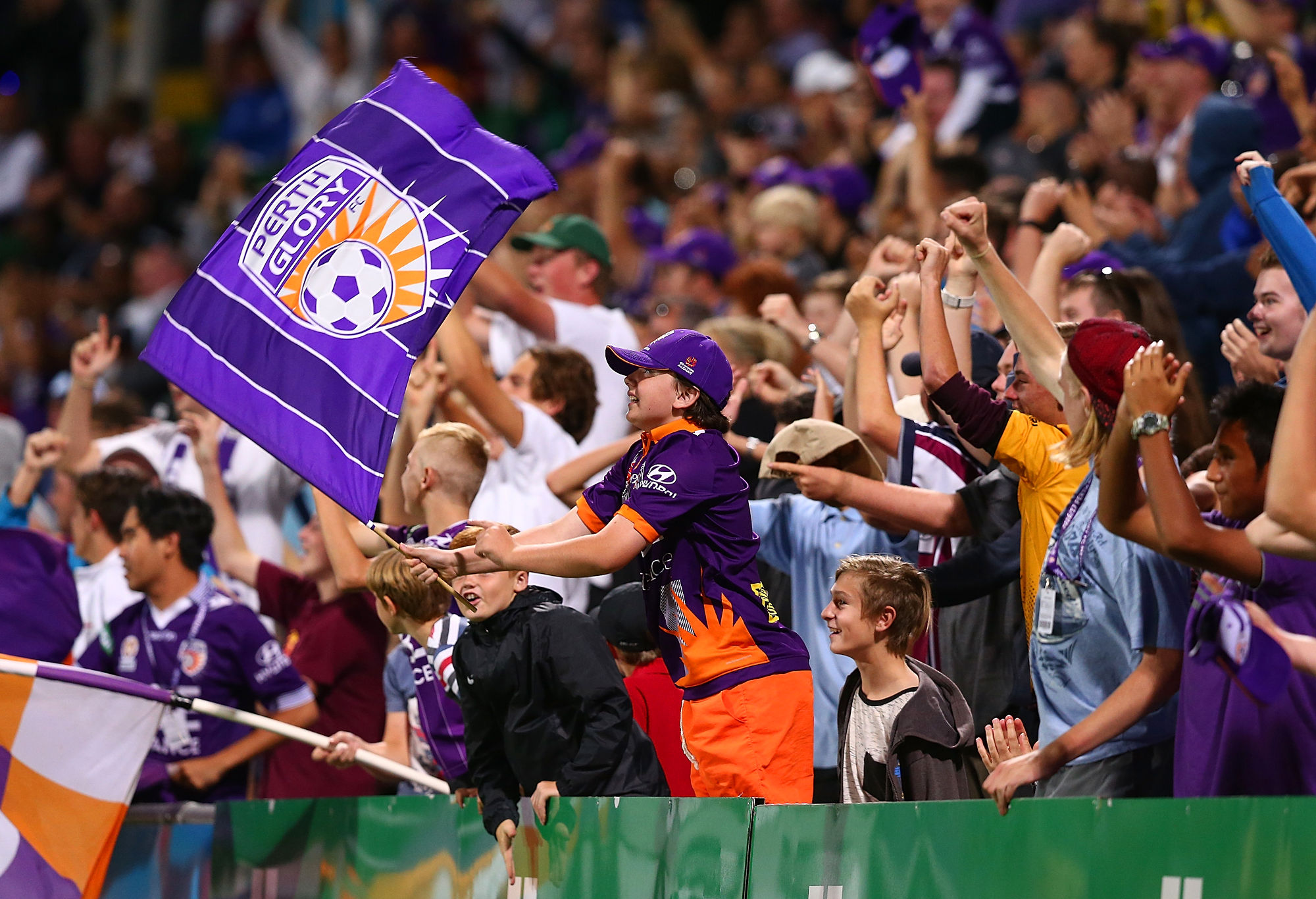
The Glory logo visible on the flag. (Photo by Paul Kane/Getty Images)
The logos of Swansea City and Wycombe Wanderers each feature swans in their designs and it’s something that Perth could go with as well.
In fact, it might not be such a bad idea to change the name of the club to Perth Swans to go with the new badge.
8 – Brisbane Roar
This logo looks more like a design concept than a finished product, it almost looks as if someone has drawn a concept image of what the badge should look like and the club have used it in a rush.
The lion is partly obscured behind a ribbon bearing the club’s name while the lion itself could potentially be mistaken for a Silurian from Doctor Who, or as one person said, a griffin.
A more traditional design with a lion inside a round badge would work much better with Chelsea a well-known example, but similar to Brisbane’s logo the lion is poorly drawn. North Epping Rangers have a shield bearing a lion in the same colours as Brisbane Roar while Sporting Lisbon also have a lion on theirs, both of which look more like lions.
Also, a name like Sporting Brisbane would be better.

Could Brisbane do a better job with their badge? (Photo by Albert Perez/Getty Images)
A lion inside of a shield is fine, but when there are much better examples elsewhere it only highlights that Brisbane Roar’s execution of such a logo is mediocre at best.
7 – Central Coast Mariners
The wave on their logo is distinctive but it would better suit the club if they were called the Breakers to fit in with the surf theme. The trouble there, of course, is that the former NSL club called Breakers actually represented Newcastle – who are the Central Coast’s biggest rival.
More traditional elements for a club called Mariners would be things like an anchor or a ship’s wheel as can be seen on the logo of Corinthians who are a prime example. In addition, the way that the name of the club is warped around the top of the logo makes it look like it’s being distorted by an amusement park mirror.
A more traditional round badge with a palm tree in the centre and an anchor at the base with the name of the club going around above it in an arc might be more appropriate. The Flag of Lord Howe Island could give you a sense of what it might look like.
6 – Melbourne City
Nothing says Melbourne quite like an English Cross of St George with the British royal crown in the centre surrounded by a dead sheep, a Holstein Friesian bull, a Southern Right whale and its arch nemesis the whaling ship in each of the four quadrants.
As strange as it sounds, all of these elements are actually featured on the flag of Melbourne, while the sailing ship as well as the bull and the dead sheep are also featured on the Flag of Adelaide so they’re hardly unique or iconic to Melbourne. The flag is only flown at two buildings in Melbourne and it is so obscure that most Melbournians probably don’t even know that it exists.
The Melbourne City logo.
Two main alterations were made to the design for the Melbourne City logo.
Firstly, the ram on the Flag of Melbourne is actually depicted as hanging dead from a ring or hook while the one on Melbourne City’s logo has been miraculously resurrected.
Secondly, the whaling ship has been replaced by the same ship on the Manchester City logo, although curiously the flags at the top of the first two masts are blowing towards the bow while the flag on the third mast is going backwards towards the stern, the same as on their 1972-1997 crest.
While the Flag of Melbourne is undoubtedly Melbournian, it is such an appallingly bad representation of the city itself that it never should have been used as part of the club’s logo and is perhaps symptomatic of the club’s confused search for meaning and identity.
Melbourne City’s logo is a flawed design because they based it on another flawed design. But at least it looks like a finished product, unlike several other A-League logos.
5 – Melbourne Victory
While the “Big V” has been used by Victorian sporting teams for many years, it’s use on Melbourne Victory’s logo is somewhat undone by so clearly following the template of Arsenal.
The bulging double shield, with large outlined letters looks tacky and the word ‘Melbourne’ seems to be falling over backwards while the ‘FC’ looks quite awkward. All of this is due to trying to fit three lines of text into an area which was only designed for one in the case of Arsenal’s badge.
A better template would be French club Girondins de Bordeaux who not only share the same colours, but the white chevron as well. Unlike the Victory logo, it’s flat and doesn’t have a bubble look.
4 – Newcastle Jets
The shield of Newcastle features three jets against a blue background representing the link to the nearby air force base, with their name set against a red background in the top section. The nickname “Jets” is held below on a red ribbon, creating a red-blue-red pattern.
The overall design is good and it’s nice to see a sense of local history and connection. The only real quibble is that the shield is bulging outwards similar to Melbourne Victory, but it’s a subtler effect that’s harder to notice as it’s only a single shield and the text isn’t as distorted.

(AAP Image/Darren Pateman)
3 – Western Sydney Wanderers
According to their website, “The official club logo incorporates the key elements of the Western Sydney landscape; the mountains, valleys and winding river system that run throughout the region.”
It might be a good logo, but it’s also just a series of interlocking letters like a number of other logos around the world and blends in a bit. The Wanderers have produced a nice logo, but it’s nothing special.
Technically though it’s pretty much flawless and the way it does this stylistically through the intertwining of their initials, is clever. Overall it represents the club very well.
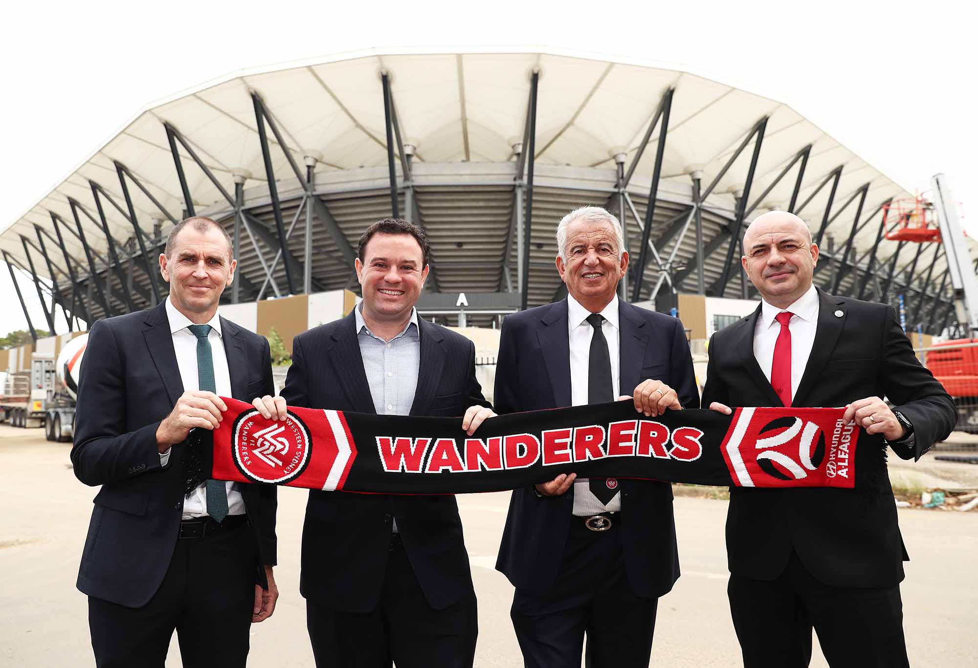
(Photo by Matt King/Getty Images)
2 – Wellington Phoenix
Their yellow and black circular logo has been likened by some to that of Borussia Dortmund.
Yet at the same time the details inside are 100 per cent pure Wellington. The central feature of the design is a type of great water monster called a Taniwha, who took the form of a Phoenix like bird upon death. Below this is the Maori inscription ‘E Rere Te Keo’ which it used as a rising call or rallying cry.
There’s a whole news page about how the logo relates to the Maori creation legend of Wellington Harbour and how the story symbolises the culture and identity of the club on the Wellington Phoenix website.
The only real fault is that the ‘FC’ looks a bit out of place and would be better off removed, but the Maori backstory to the main feature of the logo makes up for it and it’s also what gives this badge the edge over that of Western Sydney Wanderers.
1 – Sydney FC
And the winner is … Sydney!
Yes, I know, many fans of other clubs don’t like the Smurfs but whether you like them or not their logo is easily the best when it comes to visually depicting who the club represent.
At first it may seem flat, even boring, but it’s this very simplicity which gives it its class. They could have used the harbour bridge, but it also looks like a number of other bridges around the world with the Tyne Bridge in Newcastle and New York’s Hell Gate Bridge being especially similar.
No, the only thing you need to show to represent Sydney is the Opera House. There’s no mistaking it for anything else.
In terms of the visual styling, the colour pallet is subdued and pastel toned like something that David Hockney might have used, while the overall composition has a bit of an art deco poster kind of feel. It’s quite minimal and very refined.
The only minor faults in its design might be the way that split shading is used to create a sense of a three-dimensional camber and that an anchor or a shell might have been better than the Star of Federation. Maybe an art deco style font also could have been used.
After looking through hundreds of football crests from around the world, I can accurately state that there are remarkably few where you can identify where the club is based simply by the visual design of the logo, especially with the use of the eastern perspective.
Not only does this make Sydney FC’s badge unique in the A-League, but among a rare few from among thousands of others from around the world.
That’s what sets Sydney FC’s logo apart as being absolutely world-class.
It might just be the world’s best football logo.
Are you the ultimate team manager? Pick your own superstar team and go head to head with other football fans for glory and cash prizes on Draftstars. Imagine what you could be buying instead. Set a deposit limit.