NRL Round 7 judiciary: Roosters star duo charged
James Tedesco will be free for the next game of the Sydney Roosters' inconsistent NRL campaign after escaping suspension for tripping Ryan Papenhuyzen. The…

It’s the analysis no-one asked for, but I’m here to deliver it anyway.
I always have strong opinions on what teams wear, so I have ranked the home jerseys of all 16 NRL squads.
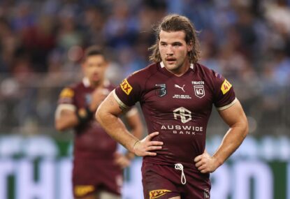
16. Brisbane Broncos
The jersey seems to be designed exclusively by NRMA so their logo visually attacks anyone in sight. Even if you imagine it without the waist-to-waist sponsorship, the design is awful. Why is having a huge yellow hoop with a white trim a good idea? Why is a gross, slightly off-yellow a reasonable colour to have as the focal point? Why is the jersey brand just as big as the Broncos logo? And the worst part about this? I’m a Broncos fan.
15. Gold Coast Titans
The Titans colour scheme is awful, so getting any kind of decent jersey is a challenge. Once again they’ve disappointed, even with the change to navy. The weird broken chevron is kind of hard to look at and the huge orange sponsor just makes everything worse. They have tried way too hard.
14. Parramatta Eels
It’s a nice idea, but it’s simply not Parramatta. They really should be wearing the classic blue top, yellow bottom with alternating hoops around the midriff. The white collar also makes no sense.
13. Wests Tigers
Again, a nice idea that’s been poorly executed. The black trim inside the chevron takes away any possible impact that may come from the orange, and the white, which I assume is there to represent the Magpies side, looks totally out of place.
12. Cronulla-Sutherland Sharks
Sky blue, black and white is another colour combination that is difficult to master, simply because it has no guts. It also looks like it should have a V but the design guy misplaced it way too low and then stretched it.
11. Manly Warringah Sea Eagles
Boring.
10. Canterbury-Bankstown Bulldogs
Boring but in blue.
9. South Sydney Rabbitohs
This is actually one of Souths’ better jerseys from the last few years. Unfortunately the red line down the arm with the black trim is not good and makes a pretty good jersey look not that great.
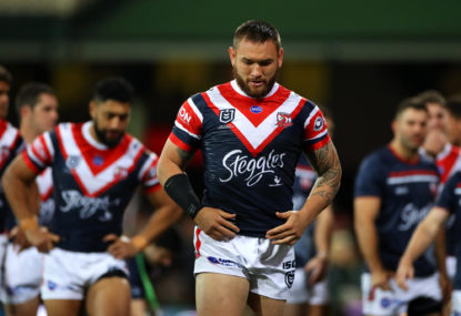
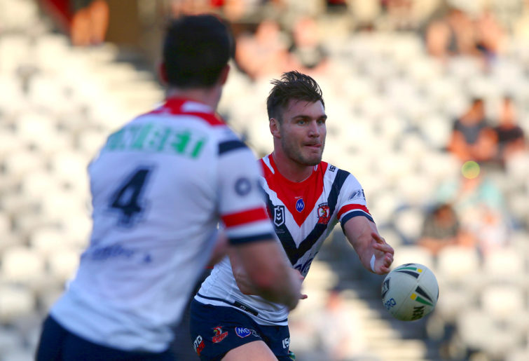
8. Sydney Roosters
Another old-time classic blue jersey with the red and white chevron. It would be a whole lot stronger if it was worn with blue shorts, but that’s not the Rooster’s way.
Angus Crichton of the Roosters (Ashley Feder/Getty Images)
7. Canberra Raiders
In 2019 the Raiders have reverted to the darker green with the coloured sleeves they wore in the 1980s and 1990s. They have kept it simple and it has paid off. Like the Roosters, it would be great if they wore green shorts too, but that’s also not the Raiders way.
6. North Queensland Cowboys
I am really glad they ditched the immensely complicated designs of the 2000s to come up with something that is simple but also incorporates the bull horns into the jersey. The colour palette is great, it’s not too fancy and the sponsor blends relatively well.
5. St George Illawarra Dragons
A classic that has stood the test of time. Red and white is a combination that can’t really be messed up, and with the white shorts and a sponsor that blends seamlessly into the design, it’s a quality jersey. It also gets bonus points for ditching the V that extended over the shoulders and reverting to ending it at the top of the chest.
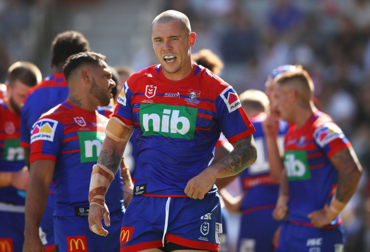
4. Newcastle Knights
This is the reason I’m writing this article. I saw another article that ranked this jersey last and it made me genuinely mad, so I’m here to rectify that. The jersey is an all-time classic with good colour combinations and a pattern that is very easy on the eye. I would have had it first, but unfortunately the giant green nib sponsor sticks out like a sore thumb and brings the whole thing down.
David Klemmer of the Newcastle Knights. (Mark Kolbe/Getty Images)
3. Penrith Panthers
Everyone looks good in black, and this jersey is way better than last year’s weird black-to-white fade. The coloured hoops on the chest provide both a good contrast as well as a nod to years gone by.
2. Melbourne Storm
Many hate this jersey, but for me it’s wonderful. The yellow trim makes the purple pop, the sponsors do not get in the way of anything, and for a short-sighted person like me at the Raiders game on Friday, the yellow numbers are way easier to read.
1. New Zealand Warriors
I love a good throwback jersey, and that they’ve made it their main home kit makes it even better. It’s a near-exact replica of their 1995 foundation jersey – blue with the red, green and white pattern at the top. It’s easy to look at and may even inspire the perpetually underachieving Warriors to a better season.
Reckon you can pick the winning team? Build your own dream team with Draftstars daily fantasy and compete on any match. For great odds on the NRL head on over to PlayUp. Imagine what you could be buying instead. Set a deposit limit.
James Tedesco will be free for the next game of the Sydney Roosters' inconsistent NRL campaign after escaping suspension for tripping Ryan Papenhuyzen. The…

Like most clubs, the Brisbane Broncos have had their fair share of big boppers over the years, many of them legends of the game.…

South Sydney have the bye this week, but that hasn't stopped their bad luck with injuries. They have now lost starting front rower Tevita…
Billy Slater says the door is open for Queensland's middle forwards to force their way into the squad for the State of Origin opener…

Friday night’s clash between Parramatta and the Dolphins is likely to be a hot one – and not just because the game is being…

Who are the hardest working big men in the NRL?