


- Video
-
Club Roar
Captured a great grassroots sporting moment? We want to see it!Content Collections
The Roar Community
- Join
- Login
Opinion
The question of how to interpret a player’s career statistics has featured in several Roar articles recently.
Renato Carini has challenged conventional views with some forensic takes on the career of Victor Trumper, as well as the real effectiveness of Don Bradman’s batting in the Bodyline series.
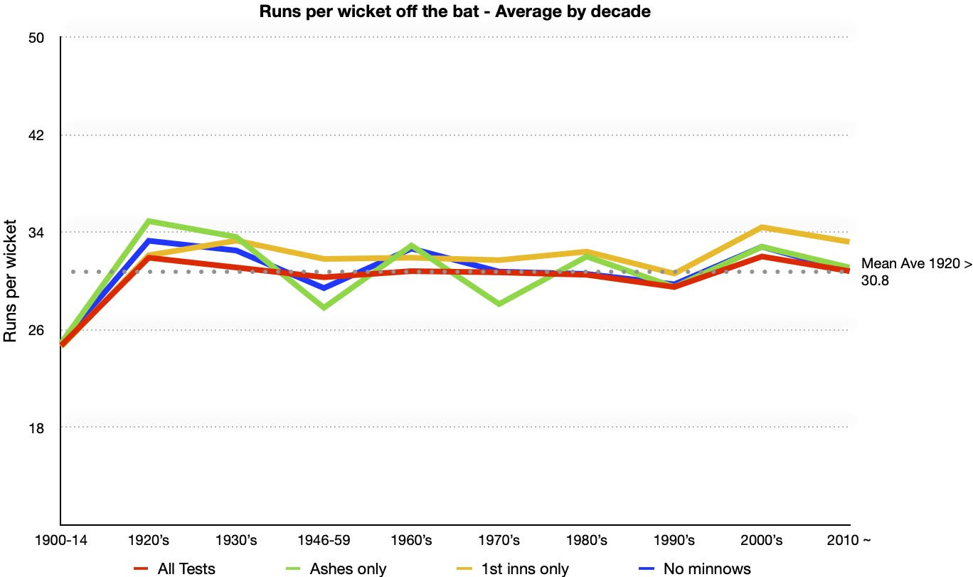
He did this by examining the decade-by-decade average runs per wicket of the top seven batsmen in all Ashes matches, focusing on the first innings only.
As I also shared the impression that averages have stayed around the same level since the 20s, I thought I should check the numbers to make sure that Renato was not polluting impressionable young minds with too much myth-busting.
First of all, I looked at the overall decade-by-decade runs per wicket for all batsmen in all Tests – both first and second innings – using the CricInfo search engine.
Renato suggests people had got it wrong about constant averages because well-meaning but incompetent amateurs had been let loose on search engines. But unless those sites are wrong and you have all the data tucked away on your own spreadsheets, I don’t see a better way of doing it.
Cranking up the old abacus, I found that runs per wicket in all Tests had, in fact, remained fairly constant – or more accurately, stable – since 1920, following a big jump from the pre-World War I level.
The average of the average runs per wicket by decade is 30.8, which is also the median decade average. This very steady outcome is seen in the red line in the chart below, which stays very flat from the 1920s after jumping up from the lower averages pre World War I.
The decade average was a bit higher in the 1920s, 1930s and 2000s; a bit lower in the period 1946-59, 1980s and 1990s; and about the same in the 1960s, 70s and since 2010.
However, all these variations were very small – the highest differences from the median/mean were only 3.4 per cent above in the 1920s and 4.4 per cent below for the 1990s.
I also narrowed down the averages in three ways to see whether it made a difference.
– First innings in all Tests (i.e. first team innings of the match)
– All innings in Ashes Tests only
– Removing weaker “minnow” countries, in case they boosted or depressed averages, similar to what Renato was trying to do by focusing only on the Ashes.
Deciding which countries are minnows is subjective, but the rough rule of thumb was whether a team could challenge the top ones on a regular basis.
This meant excluding Bangladesh, Zimbabwe, Ireland and Afghanistan completely, Sri Lanka pre-1990, the West Indies pre-1940 and since 2000, as well as India, Pakistan and New Zealand pre-1970.
People may think South Africa in the 1920-39 period were minnowish, but we already have the numbers for the Ashes matches, while South Africa drew a series with England in the 20s, and won two against them in the 30s.
In any case, slicing the data in these ways didn’t change the picture: average batting averages remained pretty stable over the decades at around the 31-32 mark – with first innings averages (orange line on chart) being a fraction higher.
The Ashes (green line) shows the biggest variations – the highest being nearly 35 in the 1920s and the lowest about 28 in the 1940s-50s and the 1970s.
Removing minnows barely made any difference, the blue line on the chart being hidden by the All Tests average for much of the century.
Unlike Renato, I did not limit the averages to the top order batsmen. I don’t see how confining the numbers to top order batsmen is necessary to see whether pitches and conditions varied, which was Renato’s main message. If it’s easier for the top order to score runs it probably is for tailenders too.
Renato’s finding that the top order batsmen in the Ashes had much higher averages in the 30s doesn’t square with my results, which show that average runs per wicket both in the Ashes and in all first innings were about the same in the 1930s as in the 2010s.
One explanation seems to be that second innings runs per wicket were quite low in the 30s – only 26.1 – compared to the long term Ashes second innings average of 29.3 since 1920, identical to the overall decade average since 2010. I have no ready answer as to why that should be.
Maybe it was the strength of Australia’s spinners, Grimmett and O’Reilly that helped depress second innings totals in the 30s?
What these numbers tell us is that the overall impact of conditions affecting batting totals – pitches, boundary sizes, equipment, umpiring and law changes – hasn’t changed much over the last hundred years. This gives greater confidence that individual statistics are comparable over time.
That does not mean that career averages, for example, perfectly represent the quality of a batsman, and that a batsman having a higher average than another means a lot on its own, especially if the difference is small.
If it is a substantial difference it is probably telling us something, but we might want to examine the stats further: how did they go against the best teams? or away from home? or over his peak years? or maybe, in clutch situations or close games, if there is a way of measuring that.
Although the differences from decade to decade have been small, we can speculate about some of the microtrends.
The slight dip in runs per wicket in the 1990s (29.5 compared to the average per decade of 30.8) might be due to a peak in bowling quality: the Windies, Pakistan, South Africa and Australia had excellent pace attacks through most of the decade, while it was a golden period for spinners with the likes of Shane Warne, Muttiah Muralitharan, Mushtaq Ahmed, Saqlain Mushtaq, Anil Kumble and Daniel Vettori.

(Photo by Hamish Blair/Getty Images)
This effect was perhaps diluted by a below average England attack, which played a lot of games.
There was a noticeable uptick in both runs per wicket and scoring rates in the 2000s. Statistician Charles Davis put this down to the advent of ‘superbats’ in the period 2001-03, as well as smaller boundaries, though the bats were most important.
It wasn’t so much six-hitting that fuelled faster scoring, but more the number of threes that were turned into fours, thanks to greater bat power and bigger sweet spots.
Davis found that the ratio of fours to threes in Tests in Australia climbed from under 2.5 in the period 1945-2000 to over 3.5 between 2000-18. Moreover, more powerfully hit shots pierce the infield more often.
This has affected scoring rates even more than runs per wicket, but it no doubt leads to bigger totals.
Why, then, you rightly ask, have runs per wicket dropped back to the long-term average (30.8) since 2010?
I would hazard a guess at three reasons: first, pitches in some countries (England, South Africa, India) have become more bowler-friendly in the last decade; second, touring teams have even less preparation for red ball cricket in the form of warm-up games, etc; and third, the profusion of T20 cricket has reduced participation in first class cricket and maybe weakened defensive technique.
So, in my view verdict is that the ‘myth’ of the constant/stable averages since 1920 is rated ‘true’, not ‘busted’.
But to cheer up Renato, I will mention what Davis concluded about scoring rates: Victor Trumper was the fastest scorer of all time in terms of runs per hour – 40 – ahead of Stan McCabe, Frank Woolley, Charlie Macartney and, believe it or not, Don Bradman.
After normalising scoring rates per over to take account of changes like bats and boundary sizes, Trumper came in third all time after Virender Sehwag and Viv Richards, and just ahead of David Warner.
Below for those interested are the full figures of runs per decade (combining part-decades for the pre WWI and post-WWII with the adjacent decade), across the parameters discussed and as shown on the chart above.
| Decade | All Tests | Ashes | 1st inn all Tests | No minnows |
|---|---|---|---|---|
| 1900-14 | 24.7 | 24.9 | 24.6 | 24.9 |
| 1920s | 31.9 | 34.9 | 32.1 | 33.3 |
| 1930s | 31.1 | 33.6 | 33.3 | 32.5 |
| 1946-59 | 30.3 | 27.8 | 31.8 | 29.4 |
| 1960s | 30.8 | 32.9 | 31.9 | 32.7 |
| 1970s | 30.7 | 28.1 | 31.7 | 30.8 |
| 1980s | 30.5 | 32 | 32.4 | 30.6 |
| 1990s | 29.5 | 29.5 | 30.6 | 29.7 |
| 2000s | 32 | 32.8 | 34.4 | 32.8 |
| 2010 ~ | 30.8 | 31.1 | 33.2 | 30.8 |
| Mean decade ave since 1920 | 30.8 | 31.4 | 32.4 | 31.4 |
Build your own fantasy cricket team and put it to the test with Draftstars daily fantasy competitions. Pick your match, pick your team and watch the points roll in to take out cash prizes on each match. What are you really gambling with? Set a deposit limit.