


- Video
-
Club Roar
Captured a great grassroots sporting moment? We want to see it!Content Collections
The Roar Community
- Join
- Login
Opinion
On Christmas morning 2021, many young rugby league fans will have unwrapped a new replica jersey to wear proudly in the year ahead, until their parents insist the garment be removed and washed on the grounds of local air quality.
Two clubs didn’t unveil a new jersey before Christmas: Melbourne and the Sydney Roosters. Was this complacency, part of a diabolical marketing strategy, or are the two best clubs of recent years opposed to festive cheer?
Whatever, I’m not here to speculate on their chicanery. I am here to criticise the fashion choices of NRL clubs and, by extension, all rugby league supporters and their progeny.
All but one NRL club has now unveiled at least one new jersey. I’ve been through the 2022 draw and awarded a win and competition points based on the jerseys likely to be on display in every fixture.
Here are the ladder positions if the NRL was decided by each team’s fashion choices in 2022.
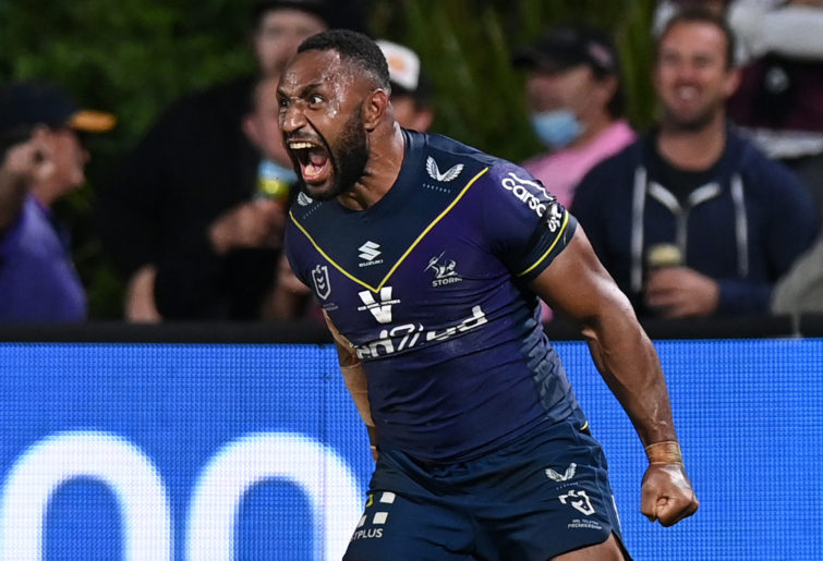
16. Melbourne, four points
While they’ve worn worse, it’s still purple. Anyway, the less said about the purple eyesore the better. Let’s focus on the positives.
First, Melbourne did a good thing. Late last year, the club and its apparel provider encouraged supporters to submit design ideas for an alternative jersey, with the winning design to be worn during 2022.
While the colour palette wasn’t up for negotiation, more clubs should do this sort of thing.
Second, there is precedent for a club radically changing its colours (Penrith) and an obvious solution to Melbourne’s baffling lack of fashion sense.
One of Victoria’s official state colours is silver. Silver and white with some dark navy-blue trim would be a nice nod to Melbourne’s home state, and a vast improvement.
(Photo by Bradley Kanaris/Getty Images)
15. Gold Coast, six points
There needs to an investigation, maybe even a national conversation about this. In 15 seasons the Titans strip is yet to transform into anything a discerning person would wear in public.
I get the colour concept, but two weak shades don’t work together, especially when one of them is an insipid yellow.
Maybe the colour scheme should reflect people in the Gold Coast region who actually produce something. The region’s most voluminous agricultural product is mushrooms. By number of producers, it’s sugar cane.
White and green works for Real Betis.
14. Brisbane, ten points
Another drab, unimaginative design from the Broncos. Why they persist with the grill on the front of their jersey is beyond me.
Maybe Annandale, who last appeared in top-flight rugby league more than a century ago, could give Brisbane some inspiration.
13. Parramatta, 12 points
To quote Phil Gould, ‘no, no, no, no, no’! Whoever designed Parramatta’s new strip was obviously keen to get to lunch. There’s something missing.
As for their alternative strips, why would Parramatta ever wear white? Yellow’s not an easy colour to work with, but Parramatta has a decent shade.
If you’re going to use it, go all in. And don’t combine it with white.
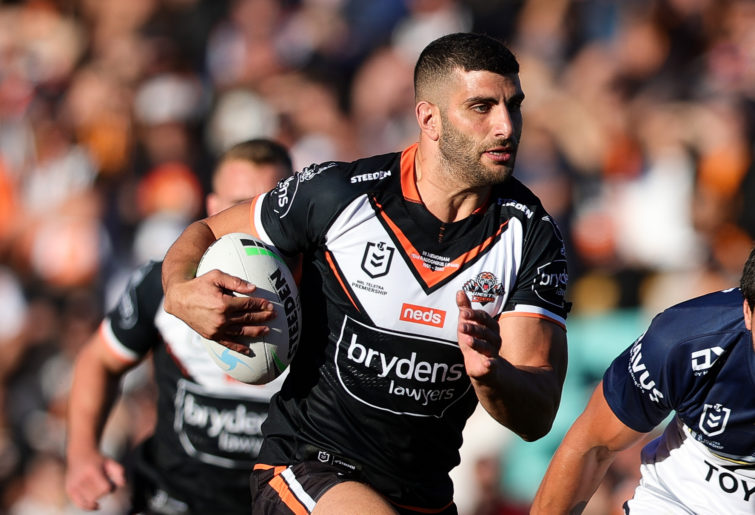
12. Wests, 12 points
Again, I’ve seen them in worse. The Tigers’ problem is trying to be a hybrid of Wests and Balmain in the 1990s. But a third colour doesn’t work with this chevron design.
(Photo by Speed Media/Icon Sportswire via Getty Images)
Neither Wests nor Balmain always wore chevrons. Why are the Wests Tigers so wedded to it? There are other options.
11. Newcastle, 14 points
Well, it’s an improvement on last season. I still see plenty of the old vertical stripes in the Newcastle home crowd. There’s a reason for that.
10. St George Illawarra, 18 points
The red V on the Dragons’ home strip is too thick and the red trim is unnecessary. It’s a hard jersey to mess up but the Dragons have managed it.
There’s a much bigger problem, though: the abominable away strip. Why can’t the Dragons just wear a classic Steelers jersey when they play in Wollongong and when there’s a clash?
9. Penrith, 26 points
Why would you change a premiership-winning jersey? The Panthers haven’t and their pink outfit and nod to the 1991 premiership winners are sound choices.
But the home strip doesn’t do it for me. I still don’t get the yellow, green and red hoops. I’d prefer to see a nod to the blue panther of the 1980s.
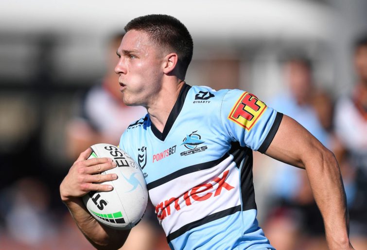
8. Cronulla, 28 points
It’s a classic Cronulla design. The new sponsor logo isn’t ideal, but that’s more pragmatism than design.
(Photo by Ian Hitchcock/Getty Images)
7. North Queensland, 28 points
In 2021, the Cowboys unveiled a very good jersey and the club has wisely retained it for 2022. They’d be better off replacing the yellow hoops with white, but I’m nitpicking.
Their away strip is a reminder of the club’s choices in its first 25 years of existence.
6. Canberra, 30 points
While I prefer the classic design, I don’t mind the addition of bottle green.
They could do without the unnecessary strip around the breast on the home jersey, and the weak sky blue on the away jersey should be white. They’re doing alright.
5. Canterbury, 32 points
Nice work by Canerbury, with a thin, intact chevron above the sponsor’s logo, which is fortuitously stylish in itself. The beauty of simplicity.
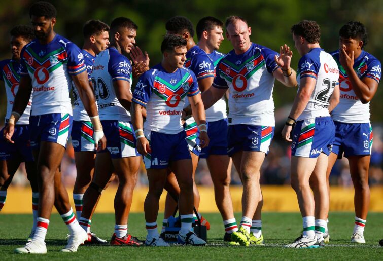
4. New Zealand, 34 points
Despite their high position, this is a step backwards for the Warriors. They’ve changed their shade of blue and introduced white chevrons which distract the eye from the unlikely splendour of their primary colour combination.
They should have stuck with the curves of 2021 and the classic 1995 design.
(Photo by Daniel Pockett/Getty Images)
I’ll put it down to a new apparel provider who’ll hopefully see the light in 2023.
3. Souths, 40 points
While there was some experimentation in the 1980s – it’s good to get that out of your system – I doubt we’ll see Souths stray far from the classic any time soon.
The only question is whether to go with black trim and shorts, or white. They can’t really go wrong.
2. Sydney Roosters, 44 points
The Roosters still haven’t officially unveiled a 2022 jersey, but it is safe to assume, based on the trials, there’ll be little, if any, change in 2022.
I love the NRLW home jersey – it’s the best strip in either competition. However, the Roosters men are deemed to have lost the fashion league due to a key mid-season defeat in their away strip.
They can make amends by bringing back their superb 2021 Anzac Day jersey and by losing to the Dragons, despite their sartorial style.
1. Manly, 46 points
These are essentially the classic strips worn by Manly in the 1980s. The Trbojevic brothers will look very stylish as Manly exit the finals of NRL proper after defeat to a team with far less fashion sense.
As nobody says, the game’s played on grass, not the laptops of the NRL’s fashion designers.
Reckon you can pick the winning team? Build your own dream team with Draftstars daily fantasy and compete on any match. For great odds on the NRL head on over to PlayUp. Imagine what you could be buying instead. Set a deposit limit.