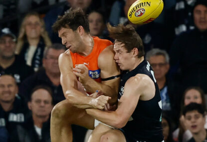
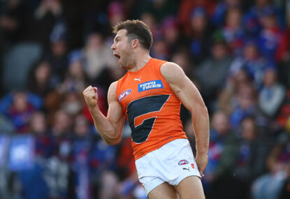
Tribunal verdict in for Hogan as Giants forward learns fate for striking Blue
Jesse Hogan is free to play Brisbane on Anzac Day, after the AFL Tribunal ruled the Giants star had no case to answer for…
Opinion

The following is a hapless attempt to critically judge your favourite team’s logo in a highly biased review from a humble Giants fan (don’t worry, my team ranks low).
It is essential to remember in fluff pieces like this that no one really values my opinion, but it is still nice to know there are others out there who consider your team impressive in artistic flair.
18: GWS Giants
The large iconic G, italicised in bright orange. I may be a fan of the team, but hands down this is the worst logo in the entire league. It appears as though it was manufactured on MS Paint in an afternoon class. Now, before discussion on manufactured team comes up, the logo and GWS naming convention are the only two points I agree with.
Unlike the team guernsey, which is aesthetically pleasing, the Giants logo completely misses the mark.
17: Fremantle Dockers
Much like the Giants’ ‘G’, it probably is difficult to make an interesting logo out of an anchor. The white anchor-D symbol overlaid on the shield is not awful, but it simply doesn’t speak to the imagination. Luckily for Fremantle fans, you are not last in logo design, just team song. Also, in a repeating trend, whilst the logo is one of the worst in the league, the guernsey is one of, if not the best.
16: St Kilda Saints
The black-over-white cross is an iconic staple of the St Kilda Football club. The abbreviated wording of the club title on top and the inclusion of Latin script beneath is a memorable throwback to football across-codes over a century ago. If you’re under 20 in 2022 and still deciding on a team to support, one look at this logo and you’ll feel like you’ve stepped back in time a century.
St Kilda’s logo certainly needs a refresh to match with the changing times.
15: Adelaide Crows
Like the nine other animal-based clubs in the AFL, Adelaide have focused on what the coolest head-shot of a crow should look like on a logo. Unfortunately it misses the mark slightly; crows can be made to look like truly ferocious creatures, an animal one can truly fear but respect. This current side-angle cartoon design does not inspire either.
(Photo by Sarah Reed/AFL Photos via Getty Images)
14: Melbourne Demons
They might be the best team in the competition right now, but their logo certainly is not. The colouration is outstanding; the crimson red overshadowing the shadowy foreground does present the demon-esque feel of the club, however, the similarities stop there.
I’m not sure if marketing decided against showing a demon to not offend more sensitive individuals, but I would love to see them be creative with the underworld; there is so much potential there.
13: Sydney Swans
The iconic flying red-V with white Swan on the underlay. It certainly wins points for being different in the shape design, however the wording of ‘Sydney Swans’ across the crown could be landscaped into the V itself or an updated font change could improve it further.
12: Geelong Cats
I always get strong Cheshire cat from Alice in Wonderland vibes whenever I look towards Geelong’s logo. The cat imposed onto the logo shield itself is a splendid touch, however the hypnotising approach is equally as unsettling. The blending white and blue splashed across is still impressive.
11: Carlton Blues
The white-over-blue insignia, date of founding and latin underscript, like St Kilda is a nice, if not outdated touch. There is not a lot to say about the Blues; and therefore it falls roughly in the middle of the ladder. It is certainly a difficult team name to work a logo around.
10: Gold Coast Suns
The font of the Suns is an appealing choice with the AFL ‘GC’ nestled above rounding out the logo. Like the Giants, it has taken a simplistic approach, though it has done a significantly better job at doing so. The GC logo could use a touch up with sun-rays or even present the shield to represent a large burning ball of helium and hydrogen; blind my eyes, GC.
9: Essendon Bombers
The stylistic bomber plane, white overlaying the red arrowhead shield is an attractive logo for an original team name. The red Essendon capital lettering above the shield fits well, however, much like the regular competition ladder, this logo just misses out on the top eight.
Who’s in your ultimate team? Pick the best team and compete with other fans for daily prizes on Draftstars. For the best odds on the game try out Aussie bookmaker PlayUp. Think. Is this a bet you really want to place? Set a deposit limit.
Jesse Hogan is free to play Brisbane on Anzac Day, after the AFL Tribunal ruled the Giants star had no case to answer for…
Damien Hardwick has predicted Toby Greene's one-match suspension will be upheld by the AFL tribunal, but the triple-premiership coach says he wouldn't ban the…
Jonathan Brown has made a passionate plea to the AFL on On the Couch to give players leeway as they make split-second decisions, following…
Matthew Lloyd told Footy Classified that his skinfold result was a wake-up call for him after being above the level that was allowed.

What an appallingly run competition the AFL is. Nobody really talks about it. We all love footy, so the AFL must be doing great.…

It is time that the tribunal became more simplistic, closed defence loopholes, and became representative of the game that it is trying to serve.