In this second part, we will look at our finalist contenders for which team will win my unofficial opinionated ranking for best team logo of 2022. Ten have already been eliminated, discarded into the not worthy pile. If the team you follow has made it this far, all I have to say to you is I’m impressed.
As a Giants fan with the worst logo in the competition, these top eight are all the inspiration my team needs when designing their new one 15 years from now.
Once again, this is an opinion of someone whose views might be the opposite of your own. Let’s recap: 18th Giants, 17th Dockers, 16th Saints, 15th Crows, 14th Demons, 13th Swans, 12th Cats, 11th Blues, tenth Suns and ninth the Bombers.
Eighth: Hawthorn Hawks
Scraping into our eighth position we have the left-facing classic brown and gold highlighted Hawk. The capitalised font and sharp, forceful design are brilliantly done. The snappy glossy black beak and the way the gold encroaches into the brown to symbolise the feathers is a style the Adelaide Crows could learn a lot from.
Seventh: Collingwood Magpies
I think the Magpies have made the right choice going for an entire front-facing body shot of the bird itself.
Distinguishing itself from the other four bird-based teams it has combined very craftily the characteristic contrast of the black and white laid behind the magpie itself. The Collingwood script beneath is simple but works well with the design of the oval shield above. The realistic concept is also a unique distinction from how most of the other teams have presented their animals, which awards Collingwood the honourable seventh spot in my ranking.
Sixth: Brisbane Lions
Of all creatures in the animal kingdom, Lions really do have rule of the roost when it comes to making a vicious, powerful looking logo. For the greater part, Brisbane have been successful in this regard. The Maroon mane is a pleasing and representative colour and what truly brings most of this logo to life.
The capitalised LIONS font also dyed maroon is a terrific choice and one that gives exclusivity to the Lions brand and stands them out amongst the pack. I truly believe Lions have done a fantastic job on their logo, but they just fall short of being the best big cat in this list.
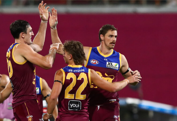
(Photo by Chris Hyde/Getty Images)
Fifth: West Coast Eagles
West Coast have kept it simple, and this has kept the image clear, bold and precise. Going for sharp edges and italicised naming, West Coast have really emphasised the gold over the royal blue, making it stand out on any flag or against any backdrop. Rather than the more realistic approach of Collingwood, they have kept their logo stylised in an almost identical way to the Crows.
The major difference being this is a bird illustrated to be both respected and feared. Their team song isn’t anything to write home about and their 2022 season is an unmitigated disaster, but in this competition, they have deservedly earnt fifth place.
Fourth: Western Bulldogs
To be honest and in all transparency, the Bulldogs are my least favourite team in the competition. There is not a lot I like about the team, except one thing: their team logo and the angular design of the shield pitted behind a hostile bulldog is one of the best concepts in the competition. The backside red, white and blue livens the image, though I feel the red could have been used even more within the logo itself to make it truly pop.
If you’re a Bulldogs fan, there is a lot to love about your logo.
Third: Port Adelaide Power
Distinctive, compelling and intense. The white, black and teal are tremendously blended in Port’s logo, overshadowing their classic black and white stripes, acknowledging their history and representing power in an image in the best way possible.
Just like how they have performed the past few seasons, Port have captured lightning firmly in their hands with their logo. This imagery makes a bold statement and is my favourite non-animal-based logo in the league. Very impressive.
Second: Richmond Tigers
I can’t think of a time I’ve ever seen a better illustrated image of a tiger. This logo encapsulates everything that a tiger represents perfectly, amalgamating seamlessly into the yellow and black shield like a camouflaged predator ready to strike at any foe.
This logo is here to make an audacious statement about their presence in the competition and when it comes to intensity, it is standalone champion of the logo domain. Richmond fans, be very proud of this wild, yet extraordinary design.
First: North Melbourne Kangaroos
This may come as the greatest surprise of all, but in my humble opinion, the very best logo in the league as of 2022 is the clear, transparent single-colour design of the North Melbourne Kangaroos. Through technicality, I am crowning it champion of the AFL purely through inimitability and individuality amongst its peers.
The team moniker of NORTH takes centre stage in what I believe is the best way to identify a club. It is the only club to create a see-through logo, the only club to have their script through the centre, the only club to focus on one colour and the only shield-based club to make theirs appear completely irrelevant.
Congratulations, North, you have received this Roar Rookie’s greatest praise.
North fans haven’t had a lot to celebrate the past two decades but perhaps you can take this as just the smallest win of all.