This week Sydney FC officially changed their team badge, releasing images of a spangly new crest, one chairman Scott Barlow felt better emphasised Sydney FC’s place as “an iconic club in an iconic city”.
Central to the composition of the new badge is a minimalist two-toned rendering of the Sydney Opera House as well as a more unified, subtle colour scheme, disposing of the rather garish use of orange as well as the fairly redundant soccer ball icon.
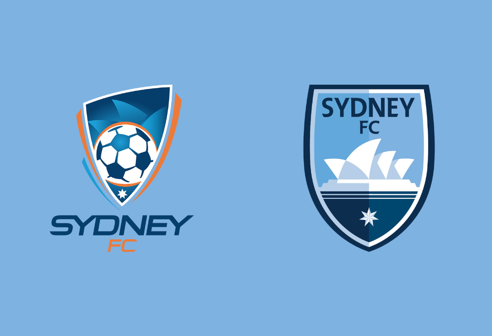

The new badge is certainly a welcome update, as Sydney’s old crest – along with most of the inaugural crests that linger on in the league – reeked of the mid-2000s as a sort of pictorial relic of clunky clip art, cringeworthy gradients and teal-and-orange colour schemes more often seen in one of Michael Bay’s cine-stinkers or indeed plaguing the entire first season of TV’s The Leftovers.
The asymmetrical flanking, tapered strips of the old crest – placed, one assumes, to imply some sort of vital energy or hint at some graceful movement – look silly, as does the orange halo around the ball.
They’ve teased the Opera House silhouette more prominently – it is a lovely building – the typeface of the club name has been smartened up, and the badge as a whole has been flattened.
The revamp has gone along the same lines as the process the refurbishment of the A-League’s own logo undertook a few months ago. It is a simpler, cleaner and more confident image that has been fashioned.
Sydney have joined Brisbane in updating the most crucial piece of branding they have as an organisation and are all the better off for it. These badges adorn almost every item of merchandise the clubs spend so much effort trying to hock, and sporting teams in all codes across all sports are all attempting to bridge the gap between fan-wear – clothes a person would feel they could only wear to relevant sporting events – and everyday fashion.
The Chicago Bulls, now a decade and a half removed from the heights of the Michael Jordan era, are still trading with the currency of their iconic logo – a symbol Jordan’s greatness launched into the social stratosphere – with hats and T-shirts still proudly worn by trendy types who, despite their snapbacks and hoodies, wouldn’t be able to recognise Scotty Pippin, let alone Luc Longley.
So what about the other clubs? Who among the rest of the league could do with a badge face-lift?
Personally I quite like the Mariners’ crashing wave, and the Phoenix’s winged crest, while obviously meant to represent the bird reborn, also looks pleasingly like the arms of a trophy – not that the Nix have really ever been in a position to lift one.
Adelaide’s needs work, as does Perth’s, but the club I’ve chosen to apply my own feeble graphic design skills to is the league’s biggest and one of their most successful: Melbourne Victory.
Big, outlined bubble letters cannot be allowed to endure any further into the 2010s, and the little ‘F.C’ planted underneath is just awful. The big white V is so basic it may as well be a giant ‘meh’ and, again, like Sydney’s old crest, there is no need for tapered edges or the allusion to three-dimensional form.
Things must change, and so, such as it is, my own humble mock-up can be seen below.
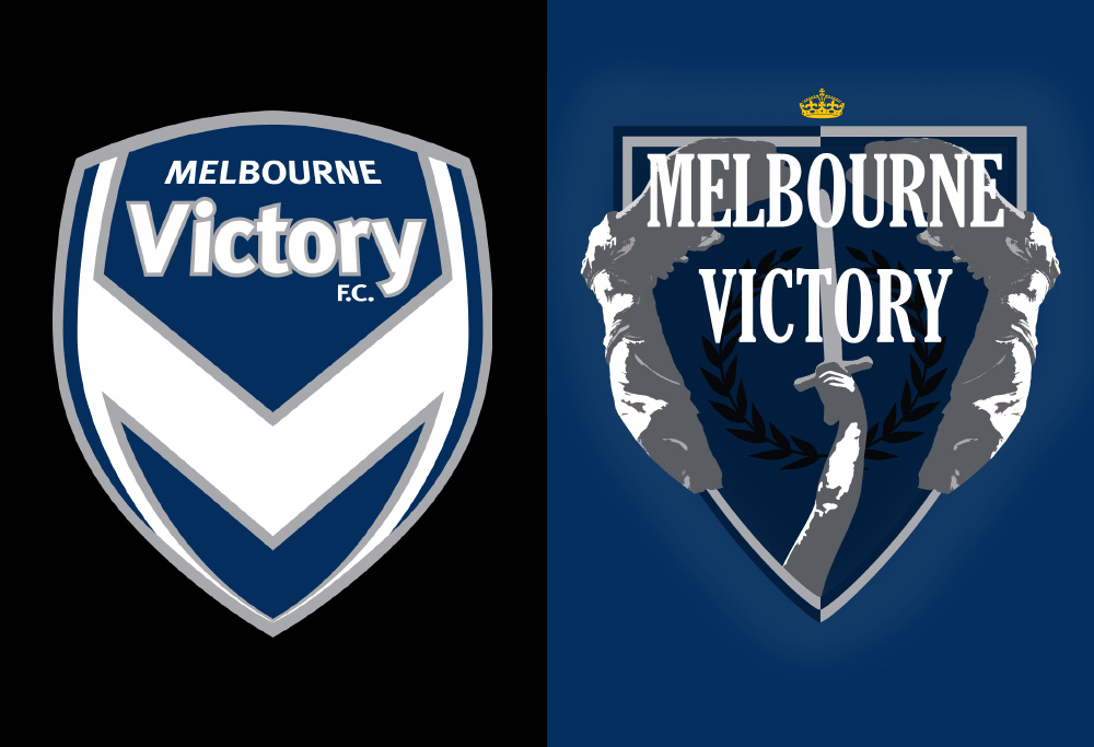
The colour scheme needs no modifications, as dark blue, grey and white make for a sleek palette. The Victory have always been a little odd due to their name: Victory, a moniker begging for defeat in a way, just to prove itself ironic.
As it happens, the club are league’s best run and, alongside Brisbane and Sydney, the most successful, so why not illustrate their name in a literal sense, with the Greek goddess Nike, the deity of speed, strength and of course victory itself? Most famously depicted in the Winged Victory of Samothrace, Nike is also seen here lunging forward with wings splayed behind her in pursuit of some grand athletic triumph.
In Greek mythology Nike flew at great speed around the battlefield, rewarding the victors with fame and glory and laying exquisite laurel wreaths around their necks. A wreath is seen here on the new badge too – a fitting backdrop for a club with such consistently lofty ambitions.
Naturally all of this makes proud reference to football’s Greek roots in the city. A sword is held aloft, drawing the eye up to the golden crown insignia adequately capping one of the A-League’s most regal institutions.
Well, all right, that all might be a bit much; the fervour may have carried me away a little. But this was pieced together in an afternoon – imagine what a trained designer could come up with.
Certainly the Victory aren’t the only ones in need of an updated crest, but as Sydney have moved on from pictorial relics of the early A-League, so should Melbourne’s biggest club.
Redondo
Roar Rookie
Thanks Arto - you make very good points. Caltex - it's a bit late for this generation of the badge/logo/branding but I'd love to see examples of alternatives you'd prefer. I'm not being sarcastic - branding evolves and you could kickstart the evolution now.
Arto
Guest
Caltex - Where in any of my comments have been derogatory of you for who you are? I've attacked your arguments, yes, because I disagree with them. You, on the other hand, have been very quick to attack anyone (in this casf both Redondo and myself) and label them simply because they disagree with you. I've called you out for it by stating you're playing the man, not the ball. If that's your staple mode of debating a topic, you'll find pretty quickly the debate stops being very advanced, but given your statement regarding why you chose not to get in contact with the club on the matter, i doubt that bothers you. You seem to be the type of person who loves to reserve the right to whinge about something, yet don't want to actually make a contribution to fixing what you think is wrong about it!
Caltex & SBS support Australian Football
Guest
"And I am most defintely an amateur when it comes to logo design" Arto - and on that we can agree. btw don't accuse me of playing the man when you clearly are doing the same thing. You have to ask the SFC board why they had taken this course of action---I am in no position to answer why they had thrown up this important decision of the club's identity to a few amateurs. However, I do know, the Cove have become a very influential part in the board's decision making in recent times because of militant action with threats of match walkouts in the past ect. This is an attempt of appeasement in my view. And nothing was going to get in the way of that. Even if it meant a dismal insignia on our merchandise. I am an ex professional (retired) who still knowns something about the process and we don't work for nothing. My guess is: the easy option for the SFC's board was to surrender to the whims of the few amateurs instead of investing $15k (there about) in doing the corporate identity professionally. I did not get involve, because I knew it was a fruitless exercise. However, I still have a voice to air my dissatisfaction.
Arto
Guest
Caltex - I'm not disputing the rationale behind your opinion (although I reserve the right to disagree with it on the grounds of different tastes) or your competency to judge in such matters. And I am most defintely an amateur when it comes to logo design. However, whether you are a (retired?) professional in the field or not, you might want to have a think about how you debate your views with others if you are in fact serious about convincing others of their merit. As I mentioned, playing the man and not the ball (like Nemesis) is a base and rather counter-productive way of arguing a point as it's more likely to simply antagonise your audience and side-track them from what you are really trying to convey - and thus tends to have the opposite effect than first wanted. As for me & my own opinion, I'm not a member or in any other way connected to The Cove, I live in Norway and am an overseas member so exactly who was involved in the design process I do not know. I have heard through 3rd person that a number of members were involved and read that The Cove did some work in gathering their members views and opinions on the new logo. Did SFC ask for any professional input? I don't know. Do they have that competency in-house? Again, I don't know. But if you feel so strongly about the failings of the logo, why didn't you get involved? Even I had heard about SFCs plans to change their logo from over here in Norway almost a year in advance of the final release, so I'm sure you as a more local member, after hearing of these plans, could have at least enquired as to whether the club would like some professional help with the process - after all, you claim to have connections to some very talented people who could have corrected the flaws you see in the logo...
David McDaniel
Roar Pro
As a non sydneyite who actually dislikes the city I don't think the logo is too bad but not good. I think a football club logo should have something that associates the logo with football, like for instance instead of having the star have a football? For instance, if you look at Chelsea, a club who has been going to over 100 years, they have a football in the border, even though the Chelsea brand does not need to have it. It is a logo with meaning in every section. The same can be said of most EPL clubs. Logos can take time to develop and they all tell a story. Looking at the logos objectively, and this is my own personal opinion so there is no point castigating me and it will not change as I am looking at them aesthetically using my own personal values, my top 2 are: 1. Melbourne City. Basic, simple, evocative and with true meaning incorporating the move from Heart and City. 2. Phoenix. It is a striking emblem with good use of colour and contrast, the name and a football. 3. The rest. They are not too bad but most need reworking, in my opinion. This will happen with time. Sydney missed the mark, they could have done much better.
Redondo
Roar Rookie
Nope - not connected to the Cove (although I do appreciate their enthusiasm). Like you, I'm one of the other two thirds of the membership base...
Caltex & SBS support Australian Football
Guest
Redondo - Dogmatism? We have had two other posters who have expressed their thoughts and described this result as bland and boring. You are obviously connected to the cove who dogmatically demand their unprofessional input in such matters, at every turn, on how the club should function. This is yet another example of it from the cove to create a logo type geared to gratify only their graphic design tastes. You people, don't make up any where near more than half of the SFC membership; yet you want all the say. Who is being dogmatic here? I want on behalf of other 2 thirds of the members a professional logo created by a corporate design house, who know what they are doing. Something we SFC supporters can proudly wear on our merchandise---not being embarrassed by it, because of the sheer lack of good design sense. Again, this is a logo, created by a group of amateurs, which says nothing about SFC's football. A shield and an opera house that could be mistaken for anything, other than a football club. Maybe it's the Sydney fencing club based in the opera house---I don't know---I have outlined where this logo falls down and you can't accept its mediocrity. I will stick with my old SFC merchandise, at least it looks still part of the 21st century.
Redondo
Roar Rookie
Caltex - are you intentionally working your way through all the logical fallacies? You've done ad hominem, appeal to a non-existent counterfactual, argument from authority, and along the way served up a healthy dose of dogmatism as well. And excusing yourself on the grounds that you don't suffer fools gladly is just admitting you can't think of any rational way to continue the discussion. Nevertheless, it is a wonderful thing to be having such a passionate discussion about aesthetics on a football website.
Caltex & SBS support Australian Football
Guest
Arto - I am a retired art director ad man and I have worked with some very special talented professionals in the field of corporate branding. This whole process of throwing over the corporate image of our club to a bunch of armatures like you and others (the Cove) has been a fruitless exercise. Here is a name for you who is a friend of mine and too, a SFC supporter, who could have designed an award winning corporate identity, logo, shirt insignia, for the club we love and be proud of. However, he does not work for nothing---we are professionals, in the field of corporate identity. I make no apology to amateurs who think they know better than professionals in the business. Like Nemesis, who doesn't suffer fouls lightly. Google the name Keith Morris typographer and see his professionalism who could have given us an image we could all be proud of and not just the cove.
Arto
Guest
Careful now, Caltex, you're starting to tread the worn path of Nemesis on here of playing the man, not the ball. Redondo's opinion is just as valid as Yours (or anyone else's on here for that matter) so instead of criticising him because he has a different opinion, how about actually engaging the points he makes...
Post_hoc
Guest
A stegosaurus in a wine glass, sorry to my Sydney FC friends, once you see it, you cant stop seeing it. In all honesty I don't mind it, I think it confirms there identity as the East Sydney Club, the CBD base etc. And nothing wrong with that. I just don't get the federation star, I never understood what the point they were making of it. I get that Federation was announced at Centennial Park and that is where Moore park is, but it is rather a long bow if that is the thought behind it.
Caltex & SBS support Australian Football
Guest
Redondo, ignorance is not a virtue---you wouldn't recognise quality if you fell over it. The new SFC logo is a camel, not a thoroughbred that I was hoping for from this exercise. FAIL!
Redondo
Roar Rookie
Caltex, I assume you are enthusing about the Wanderers badge?? If so, that just highlights how subjective this whole discussion is. To me the WSW badge is entirely self-referential - it's looks like the kind of doodle branding kids try out with their initials in primary school. The badge doesn't make any connection with the club's city or region or fan base or anything really, other than the name of the club, which itself is a nod to the English football tradition (Wolves, Bolton etc). Of course, there are less subjective ways of assessing a design. For example, I'd argue Sydney's new badge is distinctive, easily recognised, evocative of Sydney, and, easily reproduced in a range of formats, both physical and online. It's also consistent with modern 'flat' design styles adopted by companies like Microsoft. On those grounds someone might accept that it's good whether or not they actually like it.
Caltex & SBS support Australian Football
Guest
I'm not at all grateful. We now have a corporate identify that falls way short of WSW's corporate image as a progressive football club, which looks second rate compared to WSW. For example: the share holders of Qantas would not expect their company directors to ask them what they think how their corporate logo-identity should take. The loyal shareholders, would expect Qantas to engage a top class professional corporate design company to produce an award winning professional image to brand their airline company, to take them into the 21st century---ultimately displaying them as a fresh, exciting and progressive outfit. Sydney FC directors have wilted to a bunch of amateurs (the cove) that have no idea what looks tasteful---let alone professional.
Arto
Guest
So how else should a logo be designed? According to one person's own tastes? Be thankful that they included fans in the process and took time to work With as many opinions as they could...
Chris
Guest
Yes but why is it on the crest?
Caltex & SBS support Australian Football
Guest
Yep, I thought so, as I said, designed by a committee.
Arto
Guest
This was my favourite for the redesign: https://www.google.no/imgres?imgurl=https%3A%2F%2Fpbs.twimg.com%2Fmedia%2FCdLAv-qUYAADiIg.jpg%3Alarge&imgrefurl=https%3A%2F%2Ftwitter.com%2Fsmhsport%2Fstatus%2F707840023576510464&docid=s-kj6ilbz113BM&tbnid=baVkD1pW0ouAdM%3A&vet=10ahUKEwjx88H134HUAhUGDywKHRL1C-4QMwgzKAUwBQ..i&w=400&h=283&client=ms-android-samsung&bih=560&biw=360&q=sydney%20fc%20logo%20change&ved=0ahUKEwjx88H134HUAhUGDywKHRL1C-4QMwgzKAUwBQ&iact=mrc&uact=8 But I'm happy enough with the one that they picked. Evan, unfortunately I really didn't see very many of the details you described, so whilst it sounded ok as text, the visual just looked strange to me so I can't say i liked it better than the current logo. Good article topic though to get a debate going! ??
Arto
Guest
Sorry, Caltex, but I don't agree. I too am an SFC member, but I think it's an improvement on the previous logo. It's not as good as a couple of similar ones I've seen done up by fellow members, but if this is what the majority of those involved in the process agreed upon then I'm happy with that as the process itself was well organised and thought through. The thing is there's always going to be people who don't like a logo so it's pretty much impossible to get it to be everyone's favourite.
Arto
Guest
It's the Commonwealth Star (or Federation Star; same one that's on the national flag) and is meant to symbolise the Federation of Australia.