Mark Viduka, Harry Kewell, Paul Okon, Shane Candsell-Sheriff, Patrick Kisnorbo, Neil Kilkenny, Jacob Burns, Joel Griffiths, Hayden Foxe and Shane Lowry have all pulled on the famous white jersey of Leeds United.
It’s a club that has been a great proving ground for young Australian footballers
Leeds United was created in 1919 from the ashes of Leeds City. The team has played in multiple Champions League campaigns, the last in 2001 where they made the semi final, won several FA Cups and also were the last winners of the English First Division before the Premier League was created.
The 2018-19 season will be the team’s 100th in English Football, and as such, the new management including new owner Andrea Radrizzani decided the team needed to leave the last 20 tumultuous years behind them and change the team’s badge.
A bold move on its own, but when the new badge was released, it became a controversial and misguided one.
The badge was released at midday in the United Kingdom (11pm AEDT) on January 24th, and by 6pm a petition with 50,000 signatures from Leeds fans around the world was only gaining more momentum.
It is something that you would see on a video game, or maybe on a supporter’s group page and was definitely thought up in one of those maligned creative agency brainstorms in a bright boardroom with buzzwords around the walls. But it’s not something you want to wear over your heart on a jersey.
The club has stated that ten thousand people including past players, fans and other individuals considered close to the club were consulted on the development of the new crest, with many having issues with the still current badge, saying that all it reminded them of were the bad times of relegation, administration and points deductions.
Managing Director Angus Kinnear appeared on the monthly Leeds United show on BBC Radio Leeds just six hours after the release, to answer questions from fans and media on live radio and to say the club would be back to the drawing board to reconsider the direction of the rebrand.
The fans spoke, so the club listened.
I feel Australian sporting teams should take note of this scenario as we hurtle towards 2020, a landmark year where multiple teams will decide on a fresh start to a new decade. Teams need to take note that their main form of brand exposure is the fans, these fans want to wear their team’s colours with pride and show off to the world who they support.
If the fans do not like the look of the brand or what that look does or does not present, they will not show it off and the exposure opportunity is lost.

(Photo by Gene Sweeney Jr/Getty Images)
There have been examples in Australian sport where teams have rebranded, revamped, and the fan-base have revolted. Take the Brisbane Lions and the ‘paddlepop lion’.
After the merger of the Brisbane Bears and Fitzroy, the new team took on the Lions moniker and look. Between 1997 and 2009, the newly merged Brisbane team wore the Lion with its paw on the ball with pride and also featured on their logo.
It acknowledged all that Fitzroy greats such as Haydn Bunton Sr, Kevin Murray, Bernie Quinlan and Paul Roos had sacrificed before them, but then that all changed in 2010 with the ‘paddlepop lion’ coming into existence. No consultation with former players and fans, many of who came over with the merger, no revision, just a simple message of this is the direction were going in so suck it up and buy new merchandise.
Petitions, protests, and howls of disagreement were ignored by the then maligned Lions management, and the team ploughed on. Fans were reluctant and are still yet to buy into the new look, disenfranchised with the abandonment of the clubs history and merchandise sales plummeted. Fans did not buy in.
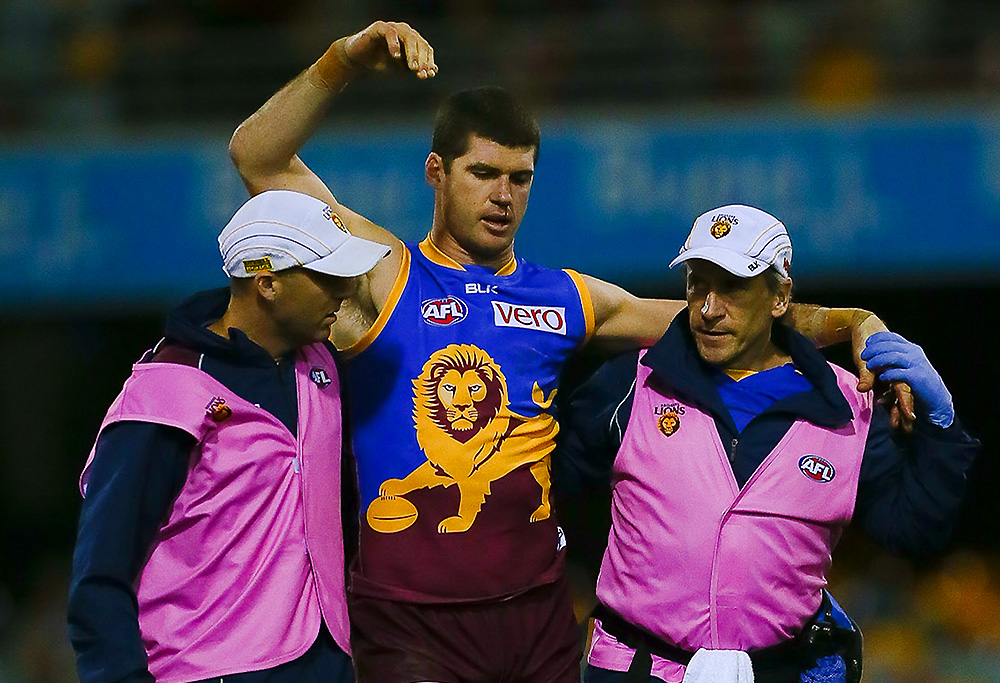
Jon Brown and the paddlepop lion. (Photo: Patrick Hamilton/AFL Media)
While the logo still bears the new lion, the jersey eventually changed, and the old lion was brought back. What do you know; people started buying merchandise again.
Not limited to the mainstream leagues of Australia, the Sydney Bears Ice Hockey Club recently underwent a long needed brand update that has fans scratching their heads. Their updated logo left people wondering if the team was still playing Ice Hockey, and if they were, if they were still doing so as the Bears.
In such a small league, fighting to gain a stronghold in a sports saturated country, your brand is more vital than ever, and if your logo leaves people unaware of what you do it can see thousands of potential fans slip through the cracks.
Don’t get me wrong, I am not scrutinising management’s desire to look into rebranding and refreshing the clubs image but it is imperative that sides keep up with modern times and expand “extensive consultation” outside of a select few in a focus group. 10,000 people do not represent the ten million approximated Leeds fans around the world.
With sport, and especially European Football, becoming the global brand it is now, it is imperative that teams look at how the entire fan-base from the city of Leeds, to far flung corners of Australasia feels their side, and ultimately themselves as people, should be represented.
Boards need to be careful when ‘revolutionising’ their teams for the future, because with change comes the opportunity to disenfranchise, abandon, and alienate the existing fan-base that have either stuck through the hardest of seasons, or recently discovered the joy of their new team to only find that the team they fell in love with has changed and become less desirable.
As we approach the year 2020, I can see a lot more sides deciding on a new look in the new decade, and if Leeds United is anything to go by, one wrong step can lead to the world laughing at your attempt.
That A-League Fan
Roar Guru
Leeds had a really good squad actually in 2001 and 2002.
Con
Guest
Crappy badge for a crappy team. Well written article and spot on with your observations.
Andrew
Guest
Good read Geoff, i am actually surprised (being a long time leeds united fan) at the global response. I like the old badge, dont fix whats not broken in my opinion.
Waz
Guest
I understand why you’d say that and I don’t like it myself, but knowing Leeds Utd it does actually make sense.
Nick Symonds
Guest
The Sideshow Bob look would be fine if they had a "Simpsons Round". Maybe the people who design uniforms should be contractually required to wear them themselves for the duration of the sports season or duration of the games that they design them for.
Kangajets
Guest
Have to agree the Leeds United and Brisbane paddlepop lions were not to clever . I think the mariners sideshow bob/ palm tree shirts was one of those things too.
Duncan Smith
Guest
'Celebrating fans at the heart of our identity' to me sounds like a stupid mission statement type thing designed by a committee. Poor wording.