The 2016 Auckland Nines jerseys have been released, and that means it’s time for the footy fashion police to come out in force. So join me as I channel my inner Joan Rivers in assessing who wore it best.
WANT TO LIVE STREAM THE AUCKLAND NINES? HERE’S HOW
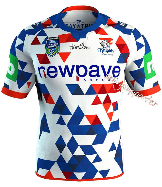
Without a doubt, the Newcastle Knights have the worst jersey.
The blue and red checkers on a white background looks completely out of place on a rugby league field, yet would suit a pre-NRL Billy Slater or 1980s John Daly to a tee. I can only imagine ISC were channeling a jester from an era where Knights were commonplace, but this jersey is beyond a joke.

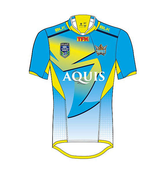
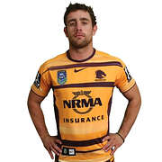
The Gold Coast have gone for a jersey that is reminiscent of Miami Vice, yet have interestingly opted for Greg Bird to model it. I’ll leave that one to you.

Fortunately, no teams have opted for the singlet-guernsey this time around – which is sure to displease the thousands of basketball and AFL fans who will be attending the tournament on February 6 and 7.
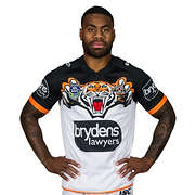
The Tigers were one team to don sleeveless apparel in 2015, and their 2016 design similarly leaves much to be desired. It remains a mystery as to why this club still hasn’t discovered that their mascot actually has stripes.

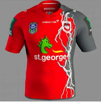
I don’t really have a clue as to what is happening with the Dragons’ jersey. If they were attempting to promote Toby McGuire’s Spiderman 3 they would have done a fantastic job, with the seeping-from-the-left black attempting to overrun their traditional red. It’s confusing and needlessly complicated.

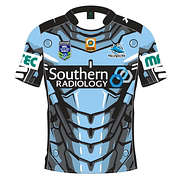
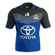
Also in the needlessly complicated category we have the Sharks, with their blue, white and an absurd number of black lines jersey, while the Cowboys are doing their best to imitate the Eels by utilising a predominantly blue strip.
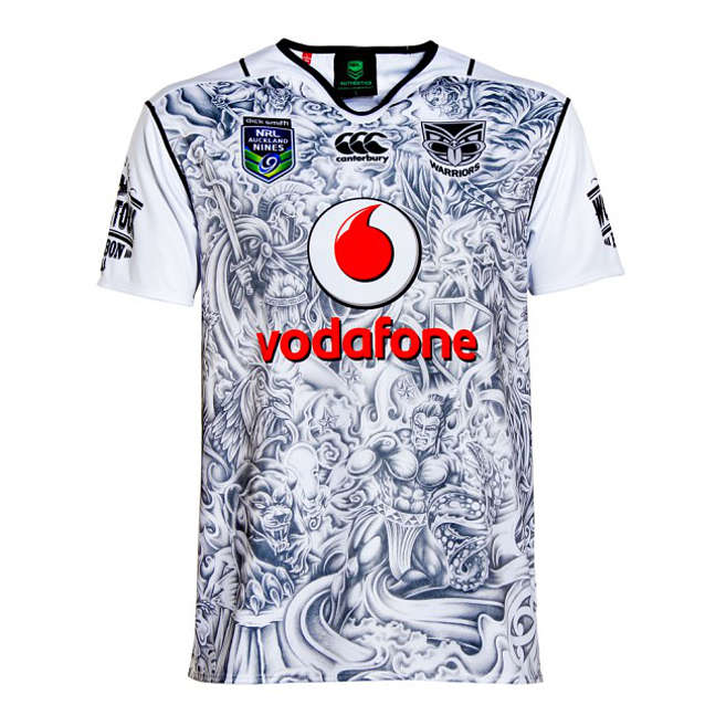
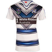
The Warriors have added their 37th jersey option for season 2016, with a tribal-tattoo-inspired top, utilising shades of black and white only.

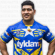
The Eels’ jersey offers the bare minimum change to the standard attire, except with the addition of a star (“But she’s got a new hat!”).
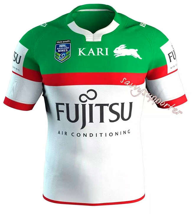
South Sydney’s predominantly white jersey looks eerily similar to their alternative strip of the early 2000s (why would anyone want to replicate this?)

The Broncos have reversed their colour coding to feature more yellow than maroon and again fall into the playing safe category.
The Bulldogs have ‘creatively’ added a number of dots to their v along with some horizontal lines across the stomach – which is essentially 2015’s alternate strip.

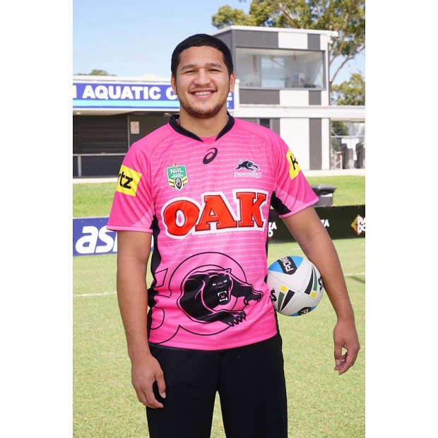
The Panthers have played it safe by choosing the pink panther strip, which has acted as their alternative for a while now. The Raiders have also played things relatively safely, with a near carbon-copy of their 2015 away jersey.

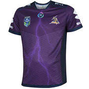
The Storm obviously did not receive the memo that nines jerseys are supposed to be more ‘exciting’ than traditional jerseys, opting for a predominantly purple number with a large sponsorship panel in the middle and minimal amounts of sublimated lightning.
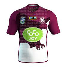
The code’s two big birds – the Sea Eagles and the Roosters – have done well. Manly have incorporated a fearsome eagle design into their choice, with deep maroon and black tones, which actually looks quite cool.

Sydney have opted for royal tones of blue and red that evoke memories of their popular Captain America strip used earlier in 2015.
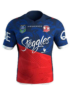

These are two jerseys worth snapping up.
What are you thoughts Roarers? Who wore it best?
All images supplied.
Sven Jensen
Guest
My ratings best to worst... 1. Manly 2. Sydney 3. Storm 4. Cowboys 5. Warriors 6. Brisbane 7. Souths 8. Dragons 9. Canterbury 10. Eels 11. Raiders 12. Sharks 13. Panthers... Embarrassing ... Get a marketing design department or google cool jerseys 14. Titans.... Abomination 15. Tigers.... Terrible 16. Knights ..... Truly terrible
Geoff from Bruce Stadium
Guest
Yes - the Raiders jersey is missing. Typical.Thanks James. Pretty sad when you don't put the jersey on there and no one even notices it's missing. I had a look at it on the Canberra Raiders website. Seen worse but I'm not sure I'll be spending my hard earned on it.
boonboon
Roar Pro
Yes just like all those Red and Green rabbitts running around in the bush or the blue bulldog down the local park - need I go on. Everytime I hear the argument about tigers jerseys needing to be certain colours or have stripes because its a Tiger I realise I'm hearing it from someone who hasn't thought about it
JayBob
Guest
Sorry but the Manly jersey is nearly the worst of them all, and that's saying a lot because none of them are good. Even if it didn't have the giant hideous green logo on the front it would still look bad. The Dogs jersey looks absolutely nothing like their 2015 alternate strip as well, it couldn't be further from it without changing the colours.
Matt
Guest
What?!? Knights jersey is the best (along with the Warriors as usual). Most are tacky cheap looking designs!
Will :)
Guest
My Rates on each jersey Broncos - 6/10 Bulldogs - 8/10 Raiders - 5/10 Titans - 3/10 Sharks - 6.5/10 Manly - 8/10 Storm - 7/10 Knights - 2.5/10 Warriors - 9.5/10 Cowboys - 7.5/10 Panthers - 2/10 Eels - 5/10 Rabbitohs - 2/10 Dragons - 9/10 Roosters - 9/10 Tigers - 7/10 My honest opinion, sorry if you disagree but this is what I think
Alex L
Roar Rookie
So it looks good rather than like a billboard?
James Preston
Roar Guru
What would you suggest for the emblem Doug? Personally I think it hasn't really dated, it's intense and sharp which immediately makes you take notice.
James Preston
Roar Guru
Will, I am actually a Tigers member so far from a conspiracy haha. As for the jersey again the Tigers have dished out something with bare minimum orange/gold being included in the strip. It's a glorious colour and they are the only team that utilises the colour in the competition yet sadly they barely ever use it. In terms of having some actual stripes, 2005 is about as close as we get - a decade of poor thought. Everyone understands the shared heritage of Magpies and Tigers but quite simply if you select a Tiger mascot it is logical to think both orange and/or stripes would be used, given, you know thats what a Tiger looks like. For me it completely lacks creativity and just doesn't look very good.
James Preston
Roar Guru
I tend to agree with a lot of those scores Mo!
James Preston
Roar Guru
Cheers Ed! Glad you enjoyed it. Not a bad idea, look out for those once the 9's tournament ends!
pete bloor
Guest
Will the cowboys have been cheated out of 214 premierships one title won't sate their fans lust for retribution.
pete bloor
Guest
I liked Melbourne's as well. Sometimes less is more.
Paul Nicholls
Roar Guru
1. Knights - pyjamas 1/10 2. Gold Coast - modern art gone mad 1/10 3. Tigers - boy's pyjamas from Lowes 1/10 4. St George - blood soaked wetsuit 2/10 5. Cronulla - more cockroach than shark 1/10 6. Nth Qld - not the worst but logo too big 4/10 7. Warriors - singlet in need of a wash 2/10 8. Parra - hard to see but looks busy 3/10 9. Souths - relatively good 5/10 10. Brisbane - OK 6/10 11. Bulldogs - kids colouring in comp. 4/10 12. Penrith - yuck! 2/10 13. Melbourne - not bad but looks like sweat stains 7/10 14. Manly - someone stuck a big fruit sticker on the front 3/10 15. Roosters - OK 6/10 Are we missing one?
DiploMatt
Guest
It is very busy but I like the Warriors jersey best.
At work
Roar Rookie
Manly would looks much better if that hideously large "CoCo Joy" advertisement wasn't on there. I don't get your criticism of the Tigers, theirs is understated yet looks great. The Roosters looks pretty good and is an easy winner here
Will Sinclair
Roar Guru
Also, why are Manly applauded for featuring a "fearsome eagle" while the Tigers are criticised for featuring a fearsome tiger? Feels like the start of an anti-Tigers conspiracy on the Roar. Where's my tin-foil hat? Surely I can borrow one from a Cowboys fan now. They don't need them anymore.
Will Sinclair
Roar Guru
From what I've read on Twitter and fan forums etc, the Tigers jersey is VERY popular with the fans, and seems set to feature on Christmas morning in many Tiger households. (Although, to be fair, you are limited in what you can buy Tigers fans as a gift. No sharp objects, nothing with shoe-laces, no trips to anywhere with a bridge...)
grey nurse shark
Guest
I'll be buying the sharks one
millsy of perth
Guest
All rubbish