One of the oldest sporting leagues in the world: the Premier League.
However, it’s not always about winning about the title – it’s also about whether what you are doing, you are doing in style.
Below, I’ll share my thoughts on what are the best, the worst, the most original and the most creative Premier League kits for the 2018-19 season. Remember to comment your thoughts on each kit. Do you agree with my selections for best, worst, original and creative? If not, tell me why.
The most voted kit for each of the topics will be revealed in a later article.
Best: Tottenham Hotspur home
A gradient used very well – shorter lines are very well implemented here for this effect. This is much better than Manchester United’s home strip which uses longer lines to complete the gradient.
Other than that, it’s all white except for the navy-blue collar.
Tottenham may be a tad off the pace in the Champions League, but this year their kit game is strong.

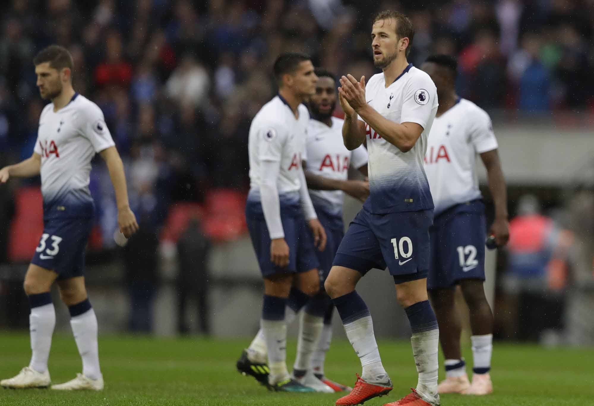
Tottenham’s Harry Kane in the side’s home kit (AP Photo/Kirsty Wigglesworth)
Worst: Liverpool third
What does this even represent? If this was meant to represent something, then either the original was also poor or it is a simply a terrible kit.
Liverpool are known as the Reds. As far as I am concerned this kit represents a loss of their identity.
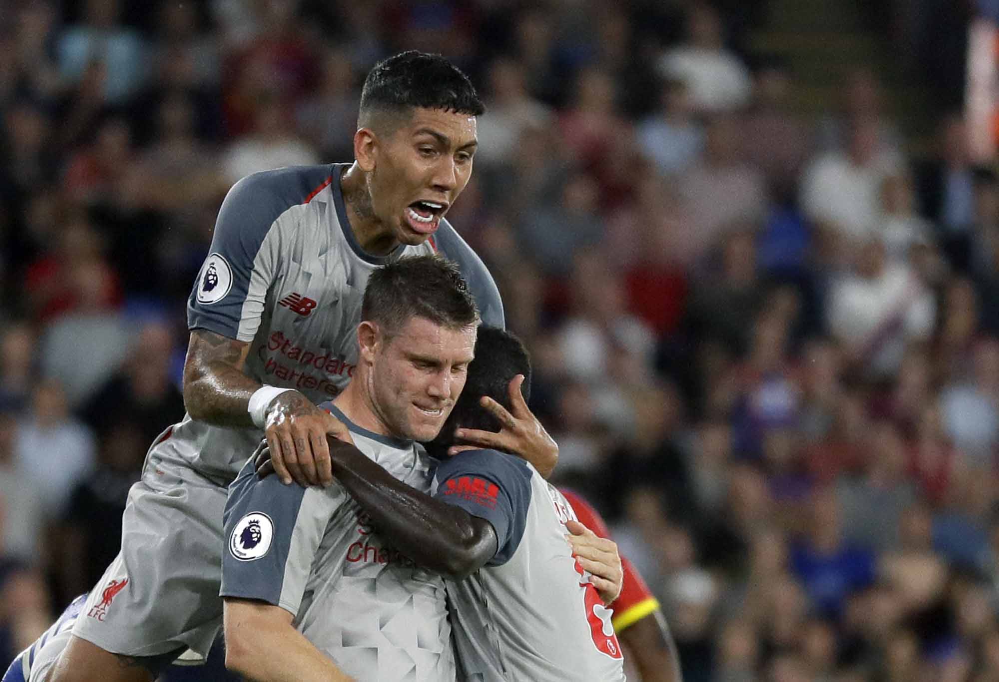
Liverpool’s James Milner, centre front, celebrates with his Liverpool teammates in their third kit (AP Photo/Kirsty Wigglesworth)
Most original: Chelsea home
This could be considered a slightly controversial pick, but I have settled on this Chelsea kit which features ‘flashes of red and white against traditional blue’. This is what Chelsea used in the 80s and 90s – which is a welcome return for a quality design.
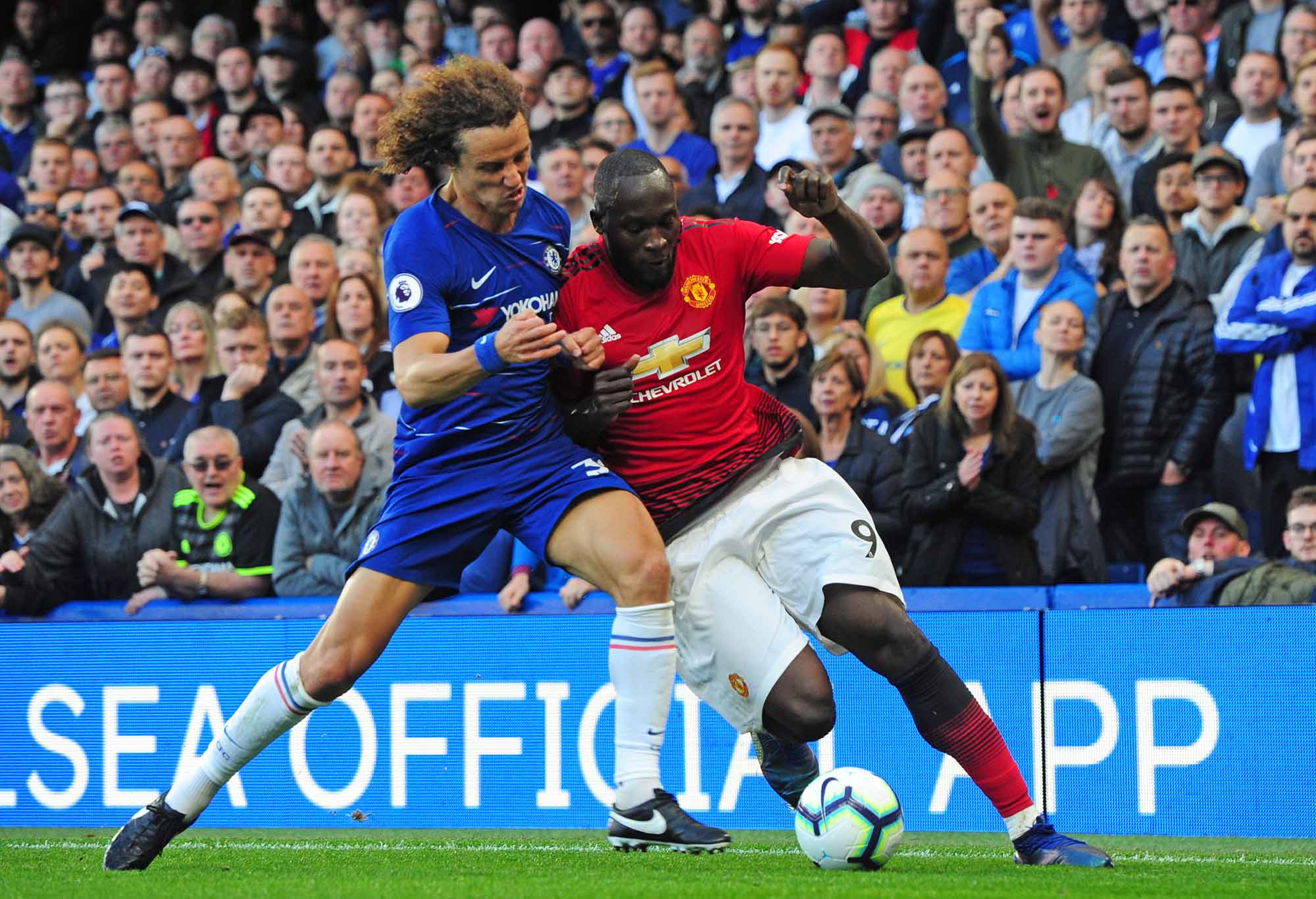
Romelu Lukaku of Manchester and David Luiz of Chelsea (Photo by Zed Jameson/phcimages.com)
Most creative: Everton third
Artistically, this kit uses a faded light blue colour on a white backdrop to represent Prince Rubert’s Tower, which appears on Everton’s team crest.
Of all the 60 kits used in the Premier League, this one strikes me as the most creative.
Roarers, remember to comment your vote on the best, worst, most creative and most original kit down below. The results will be released in a coming article.
Kangas
Roar Rookie
Cheers
SR1
Roar Pro
Yep, I will be.
Kangas
Roar Rookie
Are you doing an A league edition of this article?
Mono
Guest
I think the Man City third strip is the worst. Purple with the orange sash, shorts and socks? Horrendous. Sadly, none of the PL jerseys are a patch on Nigeria's second kit from the World Cup this year. A high point in modern kit design.
Kangas
Roar Rookie
Best ever. Sampdoria kit Fabulous kit I wish the jets would use The Newcastle kB United of cinnamon emerald and white Best traditional kit Manchester United going newton heath Green gold halves with black shorts