Every World Cup debate rages about which team’s kit is fit for sartorial champions, and this one is no different.
To be fair, most of the uniforms on display in Qatar are of a pretty high standard with global brands Nike, Puma, adidas, hummel, Kappa and New Balance producing some eye-catching outfits.
But there are a few which have fallen short of the mark.
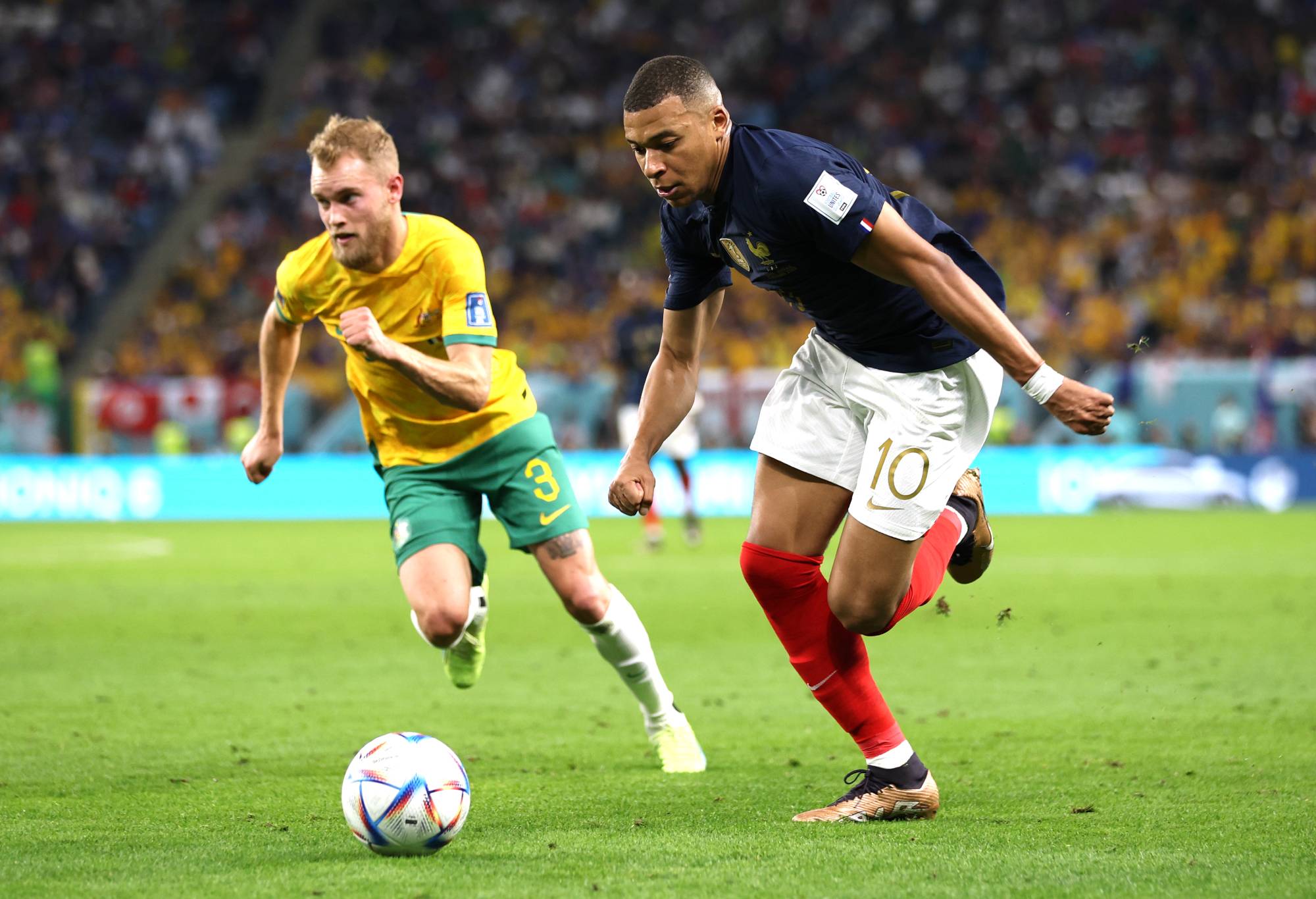
The Socceroos have stuck with tradition for their fifth World Cup appearance with the golden wattle main jersey, green shorts and white socks from the early years of the national team a century ago while their alternative kit is dark blue.
Nike announced they have been made with 100% recycled polyester constructed from recycled bottles.


(Photo by Jose Breton/Pics Action/NurPhoto via Getty Images)
We’ve kicked around the 32 kits in The Roar HQ to come up with our list of the good, the bad and the ugly.
As always, comment away down below to have your say on whose kit is top notch and who has kicked an own goal in the fashion department.
The cream of the crop
France’s dark blue jersey: The reigning champions look smooth in their red, white and blue kit. Les Bleus certainly went by the Socceroos in a blur.
(Photo by Patrick Smith – FIFA/FIFA via Getty Images)
Argentina’s classic design: They know it’s iconic so why mess with it. Like the New York Yankees and their pin stripes, the vertical blue and white lines are synonymous with Argentina. No other World Cup team has a kit with stripes, there should be more of it.
Uruguay’s alternative strip: They’ve got their brilliant blue ones as their main kit but their alternative jersey has retro cool with the player’s number on the front. The national football federation logo is in the centre of the chest in another point of difference from the main shirt.
Belgium’s white uniform: FIFA, in its unending pursuit of fascism, has forced Belgium to remove the word LOVE from the embroidery in their white kit because they don’t want any political statements on uniforms. That’s right, endorsing love is somehow politically motivated.
It’s surprising FIFA allowed the various colours to accompany Belgium’s mainly white uniform to be worn in Qatar. Looks a little like a rainbow …
Germany’s main strip: The white jersey with the bold black stripe running down the middle with gold logos and numbers looks regal.
The meh options
All the plain red ones: England, Iran, Wales, Poland, Denmark, Tunisia, Canada, Serbia, Switzerland, South Korea, Costa Rica have all gone with a simple red jersey as one of their two options with slight variations.
Red is a great colour for a jersey and it stands out on the pitch but at least give it some sort of noticeable difference apart from the badge.
Argentina’s alternative kit: The darker blue/purple option with flames looks like a training kit from the Brisbane Heat BBL team.
Saudi Arabia’s green uniform: It’s hard to be too critical because it seemed to work against Argentina in their boilover victory. It’s a bit of a 1990s throwback look but if the team keeps playing like world-beaters in it, don’t go changing.
The Netherlands’ home kit: The blotchy pattern looks terrible, like one of those old 1980s Socceroos ones that we don’t speak about it. The orange crush is a poor look but the blue ones are stylish.
Mexico’s white version: The patterns on the jersey pay homage to Mexico’s indigenous culture and close up it looks fine but it’s going to look a bit of a blur from afar when they step onto the field with this one.
The dregs
South Korea’s multi-coloured option: Where to start with this one. It looks like a child has gone ballistic with a paint gun on a black shirt. When announcing the design, Nike said it highlights Taegeuk, the symbol found on the Korean flag that represents national pride and balance between heaven (blue) and earth (red). They got the balance wrong.
Belgium’s red version: The flames rising up from the sleeves make it look like a bad nightclub shirt from the early 2000s.
Spain alternative blue: Very wishy washy. The red one is always strong but the alternative with its light blue wavy pattern is more along the lines of a shirt you’d wear to the beach.
Mexico’s green and white options: The green version looks like a goalkeeper’s kit.
USA blue: The clean white uniform is stylish, the blue one is a mess. What is going on with the tie-dye motif? Did The Grateful Dead step in for Nike in the design process? Easily the worst uniform in Qatar.
Grem
Roar Rookie
I remember Geoff Boycott saying if you can’t be a great cricketer then at least dress like one. I have a couple of Socceroos jersies, but they’re not classics to look at! I guess it’s hard to work with green and gold as your main colours, but they need someone to design something better. If we’re not going to win the World Cup then at least look good trying!
criag
Roar Rookie
Don’t like the blotchiness of the Socceroos’ jersey, same as the Netherlands, but not as bad. Hate white socks, too! The flames on the Belgium shirt remind me of a cheap Hawaiian-type shirt they used to sell at Lowes, or something the wrestler Bam Bam Bigelow would come out in, but in fairness, I didn’t really notice them much. Like you, I do like the West Bromwich Alb- I mean, the German kit. Don’t mind blue with black for USA, though.
Lionheart
Roar Rookie
I thought the German shirt looks sick, but if you play the way they do, who cares about the shirt. Australia's is right, nothing out of the box.