Clothes maketh the man.
Ten Super Rugby teams’ jerseys are reviewed in this sartorial preview.
The Brumbies are going back to 1996, the Chiefs are telling us a story of triangular threats, the cool-collar Stormers got no hoops and no roots, the Sharks put City Hall on their boring strip, the Bulls are pacific blue with fade piping numerology, the bridesmaid Lions put Joburg on their backs and put the fancy back in hoops, the Hurricanes’ wind motif is abstract and diagonal without cyclone force and an electric-washed away jersey, the Crusaders have subtle swords and optical illusions but more bloody than last year, the Highlanders have softened their tartan but neonised their visiting strip to Miami levels, and the amazing Sunwolves have added psychedelic sun and brooding moon and wild stars and garish waterfalls in their garish new avant-garde jersey designed to induce interceptions and charge-downs.
What is each of the teams saying to us with their costume?
The Brumbies
Canberra is saying to the Australian conference: “We want to go back. Back to 1996. No deconstruction. No reinterpretation. No two ways. No irony.”
Their ‘gold’ of the last few years is burned back to a dark orange.
The white base of the home jersey is no frills, workmanlike, Kearnsey-craftsman. As the players sweat, even props will be flattered by the colour-blocked shoulders and rib-cage lines.
No sexiness, except a little too scoop on the neck, to show a little cleavage by socially-conscious flankers.
The away jersey is not complicated: it is an exact reverse.
“Here we are, again. You know what we will do. But we will try to do it well. You might be bored, but you almost might be beaten.”

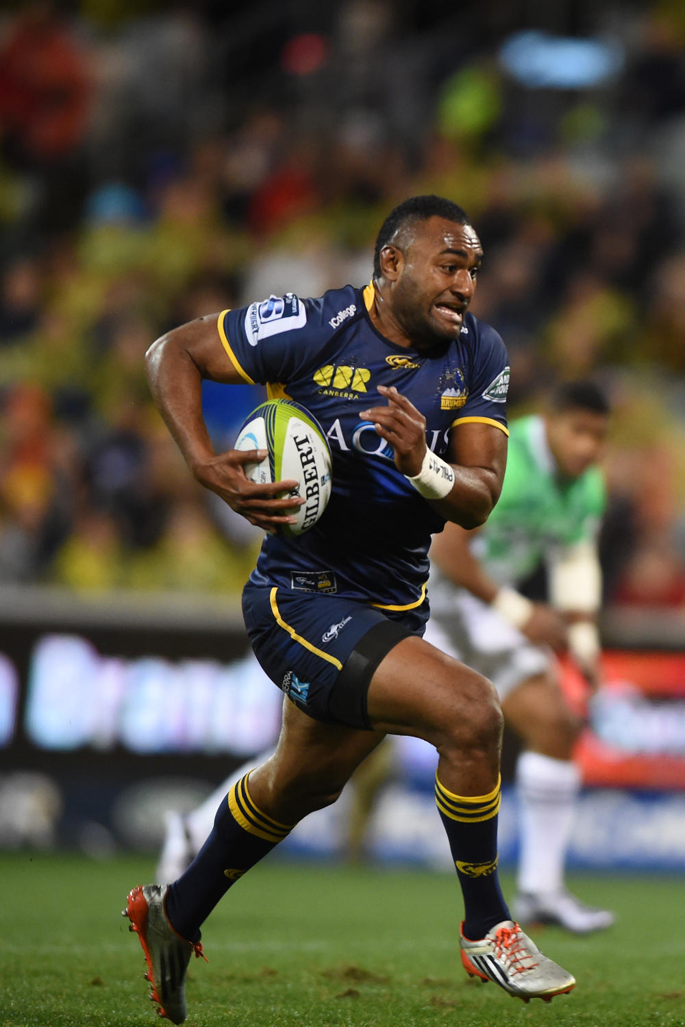
(AAP Image/Dean Lewins)
The Chiefs
“We are telling a story. No, we are telling ten stories, at once. We have an ethos, a heritage, a future, a past, bays of plenty, and caves running deep. We are a shark. No, a warrior. Fluid and dynamic, but fixed in time. We are triangles, facing threats on all sides. Run or kick or pass; we are pointed and ready. But our backs are calm. We are greenstone treasures, too.”
The 2018 Chiefs are incoherently cohering to a script forged in the rough gravel pits of Taranaki, the turning rivers of tacklers raising cane, and the hammerheads of sharks.
Fire up your bongs and watch ‘Hamilton’ on Broadway; then the Chiefs’ wardrobe makes more sense. Their jerseys are straight up Improv drama.
Triangular patterns on the back of the home jersey, green patterns on the white base of the away jersey, with a fractylised scheme.
They’ll run from anywhere, play any style, and be bold. And sweat will not hurt this look. In fact, the more they sweat, the better this style looks.
The Stormers
Cape Town rugby’s pinnacle has always been the black shorts and the not-too-slender blue-and-white hoops and red accents of Western Province, or ‘Prooooooooovince.’
The Stormers seem obsessed with being a different province, not too provincial.
So, they are veering to an NFL-style departure from WP tradition.
The horrendous canary DHL logo disrupts what could be a nice-enough flow of red, white and blue, which distinguishes itself from Cape hoops by using ‘panels’ of blue and white on the rib-cages of the players.
In 2018, black is mostly banished from the home jersey, but the away strip is red-and-black only.
The Stormer logo looks like a dollar sign, and the whole mess is a bit flea market bazaar, which is a pity, because WP has the rugby-est rugby strip of any club in the Hemisphere.
Still, the collar is beautiful. The Stormers will not be irritated by faux collars or Brumbie-style decolletage. It’s simple, strong, reinforced, and manly.
“We are really professional. We really are. We lost our stadium, we are bankrupt, run by crooks, coached by an old boy, and we have a brutal pack who don’t like collars.”
The Sharks
For a team with the sauciest cheerleaders in the competition, the Sharks’ jerseys are straight up yawn-worthy. Home: black. Away: white. That’s it.
Well, a tiny Zulu shield that’s invisible on TV. And a subtle rendition of … City Hall?! Ah, that will fire up the du Preez brothers! God, King, Country, and Parking Tickets.
The only good news from the Sharks’ fashionistas is a Superhero jersey, to be used in a few games: the big boys from Durban will have red piping around each of their 12 abdominal muscle packs.
Maybe they should just pretend to be Vincent Koch or Jean Deysel and play topless: that’s the motif of the city, anyway.
“We are sober. We play in the right areas. We believe in black-and-white rugby. But Curwin Bosch is a superhero.”
The Bulls
For some reason, the bully boys from the hard lands of the High Veld love to dress metro.
The Bulls will sport the lightest sky-blue in history, with fade piping and soft white bands like pillows in the nicest hotel bed. Pacifist jerseys for an increasingly pacifist pack.
The numbers 201818 are sprayed gently across the chest of the jersey. No, this is not the password to Handre Pollard’s medicine cabinet. The Bulls are 80 years old in 2018.
So, a club crest is back, on this incredibly amicable, amiable rugby jersey.
“We want to transform. We are transformed. We are trans-everything.”
The Lions
The Lions are Super Rugby’s ‘almost’ team.
They almost won, twice in a row. They almost kept their coach. They almost have hoops.
Why ‘almost?’ Hoops are hoops, no?
Well, when you add little tiny fancy edge to each hoop, like fin-de-siecle ceilings in Paris, you are unhooping your hoops.
Good: it’s clearly red and white, and the away strip is an exact palette swap.
Bad: the skyline of Joburg is still on the jersey, strangely cheapening the look (but at least it’s on the back, now).
“We are almost there. Almost.”
The Hurricanes
“Windy winds wind Wellington winters wildly.”
The capital city’s rugby team is even more yellow than ever, and wind is still the motif, but this year, the raw destructive power of a supercell storm is softened into a diagonal tonal wind pattern, which should look sloppy when the Canes sweat. I think. I haven’t seen a sweaty version, yet.
The away strip is washed out 1980s anthem rock band black, with electric yellow wind abstractions.
“We don’t really care about jerseys. Let’s just score a helluva lot of points, miss a tonne of kicks, and dress like Chris Boyd.”
The Crusaders
This team likes to remind you of blood.
So, the home jersey is bloody, even bloodier than last year. A sword stabs the stomach of the home jersey, in an optical illusion.
The away jersey is mostly white; presumably the colour of funeral shrouds for the victims of their home stabbings.
A stripey silver pattern (in place of the swords) should work well with sweat.
They will train in hot pink.
“We are not the nicest guys, but we will give you a proper burial.”

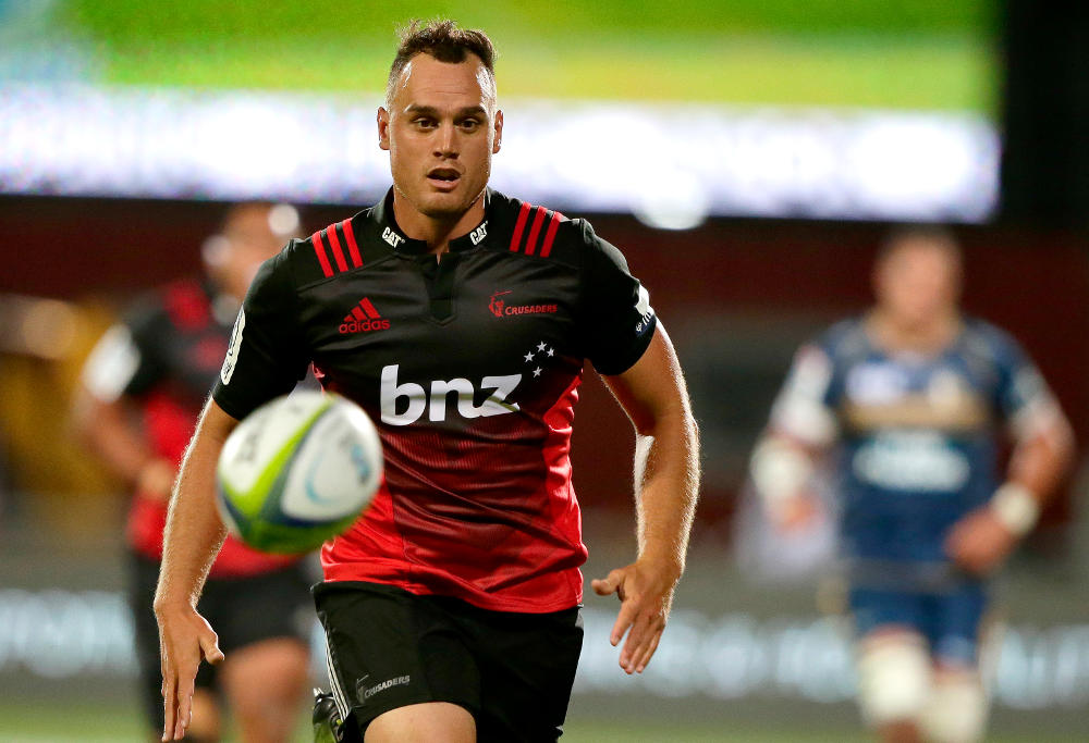
(AP Photo/Mark Baker)
The Highlanders
“At home, we are great. Away, we are rubbish.”
The Celtic band and tartan of the 2018 home jersey of the Highlanders might be the best in the competition. Quite simply, it’s beautiful.
It’s a real rugby classic.
But the neon green of the away jersey is straight up highway maintenance.
What were they thinking?
The Sunwolves
“We are the mystical sunlight of nature’s loving moons; we scrum as if in a waterfall, and our garryowens are so high, our jerseys look like heroin on fire.”
I have no idea what is going on with this design, but … I … absolutely … adore … it.
I think these gumbo-like jerseys will make the lame walk, and the blind see.
Also, it’s possible that opposing teams will contract a contagion of vertigo.
Chris
Guest
Both Rugby Union and Rugby League want to go back to the 1990s for as even fatties like me could buy them with the v-neck collars and not see my beer and wine gut also want to be like the NFL and other North American sports and not change the design every year.
Rugby Tragic
Roar Rookie
Hiya Thugby ... and same back to you ... hope you had a goodie. No, not about to commit to a 27 (or whatever) to zip scoreline and tbh, I hope that does not happen. Of course good, even great to win but scoreline like 2017 is not good for the code in either country. As for Blues .... like the proverbial idiot (or masochist that I must be!), I will support them in 2018 ... I suppose I'll even pay up for my membership again too ... Oh well ,,, The biggest disappointment for me was losing Steven Luatua, who I had followed since his MAGS days ... Big Charlie is a loss too whereas George Moala has seen the writing on the wall as far as his AB aspirations are concerned. There are plenty in NZ chasing a midfield position for 2019. I know Geoff Parkes always has me on about my support of Luatua but I note in his book "A World in
UnionConflict", the very high regard the AB selectors hold the player in ... (I also note he is possibly open to a contract extension with Bristol all ready, if they do not he will come back to the Blues .. but realistically Bristol will not let him go!) ... By the way if you haven't read Geoff Parkes book ... grab yourself a copy ... very enlightening stuff, well researched. You being a suffering fan I know will enjoy it ...sheek
Guest
It's funny, well, not really, how we can call a team "Blues" & not be bothered if its navy, pale, dark, French, royal, light, sky or something else in between. But we struggle to call a team "Reds" if it deviates ever so slightly from blood red. Maroon is a red. Here's some advice to the marketeers crapping with the Queensland Reds jersey colour. The traditional Queensland state sporting colour is maroon. It is not owned by rugby league, it is owned by the state. This was a theory put forward by a bloke who called himself 'Jiggles' on The Roar many years ago. He reckons union went with with red so as not to upset league. Pleeeeeaaaaassse. So if you (QRU) still want to call the team "Reds", here is my advice. Return the colour to maroon, & call the team the "Dark Reds". Problem solved. You still have your marketing gizmo, but the right colour is restored.
Harry Jones
Expert
Actually, this is an area in which we agree 100%!
Harry Jones
Expert
Haha! Don't trust me. Don't!
Harry Jones
Expert
Your Reds (and my Reds) have the Maroon coming back!!!!!!!!!!!!!!
Harry Jones
Expert
Collars can look very very good, or terribly silly.
sheek
Guest
Call me old-fashioned, & I know you will, but jersey designs ought to be changed sparingly, like every 20 years or so. And then the changes should be very, very slight. It makes me want to be sick to read that people are going to go out & buy a new version this year, presumedly after buying a new version last year, & the year before that, etc. Encouraging the merchandisers to tinker & tamper with jersey designs every year is tantamount to treason, I reckon. Society obviously has way too much spare cash on its hands..... triple shot lattes & smashed avocados daily & a new rugby jersey every year. Way too much spare cash on its hands.....
Carlos the Argie
Guest
I don't know if I can trust a rugby man that uses the word décolletage. Also, using "almost" reminds me of the old joke of the couple that had coitus almost every night. Almost on mondays, almost on tuesdays...
RobC
Roar Guru
Happy Holiday Haazaaaaaaaaaaàåæāáaàä!!!! Thanks for this thesis Uniforms undo untidyness to uniformly unite Aussie athlete attire are awesome. KISS scheme should solve sports' situation
RobC
Roar Guru
Fionn. Better to grab collars... Than someone's hair? In theory of course because apparently it's never happened according to an expert / coach ;)
ThugbyFan
Guest
Rebel, what a great year 1996 was. Highlanders, Canes and Crusaders down the bottom of the pack. Where they belong! :)
ThugbyFan
Guest
G'day Tragic, may the beer, vino and merriment flow aplenty for you and family over the holidays. And as they say in Game of Thrones (a million times/episode) "Winter is Coming" which means RUGBY is back. Yeahhhhh! Now that Aussie rugby has applied the scalpel to itself, any bets on whether the kiwi SR2018 teams will go 27-zip again against their lil Aussie brothers? And I guess you must have the blues, I just read that George Moala has signed a 3 year deal with the Frog club Clermont. I guess he reasoned that his AB days are over with so much talent in front of the AB pecking order.
Pickett
Guest
Entertaining read as usual Dirty Harry. As a few have noted, bring back those collars. Merry Christmas mate.
Harry Jones
Expert
I would like it to be: Stormers Blues Reds Everyone else
Harry Jones
Expert
NB, I also really like Bath's uniforms.
Harry Jones
Expert
Thanks, cuw
rebel
Roar Guru
There may be a few other hoping for the return of the 1996 form, this is the ladder prior to the Blues winning the finals: Reds Blues Bulls Sharks Brumbies Chiefs Tahs Highlanders Canes Lions Stormers Crusaders
Fionn
Guest
Cheers, cuw, that Chinese collar is at least something.
Fionn
Guest
Brett, having actually seen a photo of Carter wearing it, as opposed to just a photo of the jersey, I've got to say that I agree completely with you. It looks really fantastic. This year's jersey and next year's are both absolutely fantastic. Let's hope we see a return to our 1996 form, eh?