Nike released the Socceroos and Matildas 2018 World Cup kits yesterday. To put it lightly, the reactions have been negative from Australian fans.
Nike Pacific general manager Ashley Reade said of the jerseys, “The new Socceroos and Matildas jerseys belong to all Australians. It’s going to be truly exciting to see our Australian national teams Play Gold on the world stage, led by the Matildas this week and the Socceroos in Russia.”
Despite Reade’s comments, the response was not nearly as positive as he and the Socceroos would have been expecting after the much-anticipated release.
A different look from 2014’s classier and cleaner jerseys, many were hoping for a similar look and a potential return to the classic 1980s kit.
It is obvious that Socceroos and Matildas supporters feel at least a little let down after their requests went unanswered, with some even calling for Adidas to step in and take the reins in four years’ time.

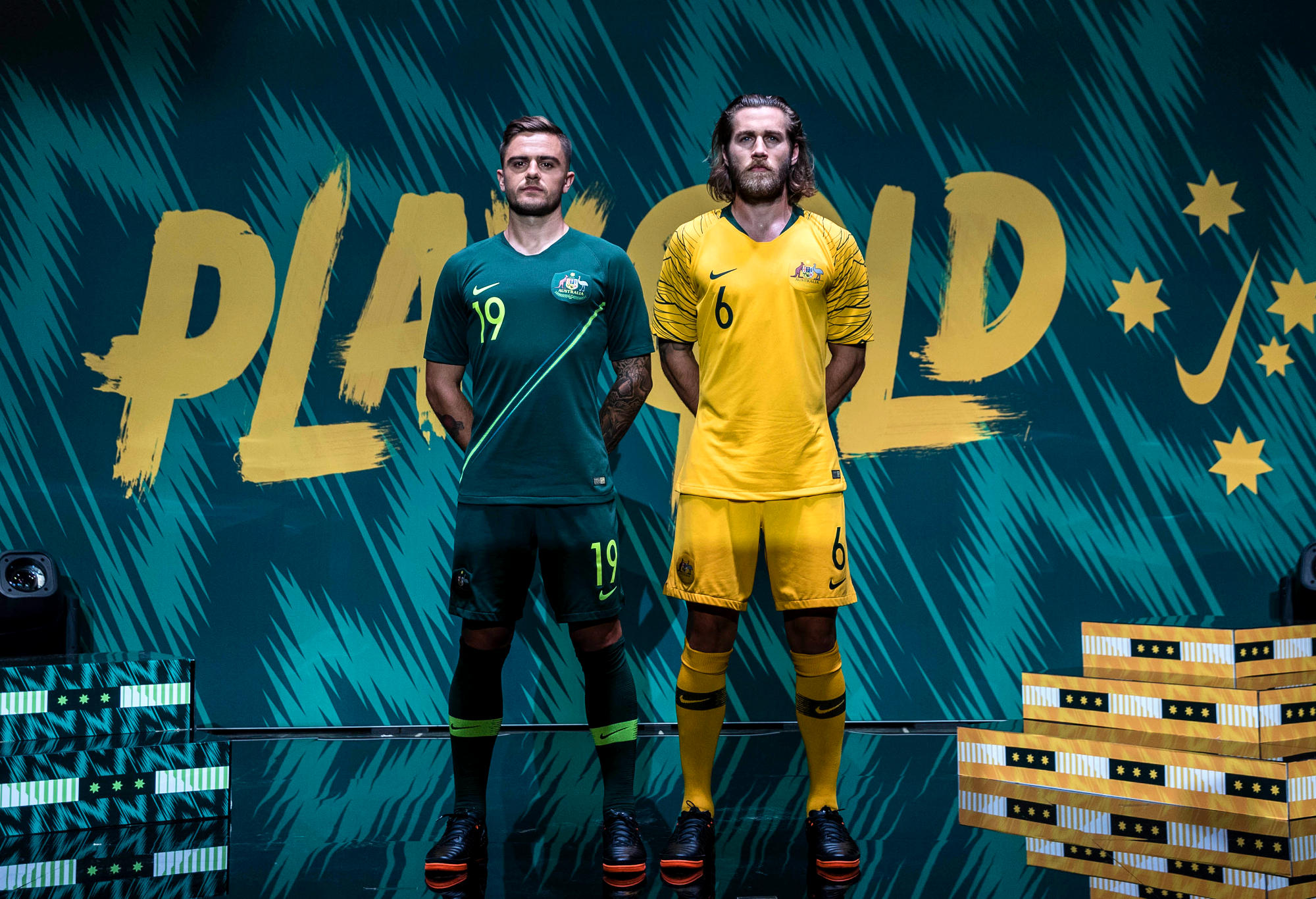
(Supplied: Nike)
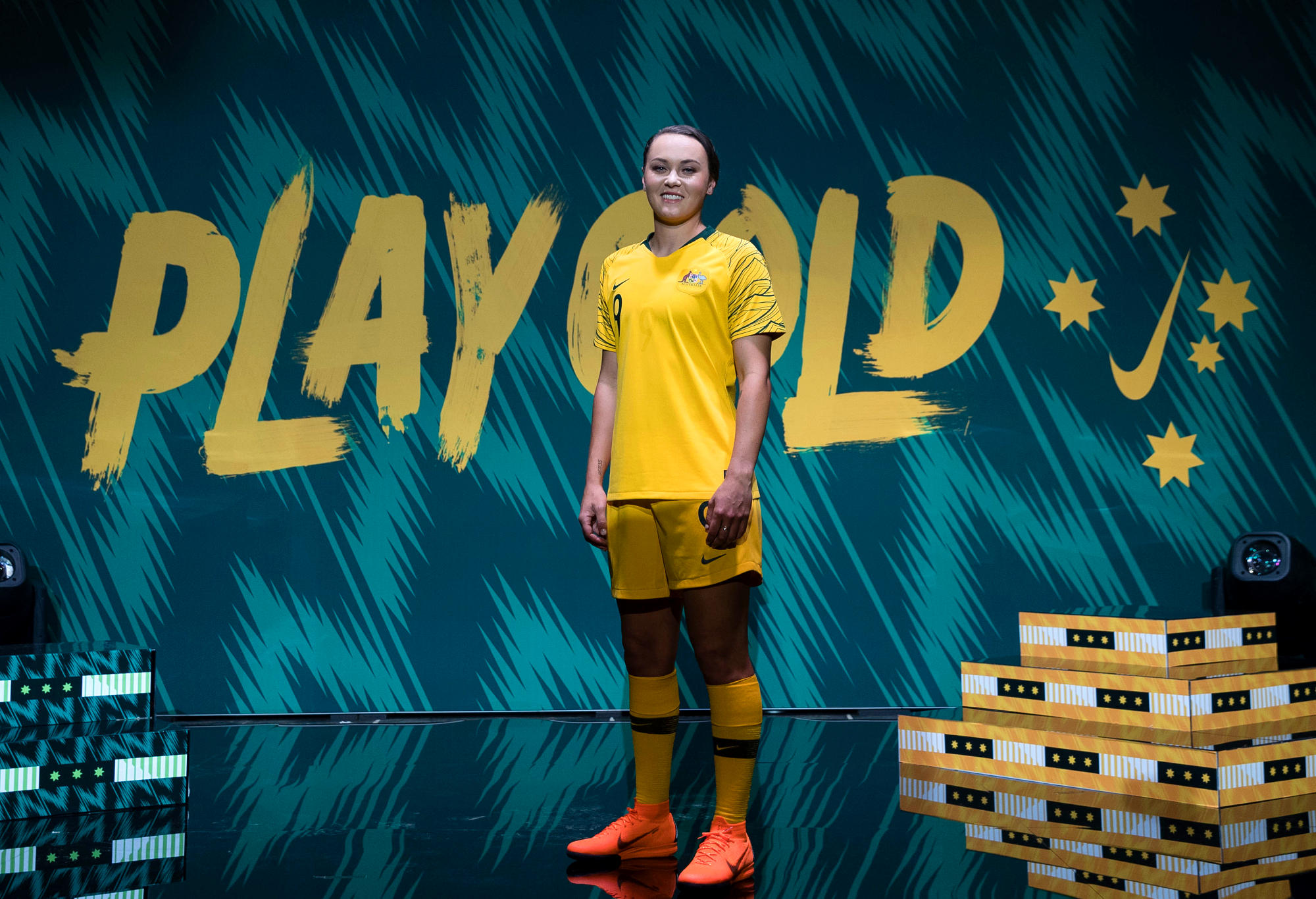
(Supplied: Nike)
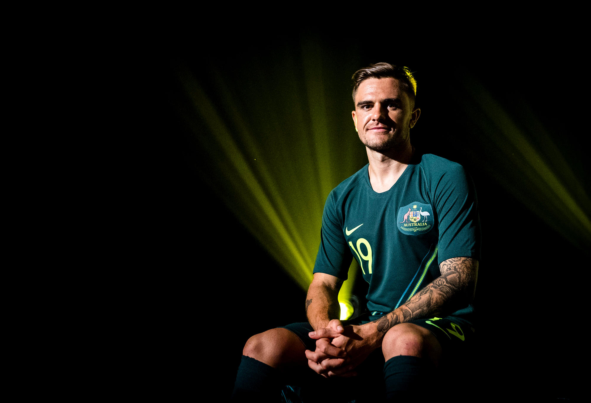
(Supplied: Nike)
Of course, not everyone disliked the kits. In scouring Twitter, we found a few positive reactions. It seemed as if the green jerseys were the only outfit that got some form of approval.
In addition to the gold and green get-ups, the goalkeepers will sport a purple jersey.
Needless to say, it appears that the design of these jerseys aren’t going to make a reappearance in the next World Cup unless Nike and the Socceroos want to face the backlash they are today.
marron
Guest
They're wAves. Our shirt is girt by sea.
bananaroos
Guest
what can you say? Bananaroos.... Shocking yellow jersey. Hopeless designers. Spineless FFA to accept it.
Harpreet Sandhu
Roar Rookie
Can someone please explain what the cobwebs on the sleeves represent? Why couldn't we have something which meant something like an indigenous pattern or maybe have them green (so it represents Green and Gold). I think the sleeves are horrible, who was responsible for this Nike or FFA?
Nick Symonds
Guest
The South African kit looks very similar to Australia's - https://news.nike.com/news/nike-and-south-africa-unveil-new-national-football-team-kit https://commons.wikimedia.org/wiki/File:First_game_of_the_2010_FIFA_World_Cup,_South_Africa_vs_Mexico4.jpg - Maybe we should add some indigenous motifs to our own kit to differentiate it. https://www.rugby.com.au/news/2017/07/06/10/13/wallabies-beale-indigenous http://www.skysports.com/rugby-union/news/15175/10951301/australias-kurtley-beale-eager-to-face-all-blacks-in-indigenous-green-and-gold http://www.abc.net.au/news/2017-10-23/indigenous-wallabies-jumper-nice-touch-but-match-it-with-action/9074828
Nick Symonds
Guest
The tones of green and diagonal line in the away kit give it a bit of a North Queensland Fury vibe. But it's all green no gold, not quite Australian. As for the home kit due to the regulations I think we should dub it "FIFA Yellow". But the "tiger stripe/cobweb" sleeves just look weird.
David C
Guest
They should change their name to the Bananaroos whilst they have to wear that rubbish kit. Would I buy it? Not a chance!
Griffo
Roar Guru
Yeah yellow-gold shirts, green shorts, white socks for me... I don't know what it is with trying to do a one-off panel/contrast/multicolour shirt over a two year cycle when the general consensus is just plain yellow-gold please. Another Nike country, Brazil, keeps with yellow shirt, blue shorts, white socks pretty much. Calling it an ode to Viduka's call for a sea of yellow/gold, using green stripes that looks like bandages, just seems another marketing ploy to sell shirts to the same people every two years. Still it won't stop me supporting my national teams 8-)
Footoverhand
Guest
Green away kit is alright
Waz
Roar Rookie
Gold shirts, green shorts, white socks. Apart from that, nothing wrong with it that can’t be put down to a difference in taste. No matter what we’re wearing though, it’ll look great when we smash our way out of the group ?
Paul Nicholls
Roar Guru
I'm a traditionalist but never liked the white socks. As a kid I thought it looked cheap - like we could not afford coloured dye (all my junior teams wore white socks as well) Then when I got a bit older I felt the socceroos were just trying to copy Brazil. I always prefer the dark green (which is the original Australian jerseys) I like the shade of the away kit but don't like the flouro stripe. Any way I don't think it's a big deal.
Nemesis
Guest
It's not a Twitter Account. It's a hashtag that was created a few years ago. It's a facetious play on words using the word SOKKAH, which I think was coined on this forum several years ago, and the hashtag it is now a ubiquitous term used to describe the vocal & militant football community on Twitter, who will create misery for anyone who makes the slightest negative comment about our Game.
chris
Guest
Have to agree with you there about the green shorts and white socks. I remember as a kid watching the 'roos come out of the tunnel and seeing them in the green shorts and white socks. Its what i remember the most vividly. Having said that, I actually dont mind the new shirt!
shirtpants
Roar Guru
I actually don't mind it. Not sure what all the fuss is.
lesterlike
Guest
It's a massive spit in the fast to fans. All we want is Gold Shirt, Green Shorts and White socks, which has been made very damn clear for years along with how unpopular the current all gold fest has been. Can't blame Fifa either about the colour contrast rule when Germany are going to the world cup in White Shirts and Black shorts. Nikes only hope now is if the next kit is a Spew Kit tribute to cash in on it's new found Nostalgic popularity. Otherwise i'm all for Adidas to step in.
Cousin Claudio
Roar Guru
Pink boots don't go with anything. Seems to be a few who like the new kit too. Did you do a poll?
Cousin Claudio
Roar Guru
Ya, this is not the opinion of true footballroos fans, just those on social media who are the bandwagoners and those that hate "sokkah".
tommo
Guest
Even the twitter account has soccer in it. Oh dear