After two rounds of A-League action, I take a look at what kits the ten A-League sides will be wearing in season 2018/19, and highlighting what’s hot, and what’s not so hot.
Feel free to agree or disagree with me in the comments, and make sure to comment your favourite and least favourite A-League shirt for this year.
Hot
All of Western Sydney Wanderers kits
The first thought that came to my mind when turning on the TV to watch the Sydney derby at the SCG was “Wow, I want one of those Wanderers black and gold kits.”


How nice is this get-up? (AAP Image/Brendan Esposito)
This is a stunning piece of fashion. While delightfully simple, which is sometimes a rarity in modern day football shirt culture, this design manages to look stylish, elegant, and threatening all in one.
Not to mention the home kit, with the gradient hoops, is also vying for the best home shirt in the league.
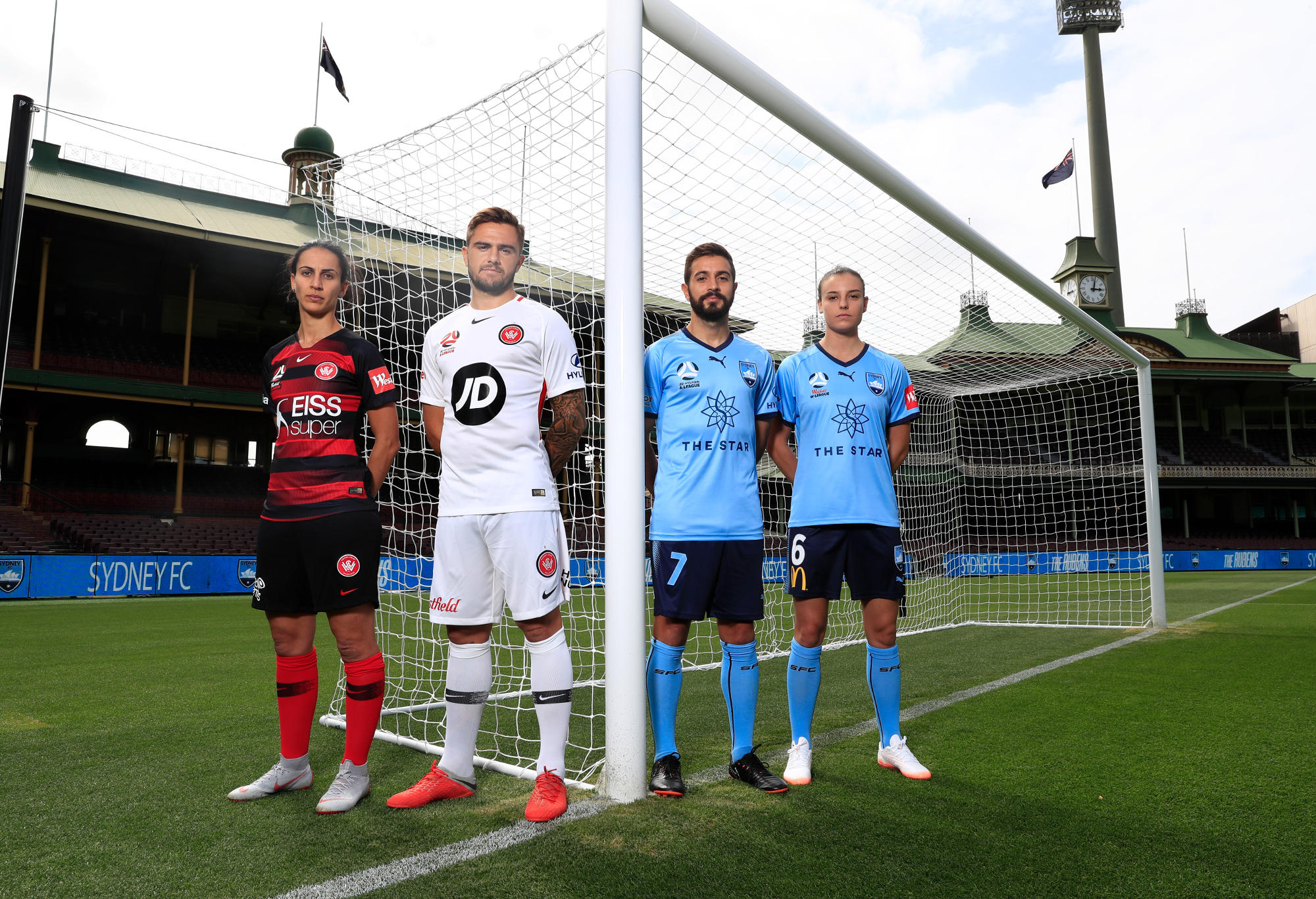
Those Wnaderers jerseys (on the left) aren’t half-bad. (Photo by Mark Evans/Getty Images for The Star)
While the away kit is just white with red trim, it doesn’t look bad, and Nike have done a simple, yet superb job with these shirts.
Melbourne Victory away
Adidas have done a very good job with this kit. The white bottom with transition to navy blue through the v-shape is very cool, and stays true to tradition.
The orange trim on the neck adds a bit of pop, and the speckles of white which happen to look very much like snow, or confetti, are a very cool addition to the shirt. Top it all off with the golden A-league logo, and the Victory have themselves a beautiful shirt to wear for away days.
Central Coast Mariners away
While the Mariners barcode style home kit has been a bit divisive, the away kit shows a very nice use of gradient effect. A navy-blue base is always a good choice, and any kit with a sash is very difficult to make look uncool.
The gradient, almost blurry use of lighter blue for the sash looks very modern, and the lack of sponsor also makes the kit look classier. As a Brisbane Roar fan, I’m a bit miffed Umbro couldn’t produce a kit this good looking for the orange and black.
Not hot
Brisbane Roar away
Yikes. While the Brisbane home kit is a very solid shirt, the choice of an off-white grey for a shirt colour baffles me. Somewhere in between Perth Glory third shirt grey and Wanderers away shirt white is this Roar shirt, which just looks like a cricket uniform after years of being stained and faded.
Although I went to the kit launch for this year’s home and away shirts, I definitely won’t be purchasing this one.
Perth Glory third
Honestly, this shirt isn’t terrible. It’s not good, but not terrible. The issue I have with it is why does Perth even need this shirt anyway?
Perth has a purple home shirt, and a white away shirt. What is a grey shirt going to add? While the modern-day reality of teams putting out three football shirts is becoming increasingly common, I’m perfectly fine with that if the shirt serves a purpose, or looks nice. This does neither.
Remember, make sure to comment your opinions below!
Jordan Klingsporn
Roar Guru
Yes, I am not a big fan of the Perth Glory third. It looks like Carlton's clash guernsey that they just got rid off
Kangas
Roar Rookie
The jets should bring back the green with white and brown trimmings for the away Traditional colours of KB United and Newcastle sport rep teams
Cooper BP
Roar Rookie
I would've been fine with a white kit, I don't get why Umbro felt the need to make it darker.
Waz
Roar Rookie
The Roar change kit grows on you but yeah, why go with “off white” as it’s not really grey. Thankfully it only gets worn 5 times this year