T20 cricket; one of the most popular sporting events to watch in the Australian summer. Under analysis today will be the jerseys of BBL|08.
I will comment on what I think is the best, the worst, the most creative and the most original jersey below.
Please also comment your thoughts for each of the above-mentioned topics.
Best jersey: Melbourne Stars

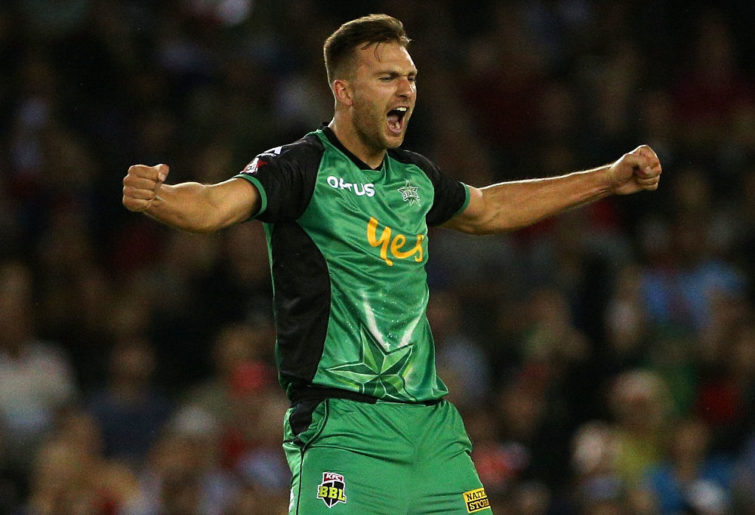
Jackson Coleman of the Melbourne Stars celebrates after taking a wicket. (AAP Image/Hamish Blair)
I always like to think that simpler jerseys that have the same scheme running throughout (with no sponsors stealing the show) are the best.
This focuses on the colour green and the star emblem as well as using the yellow ‘Yes’ to good effect with contrast.
Worst jersey: Sydney Thunder

Bright colours. Plain design? (Photo: Cameron Spencer/Getty Images)
There’s no major feature there that really relates to the Thunder, unlike other teams who all have at least one thing printed on.
Most original jersey: Brisbane Heat
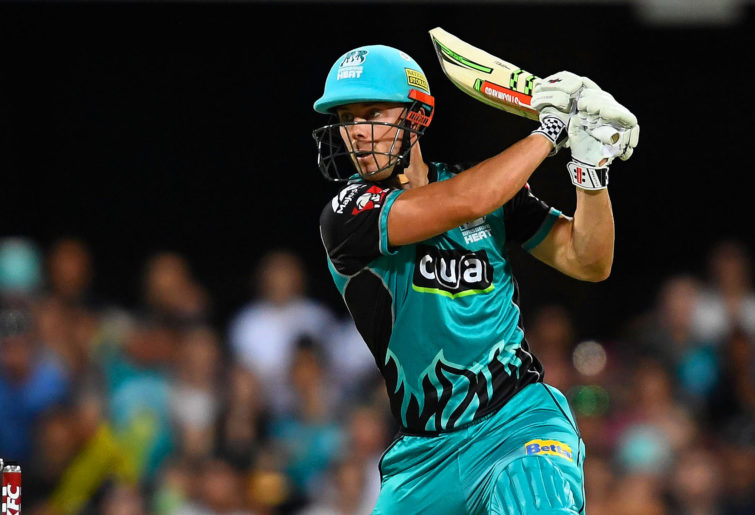
Chris Lynn in a Heat uniform. (Photo: Ian Hitchcock/Getty Images)
This was exceptionally hard to pick, considering this is just the eighth edition of the competition.
However, I’ve gone the Heat here as I believe they’ve been the most consistent with the general look of their design over the years.
Most creative jersey: Sydney Sixers
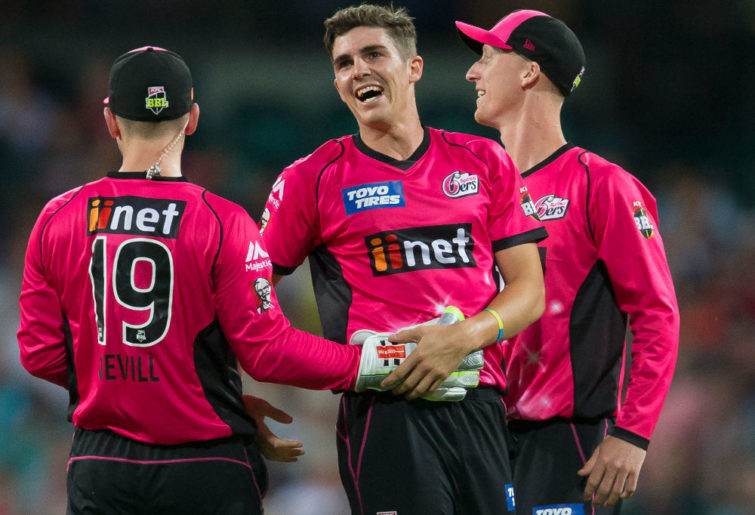
The Sixers incorporate their logo well. (AAP Image/Craig Golding)
For me, this was between the Sixers and the Stars simply for the colours and designs on the respective strips.
However, I wasn’t going to pick the same one twice, thus my choice of the Sixers.
They have very well embedded their logo into their kit without doing what the Scorchers or Strikers have done and just simply pasted their logo on there.
This is similar to what the Stars have done but you know why I couldn’t pick them.
Roarers, remember to comment your thoughts for each of the topics above so others can see.
Results will be revealed in an upcoming article.
VivGilchrist
Roar Rookie
They’re all off the same template. One primary colour + black. No real standout in my opinion, just a lack of effort from the design team(s).
SR1
Roar Pro
(The WBBL jerseys)
SR1
Roar Pro
They're pretty much exactly the same...
Gary
Roar Rookie
Not sure how you came to the conclusion that the sixers jersey was in anyway more creative than the rest, and the sixers' sponsor's labels are just slapped on same as the scorchers. Perhaps put images of all teams uniforms in the article so people can compare for themselves. I agree the Brisbane one is a good design. Also, could include the WBBL jerseys as well.