Which club has the best logo, who has the worst logo and where does your team come in the final standings?
There have been articles ranking logos in other leagues around the world, but surprisingly, when I did a Google search for A-League logo rankings nothing came up.
To put things right I’ve decided to write one myself going from worst to first.
Most articles along these lines are quite bare on detail, mine however is about twice as long as I don’t want to just zip through them with little thought or consideration, with 800 words I would have just 80 for each. They deserve better than that.
So without further ado, here they are starting at number 10.
10 – Adelaide United

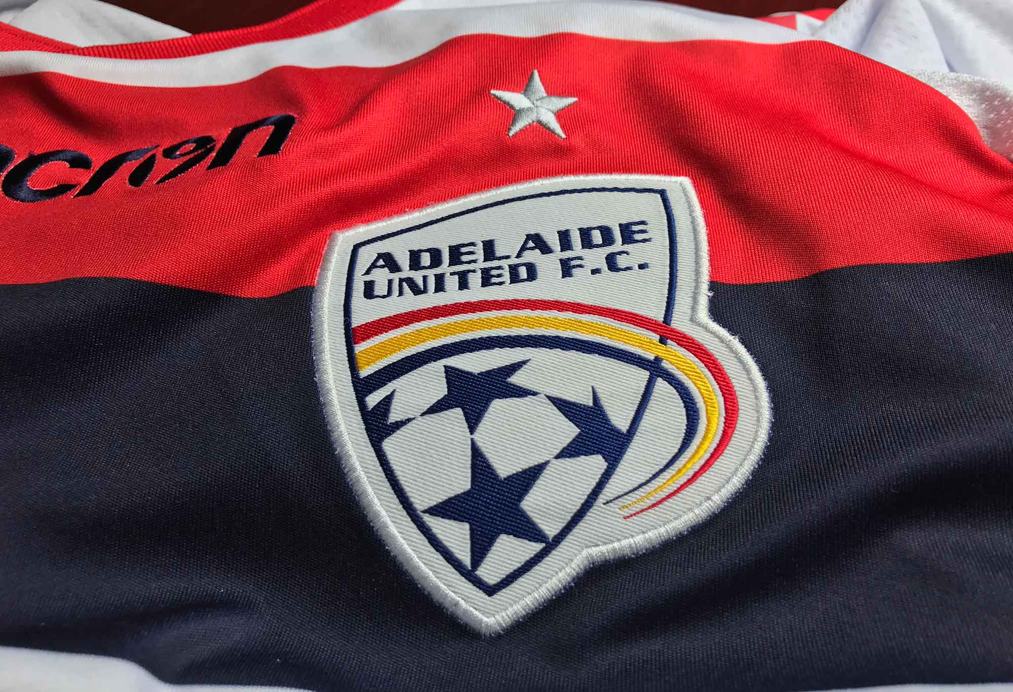
Adelaide United FC shirt and logo (Supplied)
For a club like Adelaide United, this badge is a huge disappointment. The asymmetrical sides of the shield in the design are similar to those of Sydney FC’s old badge and the club’s name looks like it’s been shoved into the space with little thought or care. The three colour “swoosh” in the colours of South Australia looks like something from another planet.
There’s a lot of empty white space and the ball at the base of the logo is barely recognisable. It would be better to use something iconic on their badge, like the Piping Shrike.
Ice hockey club Adelaide Adrenaline have done a much better job with their secondary logo and show what might be possible for Adelaide United.
Adelaide United, go home and do it again.
9 – Perth Glory
Another unremarkable logo is that of Perth Glory. There isn’t much to separate this design from that of Adelaide United, but the main differences in its favour are that the ball on Perth’s logo is actually clearly identifiable as a football and that the name fits better into the symmetrical shield.
Again, like Adelaide, it would be nice to see something iconic and recognisably Western Australian on the badge. As the city that stands on the Swan River and with the Black Swan as the state’s official emblem the obvious choice would be to feature a swan.
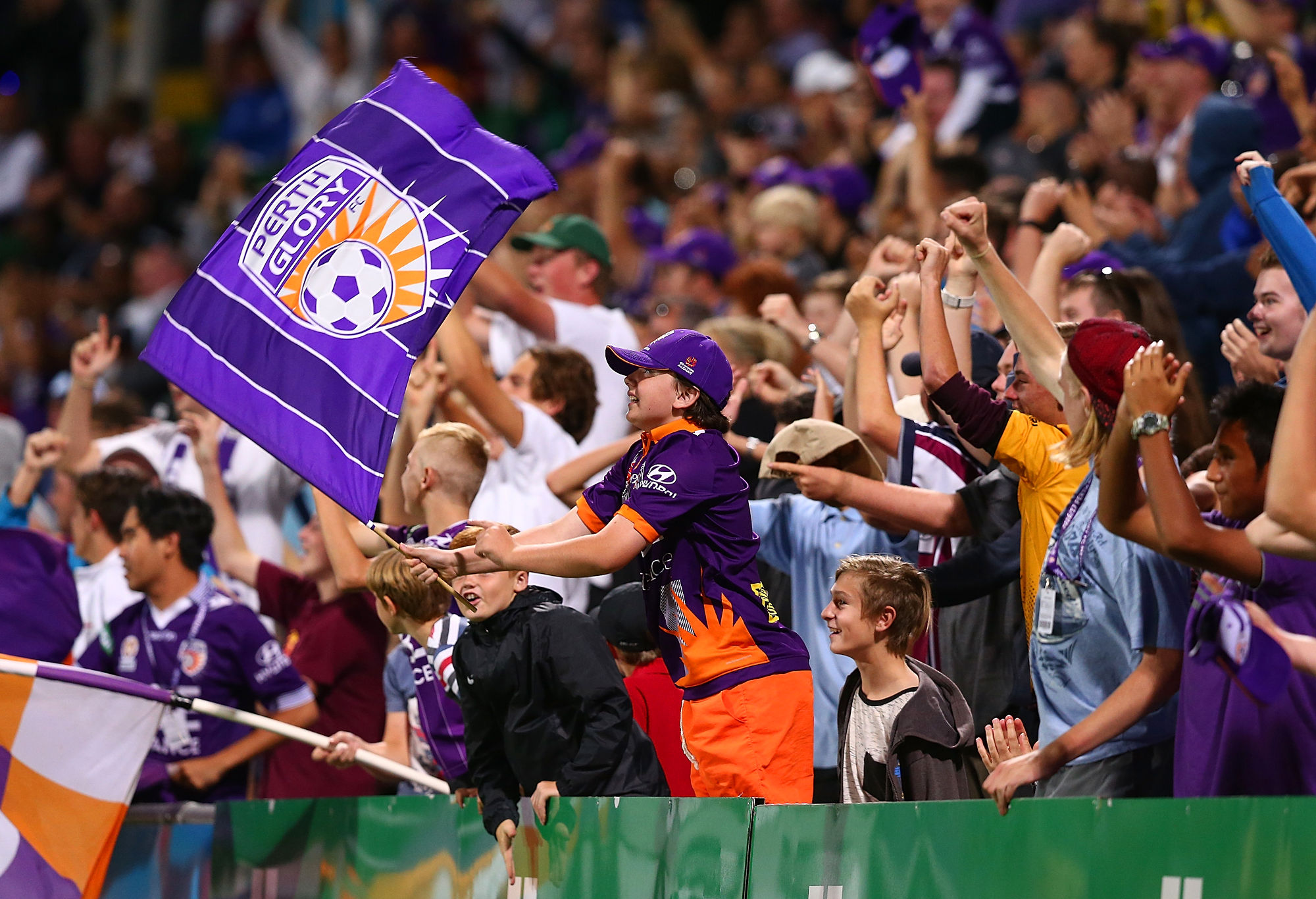
The Glory logo visible on the flag. (Photo by Paul Kane/Getty Images)
The logos of Swansea City and Wycombe Wanderers each feature swans in their designs and it’s something that Perth could go with as well.
In fact, it might not be such a bad idea to change the name of the club to Perth Swans to go with the new badge.
8 – Brisbane Roar
This logo looks more like a design concept than a finished product, it almost looks as if someone has drawn a concept image of what the badge should look like and the club have used it in a rush.
The lion is partly obscured behind a ribbon bearing the club’s name while the lion itself could potentially be mistaken for a Silurian from Doctor Who, or as one person said, a griffin.
A more traditional design with a lion inside a round badge would work much better with Chelsea a well-known example, but similar to Brisbane’s logo the lion is poorly drawn. North Epping Rangers have a shield bearing a lion in the same colours as Brisbane Roar while Sporting Lisbon also have a lion on theirs, both of which look more like lions.
Also, a name like Sporting Brisbane would be better.
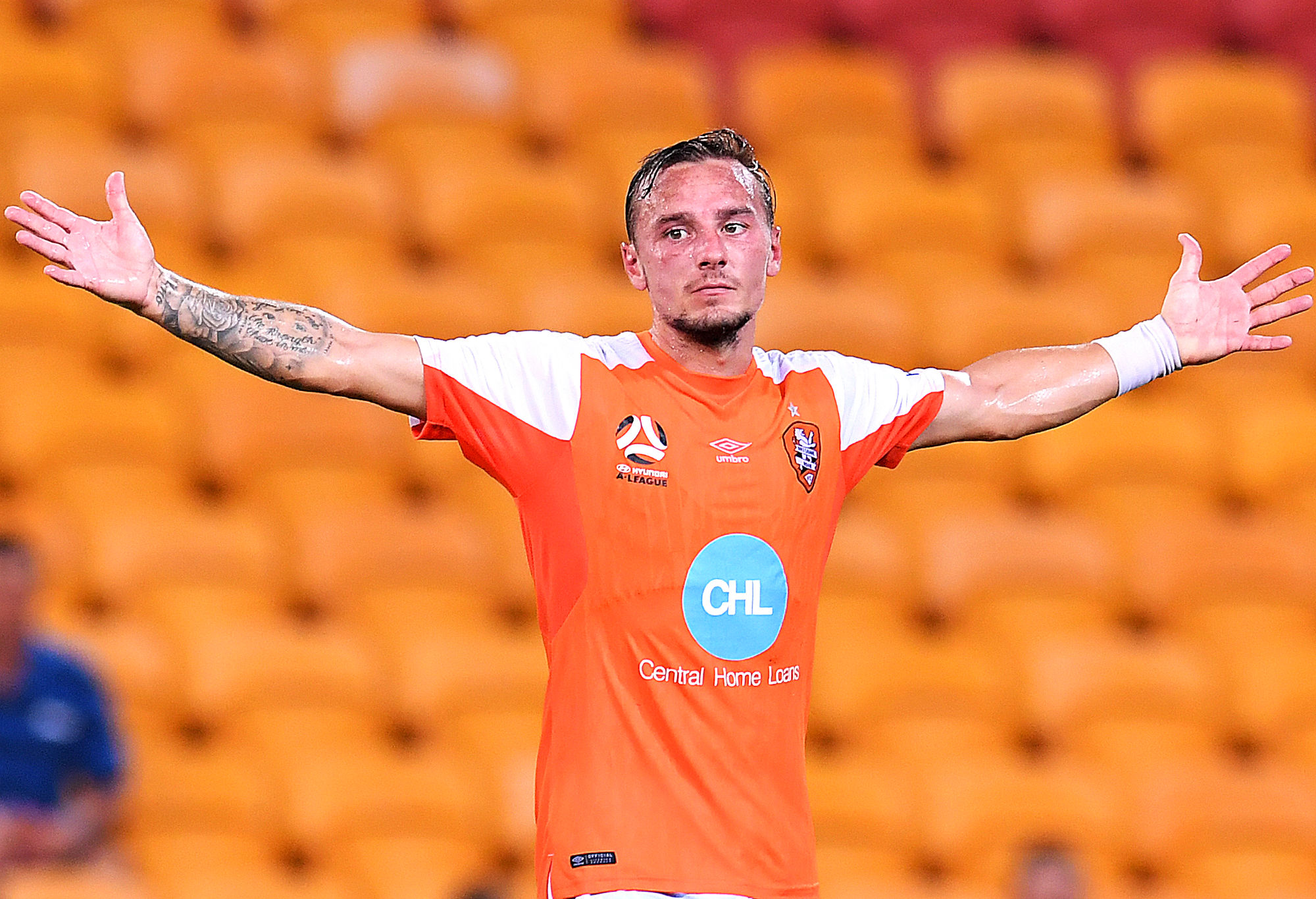
Could Brisbane do a better job with their badge? (Photo by Albert Perez/Getty Images)
A lion inside of a shield is fine, but when there are much better examples elsewhere it only highlights that Brisbane Roar’s execution of such a logo is mediocre at best.
7 – Central Coast Mariners
The wave on their logo is distinctive but it would better suit the club if they were called the Breakers to fit in with the surf theme. The trouble there, of course, is that the former NSL club called Breakers actually represented Newcastle – who are the Central Coast’s biggest rival.
More traditional elements for a club called Mariners would be things like an anchor or a ship’s wheel as can be seen on the logo of Corinthians who are a prime example. In addition, the way that the name of the club is warped around the top of the logo makes it look like it’s being distorted by an amusement park mirror.
A more traditional round badge with a palm tree in the centre and an anchor at the base with the name of the club going around above it in an arc might be more appropriate. The Flag of Lord Howe Island could give you a sense of what it might look like.
6 – Melbourne City
Nothing says Melbourne quite like an English Cross of St George with the British royal crown in the centre surrounded by a dead sheep, a Holstein Friesian bull, a Southern Right whale and its arch nemesis the whaling ship in each of the four quadrants.
As strange as it sounds, all of these elements are actually featured on the flag of Melbourne, while the sailing ship as well as the bull and the dead sheep are also featured on the Flag of Adelaide so they’re hardly unique or iconic to Melbourne. The flag is only flown at two buildings in Melbourne and it is so obscure that most Melbournians probably don’t even know that it exists.

The Melbourne City logo.
Two main alterations were made to the design for the Melbourne City logo.
Firstly, the ram on the Flag of Melbourne is actually depicted as hanging dead from a ring or hook while the one on Melbourne City’s logo has been miraculously resurrected.
Secondly, the whaling ship has been replaced by the same ship on the Manchester City logo, although curiously the flags at the top of the first two masts are blowing towards the bow while the flag on the third mast is going backwards towards the stern, the same as on their 1972-1997 crest.
While the Flag of Melbourne is undoubtedly Melbournian, it is such an appallingly bad representation of the city itself that it never should have been used as part of the club’s logo and is perhaps symptomatic of the club’s confused search for meaning and identity.
Melbourne City’s logo is a flawed design because they based it on another flawed design. But at least it looks like a finished product, unlike several other A-League logos.
5 – Melbourne Victory
While the “Big V” has been used by Victorian sporting teams for many years, it’s use on Melbourne Victory’s logo is somewhat undone by so clearly following the template of Arsenal.
The bulging double shield, with large outlined letters looks tacky and the word ‘Melbourne’ seems to be falling over backwards while the ‘FC’ looks quite awkward. All of this is due to trying to fit three lines of text into an area which was only designed for one in the case of Arsenal’s badge.
A better template would be French club Girondins de Bordeaux who not only share the same colours, but the white chevron as well. Unlike the Victory logo, it’s flat and doesn’t have a bubble look.
4 – Newcastle Jets
The shield of Newcastle features three jets against a blue background representing the link to the nearby air force base, with their name set against a red background in the top section. The nickname “Jets” is held below on a red ribbon, creating a red-blue-red pattern.
The overall design is good and it’s nice to see a sense of local history and connection. The only real quibble is that the shield is bulging outwards similar to Melbourne Victory, but it’s a subtler effect that’s harder to notice as it’s only a single shield and the text isn’t as distorted.


(AAP Image/Darren Pateman)
3 – Western Sydney Wanderers
According to their website, “The official club logo incorporates the key elements of the Western Sydney landscape; the mountains, valleys and winding river system that run throughout the region.”
It might be a good logo, but it’s also just a series of interlocking letters like a number of other logos around the world and blends in a bit. The Wanderers have produced a nice logo, but it’s nothing special.
Technically though it’s pretty much flawless and the way it does this stylistically through the intertwining of their initials, is clever. Overall it represents the club very well.
(Photo by Matt King/Getty Images)
2 – Wellington Phoenix
Their yellow and black circular logo has been likened by some to that of Borussia Dortmund.
Yet at the same time the details inside are 100 per cent pure Wellington. The central feature of the design is a type of great water monster called a Taniwha, who took the form of a Phoenix like bird upon death. Below this is the Maori inscription ‘E Rere Te Keo’ which it used as a rising call or rallying cry.
There’s a whole news page about how the logo relates to the Maori creation legend of Wellington Harbour and how the story symbolises the culture and identity of the club on the Wellington Phoenix website.
The only real fault is that the ‘FC’ looks a bit out of place and would be better off removed, but the Maori backstory to the main feature of the logo makes up for it and it’s also what gives this badge the edge over that of Western Sydney Wanderers.
1 – Sydney FC
And the winner is … Sydney!
Yes, I know, many fans of other clubs don’t like the Smurfs but whether you like them or not their logo is easily the best when it comes to visually depicting who the club represent.
At first it may seem flat, even boring, but it’s this very simplicity which gives it its class. They could have used the harbour bridge, but it also looks like a number of other bridges around the world with the Tyne Bridge in Newcastle and New York’s Hell Gate Bridge being especially similar.
No, the only thing you need to show to represent Sydney is the Opera House. There’s no mistaking it for anything else.
In terms of the visual styling, the colour pallet is subdued and pastel toned like something that David Hockney might have used, while the overall composition has a bit of an art deco poster kind of feel. It’s quite minimal and very refined.
The only minor faults in its design might be the way that split shading is used to create a sense of a three-dimensional camber and that an anchor or a shell might have been better than the Star of Federation. Maybe an art deco style font also could have been used.
After looking through hundreds of football crests from around the world, I can accurately state that there are remarkably few where you can identify where the club is based simply by the visual design of the logo, especially with the use of the eastern perspective.
Not only does this make Sydney FC’s badge unique in the A-League, but among a rare few from among thousands of others from around the world.
That’s what sets Sydney FC’s logo apart as being absolutely world-class.
It might just be the world’s best football logo.
Post_hoc
Roar Rookie
You are kidding on the FC logo, i'd rate in behind Cities.
Leonard
Guest
“But Sporting Brisbane would have to be the best match in Australia” evokes my inner John McEnroe: ARE YOU BEING S-E-R-I-O-U-S? The kindest reaction would be “Just sounds silly” and the most common “WTF?” “Sporting” is a European adaptation / bastardisation of our adjective ‘sporting’ as in ‘sporting club’ (rather than our ‘sports club’); link to prominent example - https://en.wikipedia.org/wiki/Sporting_CP. Note how ‘clube’ was dropped from ‘Sporting clube de Portugal’ a usage which made complete sense in Portuguese, Spanish and French, but looks and sound weird in English. BTW: each ‘Sporting Wherever’ began with a wide range of sports, and many such clubs still have other sports, even if soccer is their Numero Uno focus. Interesting that both AFL Carlton and AFL Collingwood went a bit ‘Sporting’ when they entered soccer teams in the NSL in the 1990s. In Victoria and probably elsewhere, many suburban and country football clubs have became ‘the Wherever Football Netball Club’, which is / could a step toward being more ‘Sporting’. Could Brisbane A-League become truly ‘Sporting’ by acquiring some other sports?
Dart
Guest
Yeah maybe some subtle adjustments, Nick. As for Sydney FC’s logo, there was an alternate one floating around which is similar to the one they chose, but I think is better. It has the logo of the city of Sydney and the shield is a different shape.
Lionheart
Roar Rookie
‘The Little Turd’? I think you're mixing up your fighter jets and SFC fans Nick.
Lionheart
Roar Rookie
kidding, right?
Leonard
Guest
There were two quite striking Foot Ball logos (as distinct from something like a coat-of-arms) in Melbourne a few years ago which comprised design plays on letters: one cleverly combined the capital letters 'M' and 'H' inside a heart shape, but when that club sold itself to the Pommy mob, it got replaced by the bastardised City of Melbourne logo - and is rightly much abused in many posts. The other combined a red 'M' with flames to very cleverly evoke a demon from hell to represent the 150-year-old Melbourne Football Club, but eventually got replaced by a dark blue shield with a red MFC - not a good combination because red does not stand out enough from either dark or royal blue. The other first class letters-based badge is the classic CFC in a laurel circle of the Carlton Football Club on the front of the 'Old Dark Navy Blue' jumper - simple, straight-forward and effective. Two distinctive points in Australian badging: one, cricket ground names never got reduced to 'Melbourne SG' (however neat that would have been) and two, 'Football Club' and 'Cricket Club' in club names didn't get abbreviated down to 'FC' and 'CC'.
Nick Symonds
Guest
JUST FOUND WESTERN UNITED'S LOGO - It's very basic with the name WESTERN UNITED F.C. and EST. 2019 underneath, all in white. Below that are the letter W in white and U in green all set within a shield on a black background. The letters W and U look like a W and V, and it also kind of looks like the Warner Brothers logo. https://imgur.com/a/KMM1m2B - Michael Taylor did a much better job on their Facebook page: https://imgur.com/QtF1zQX - SAME STORY ON DIFFERENT WEBSITES (In case you hit a paywall on one) https://www.smh.com.au/sport/soccer/western-united-s-logo-revealed-20190305-p511sz.html https://www.theage.com.au/sport/soccer/western-united-s-logo-revealed-20190305-p511sz.html?fbclid=IwAR0plDVcSon1ladXoplceP3OEDdDOJHcvrK8f4d1sa_XoR_yP66mt8iD0SQ
NJ
Guest
I think Brisbane's logo is good. It, along with Sydney, Western Sydney and Melbourne City (be it an inaccurate representation of Melbourne) are the most professional looking in the A-League. Much better than the early noughties WordArt style of Perth Glory or Adelaide United. CCM seems to be somewhere in the middle of the 2 styles.
Nick Symonds
Guest
I'd have to say it's better than the old logo, but there's always been something I didn't quite like about it somehow. Maybe it's a bit too dark. Maybe they could either brighten the badge or darken the kit. I don't know. It also looks a bit gummy without fangs and the ears are down, not pointed up.
Dart
Guest
Sure, it is abstract, but in a good way. The Wolves have had logos with Wolves gritting their teeth in the past. They soon become passé. I think the current logo will stand the test of time, with perhaps some subtle adjustments. Obviously we’ll be getting some more stars (hehe)! I have a beanie with just the wolf (like the Rabbitohs sometimes have just the rabbit) and I reckon that is a good look.
Nick Symonds
Guest
"I love the Wollongong Wolves’ new logo. The wolf depicted is in the shape of our city’s floral emblem (the flower from the Illawarra flame tree)." - It's a bit abstract don't you think? Flowers of the Illawarra Flame Tree: Brachychiton acerifolius: https://www.pinterest.com.au/pin/393361348675678114/ http://www.instanttreenursery.com.au/images/Brachychiton-acerifolia-flower.jpg - How about something like one of these designs - Wollongong Wolves redesign concept: https://twitter.com/wwolvesfans/status/503349118513602560 RAFC Wolves: https://seeklogo.com/images/R/rafc-wolves-logo-4EB500ACB0-seeklogo.com.png Minnesota Timberwolves (NBA): https://www.nba.com/timberwolves/sites/timberwolves/files/mtimberwolves_global.jpg - The current logo is pretty good but needs a bit more finishing.
Nick Symonds
Guest
Here's an image that Perth Glory used in the design competition for their 3rd kit showing a Black Swan in silhouette against the current logo in the background. It also shows both the current logo and also a Black Swan redesign at the same time: https://www.perthglory.com.au/sites/per/files/per/performgroup/1lemkt8rekvnq1skohudrk7auv.jpg
Dart
Guest
I also think a black swan silhouetted against a setting sun would be a great logo concept for Perth Glory.
Dart
Guest
I love the Wollongong Wolves’ new logo. The wolf depicted is in the shape of our city’s floral emblem (the flower from the Illawarra flame tree). Still, I think we could get rid of the soccer ball poking over the top of the shield. We mightn’t be in the A-League, but we have the best logo in the country!
Nick Symonds
Guest
"I expect the Jets will have at least a slight logo update in the next year or two, replacing the trio of F/A-18s with F35s." - The F35 is riddled with a long list of technical problems and design faults, in fact, the engineers refer to it among themselves as 'The Little Turd'. Keep the F/A-18 design on the logo. I mean, have Arsenal upgraded their canon to a Multiple Launch Rocket System?
Jordan Klingsporn
Roar Guru
That 1st one looks like a parliamentary logo The 2nd one reminds me of something that's not related to football. I'll ask as many Glory fans as I can and see if they would like to change the nickname to Swans. 2-0 to No Swans at the moment. Me and That Glory Fan.
jbinnie
Guest
Nick - Funny that in your analysis you have come up with the name Brisbane United. That name is hardly new,for back in 1976 ,before the establishment of the NSL, a group of people involved in the game were charged by the then ruling body the QSF, to come up with a team to partner Brisbane Lions in the inaugural competition. After a 7 hour meeting in the local Greek club it was decided that the remaining "local " teams would get together and supply the players and finance needed to maintain a team. Because of the combined effort it was decided to call the team Brisbane United. Two weeks later when the NSL clubs were named Brisbane City/ Azzurri, who had walked out of the original meeting stating they would not pay in such a league,were named as the other participant. Brisbane United were never mentioned. Some years later ,when both Lions and City had been "dumped from the NSL, the administrative body of football in Queensland that same Q.S.F., came up with the idea of them having a team in the NSL, and lo and behold they called the team Brisbane United. Like many other ideas generated from that same source the team was not a success and the identity only played in the league for 2 seasons before being disbanded. It was then a different team,being financed from a different source appeared, and we got the Brisbane Strikers appearing but come HAL time the Strikers were not in the ball park when it came to raising the $7,000,000 needed to participate, so the stage was set for Brisbane Roar to be established. The story from then is better left untold. Cheers jb.
Griffo
Roar Guru
Wanderers and Nix were refreshing from all the shield-based designs. Roar’s MkII looked a lot like a 90’s MS Paint design. Sydney’s was barley better and was let down by restriction in a shield. Glory as a name is distinctive but is it needed on a logo? A black swan silhouetted in front of the orange rays of sunset could be a good element that doesn’t need to be fully contained with a shield or circular design. Similar to Wellington’s phoenix flares wings, bother swan and sun rays could lead to interesting elements of done right. Whether the swan grips the word ‘GLORY’ or the element that contains ‘Perth Glory’ would come down to what is important in the design. I expect the Jets will have at least a slight logo update in the next year or two, replacing the trio of F/A-18s with F35s.
Nick Symonds
Guest
“Perth Glory is a recognisable name for anyone in Western Australia, due to the clubs 23 year history" - If it's history you want, the Black Swan logo has history going back to 1902. - The Black Swan Flies Again: http://websites.sportstg.com/assoc_page.cgi?client=0-10258-0-0-0&sID=329595&&news_task=DETAIL&articleID=35748666 http://www-static2.spulsecdn.net/pics/00/03/76/11/3761115_1_O.jpg - The Black Swan was also used on Perth Glory's 3rd kit in the 2013/14 season. https://www.bigfooty.com/forum/proxy.php?image=http%3A%2F%2Fi1170.photobucket.com%2Falbums%2Fr525%2FHaydos_1991%2Fproductimageashx_zpse0c49e2c.jpg&hash=3a3b95f10305734beae50f690f65e436 - As for the future, here are a few concept designs: https://www.designfootball.com/design-galleries/crcw/perth-glory-football-club-24730 http://i45.photobucket.com/albums/f100/MowseRFC/perthglory_logomock_zpsd4c2c27b.jpg~original https://www.bigfooty.com/forum/attachments/perth-glory-wa-logo-png.26975/ - And a Sporting Fremantle concept: http://4.bp.blogspot.com/-0uktuCWsgm0/VRyMujtvR-I/AAAAAAAAKAg/e3GQher1j2E/s1600/Fremantle.png - There's even a few Perth Swans AFL concepts: https://www.bigfooty.com/forum/threads/afl-rebooted-perth-swans.872562/ - As you can see the Black Swan is popular with people in Perth.
Nick Symonds
Guest
"Perth Glory is a recognisable name for anyone in Western Australia, due to the clubs 23 year history, so I can’t see any reason anyone would want to change that" - Their current logo needs updating and the most obvious thing to add would be a swan. If their logo features a swan, then people could start referring to them as the Swans. If that's the case then they might even want to change the name of the club to go with the new logo. I've seen swans on a few redesign concepts, so it seems like a natural progression to go from featuring a swan on the new logo to changing the name of the club to go with it. Simple.