The following is a hapless attempt to critically judge your favourite team’s logo in a highly biased review from a humble Giants fan (don’t worry, my team ranks low).
It is essential to remember in fluff pieces like this that no one really values my opinion, but it is still nice to know there are others out there who consider your team impressive in artistic flair.
18: GWS Giants
The large iconic G, italicised in bright orange. I may be a fan of the team, but hands down this is the worst logo in the entire league. It appears as though it was manufactured on MS Paint in an afternoon class. Now, before discussion on manufactured team comes up, the logo and GWS naming convention are the only two points I agree with.
Unlike the team guernsey, which is aesthetically pleasing, the Giants logo completely misses the mark.
17: Fremantle Dockers
Much like the Giants’ ‘G’, it probably is difficult to make an interesting logo out of an anchor. The white anchor-D symbol overlaid on the shield is not awful, but it simply doesn’t speak to the imagination. Luckily for Fremantle fans, you are not last in logo design, just team song. Also, in a repeating trend, whilst the logo is one of the worst in the league, the guernsey is one of, if not the best.
16: St Kilda Saints
The black-over-white cross is an iconic staple of the St Kilda Football club. The abbreviated wording of the club title on top and the inclusion of Latin script beneath is a memorable throwback to football across-codes over a century ago. If you’re under 20 in 2022 and still deciding on a team to support, one look at this logo and you’ll feel like you’ve stepped back in time a century.
St Kilda’s logo certainly needs a refresh to match with the changing times.
15: Adelaide Crows
Like the nine other animal-based clubs in the AFL, Adelaide have focused on what the coolest head-shot of a crow should look like on a logo. Unfortunately it misses the mark slightly; crows can be made to look like truly ferocious creatures, an animal one can truly fear but respect. This current side-angle cartoon design does not inspire either.

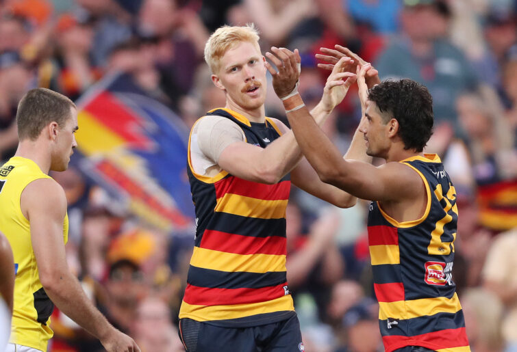
(Photo by Sarah Reed/AFL Photos via Getty Images)
14: Melbourne Demons
They might be the best team in the competition right now, but their logo certainly is not. The colouration is outstanding; the crimson red overshadowing the shadowy foreground does present the demon-esque feel of the club, however, the similarities stop there.
I’m not sure if marketing decided against showing a demon to not offend more sensitive individuals, but I would love to see them be creative with the underworld; there is so much potential there.
13: Sydney Swans
The iconic flying red-V with white Swan on the underlay. It certainly wins points for being different in the shape design, however the wording of ‘Sydney Swans’ across the crown could be landscaped into the V itself or an updated font change could improve it further.
12: Geelong Cats
I always get strong Cheshire cat from Alice in Wonderland vibes whenever I look towards Geelong’s logo. The cat imposed onto the logo shield itself is a splendid touch, however the hypnotising approach is equally as unsettling. The blending white and blue splashed across is still impressive.
11: Carlton Blues
The white-over-blue insignia, date of founding and latin underscript, like St Kilda is a nice, if not outdated touch. There is not a lot to say about the Blues; and therefore it falls roughly in the middle of the ladder. It is certainly a difficult team name to work a logo around.
10: Gold Coast Suns
The font of the Suns is an appealing choice with the AFL ‘GC’ nestled above rounding out the logo. Like the Giants, it has taken a simplistic approach, though it has done a significantly better job at doing so. The GC logo could use a touch up with sun-rays or even present the shield to represent a large burning ball of helium and hydrogen; blind my eyes, GC.
9: Essendon Bombers
The stylistic bomber plane, white overlaying the red arrowhead shield is an attractive logo for an original team name. The red Essendon capital lettering above the shield fits well, however, much like the regular competition ladder, this logo just misses out on the top eight.
Jason
Guest
(1) Here in the United States, where I am, orange Gatorade bottles have the same design as Giants' uniforms. The similarity is not even subtle. Does anyone know if Coca-Cola/Gatorade sponsors GWS and whether the sponsor demanded the uniform design? (2) I've been a St. Kilda fan my whole life, but to be honest, I would prefer the logo didn't have a cross. There was no saint named Kilda; it's just a place name, so it doesn't actually need a cross. St. Kilda is not a religious word. (3) Is that a US warplane on the Bombers' logo? (4) Let's face it, the Lions have the best logo :silly: .
JamesH
Roar Guru
The Melbourne logo is brilliant, comfortably my favourite in the comp. Not everything needs to be over the top.
adroyo
Roar Rookie
Good morning, I would love to have been able to add the logo illustrations next to each team as this was my initial plan. However it wasn’t allowing me to do so. I agree with most of your points, particularly the Pies, Dees and Dogs moving far away from their previous attempt.
Rowdy
Roar Rookie
Logos aren't the Crows problem. No, it's our sponsor's car. Camrys are the car you having when you aren't having a car. They're as boring as bat guano.
fractal pixie
Guest
Everything about the Suns is putrid, from their jerseys through to their logo. This club needs a complete overhaul. The Giants also have a dreadful logo. No imagination went into it whatsoever. St Kilda’s logo is fine as it is adult in its design as opposed to childish. Carlton’s traditional logo is excellent as it resembles sporting clubs from around the world. Their current logo is no good as the block style CFC no longer works. It only worked as an interlocking cloth monogram on their old jersey. If one looks at the current logo, one can see that it is poorly designed. The notches at the top are a different width to the rest of the F. It looks like it has been drawn by free hand by a five year old. Sydney has a great logo. It’s edgy and stylish. Essendon’s logo is alright but their one from the late 1970’s is even better. Hawthorn’s hawk head is shocking. Their original hawk clutching a football was excellent, as it was well drawn. North Melbourne should have kept their blue kangaroo from the 1970’s. Melbourne’s MFC logo is excellent as it is classic. Brisbane’s lion is a good one. The Crow’s logo belongs in the trash can, as does West Coast’s. The Dockers’ logo is fine, but I used to like the wharfie clutching the anchor. I like Port’s PAFC logo, as it’s to the point and not oriented to children. Richmond and Footscray should have kept their logos from the 1970’s. They were well drawn and looked realistic. Geelong’s GFC logo was really good, but I also like the cat one. It’s striking and powerful.
Christo the Daddyo
Roar Rookie
You haven’t described the Swans logo correctly. Which makes me wonder what you think you’re looking at for this article…
me too
Roar Rookie
You need to illustrate your argument. Literally. Not many of us have a photographic memory or wish to flick back and forth looking at logos. That said the older and simpler logos stand the test of time. The Saints logo is the best of them. Carlton also one of the better ones. What's wrong with a bit of latin? The motto is part and parcel of the club's identity. A logo represents the club in its entirety, not just the current day and temporal, ever changing with the current trends. That said at least Melbourne, Dogs, Pies, and the Dees have reverted from their last awful recreations to a more traditional appearance. The Giants, Suns, and Dockers are awful. The Swans is a good example of blending modern with new - relevant in their case as they need to represent their new home. The Crows logo should be binned. The rest are fine enough, although obviously not as they will soon change again to meet the whims of the marketing department.
DarwinDee
Roar Rookie
Personally think the simple ones are by far the best - you have Melbourne and Freo in the bottom few, I actually have them in my top few, along with Port.