There has been lots of controversy surrounding the A-League in recent times, whether it be VAR or Usain Bolt’s departure. Today, however, we’ll change the topic of conversation to the best, the worst, the most creative and the most original of A-League kits.
Remember to vote below your opinion on each of the four topics under question (best, worst, most creative, most original). The results will be revealed in an upcoming article.
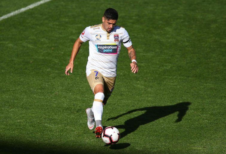
Best kit: Western Sydney Wanderers Home


Kearyn Baccus from the Wanderers in their home kit. (Photo: Steve Christo)
Usually, I am not the biggest fan of striped kits, however, this is an exception. I love the pattern within the actual stripes which I think adds texture and contrast to the kit.
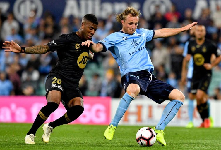
Worst kit: Newcastle Jets Away
Dimitri Petratos in the Jets’ away jersey. (Photo: Hagen Hopkins/Getty Images(
This one was fairly easy to pick. I don’t like the lines or the texture on the kit. Why not just have it all white with lines across?
Most Original kit: Sydney FC Home
Rhyan Grant (right) of Sydney FC. (AAP Image/Brendan Esposito)
Three words: Simple, Clean, Effective.
Most Creative kit: Melbourne Victory Home
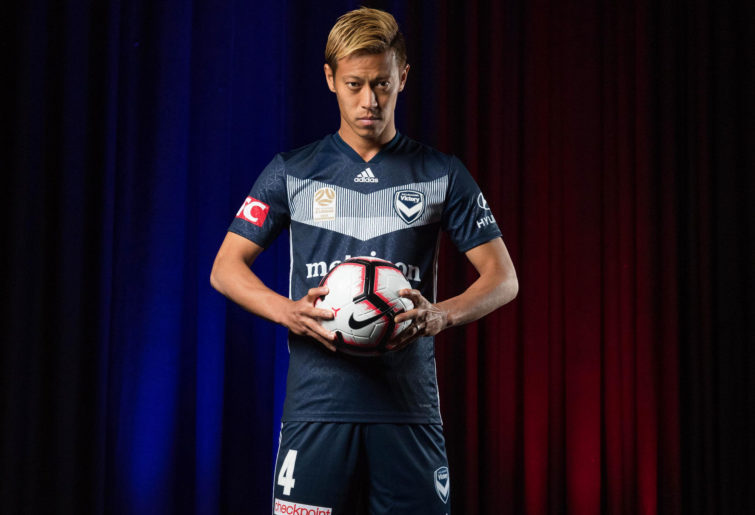
Keisuke Honda of Melbourne Victory showcases their new kit. (Photo by Mark Metcalfe/Getty Images)
There wasn’t much in terms of creativity in the A-League; most kits a fairly clean. This was the best I could find; however, I would have picked the Wanderers home kit again if I hadn’t already…
So Roarers, as well as commenting your votes, also mention any other sporting leagues you want me to do this ‘jersey’ series with.
SR1
Roar Pro
Yeah, that was last year's kit. Check out this year's to see what I'm talking about.
Mister Football
Roar Guru
That must be an old photo, I don't think NRMA is a major sponsor of the Wanderers anymore.
Griffo
Roar Guru
The only thing I don't like about the Jets kit this season is the buttons for the collar. Sometimes it's the minor details...subjective as it is between fans and non-fans of the clubs themselves. Kit manufacturers will change design and patterns from season to season, and depending on who it is, can offer little choice or will accommodate a club's custom design preference with minor flourishes of their own. Sometimes I think what makes or breaks a shirt is how the main sponsor logo is applied, which often is reflective of the sponsoring company's design guide on the use of their logo. WSW 'NRMA' logo blends in well with the black and white. It doesn't detract from the shirt with a clash of colour or being the only thing you see, unlike the Inspiration Paints logo which goes better with the black than the white/gold imo. The Melbourne Knights recently released their 2019 home and away kit design and it looks classy - probably a blend between the club and Umbro. -- You can easily miss the mark with a predominantly white kit. Agree with Kangas there is a reason behind the kit and design colour for the away kit, as there was with the green/white/brown kit a few seasons back. The fans wanted gold included as it reflects the home kit primary colour in the early A-League and also a nod to the Season 3 Grand Final kit design. Personally I think the black shirts/gold shorts would be smashing it for the Jets but being a third kit we will enjoy it this season before anticipating if the kit manufacturer and club hit the mark again or panned for getting it all wrong...
Mister Football
Roar Guru
The Roar kit definitely looks much better since they got rid of the maroon, prior to that, it used to look hideous. I'm saddened to see the demise of the Peru-style red sash which used to adorn Heart.
Mister Football
Roar Guru
I think the Wanderers home kit is a good choice for best, and the Jets away kit is also a good choice for worst. The SFC kit is so-so, nothing special to be honest, but not bad either. I have mixed feelings about the new Victory kit, good on them for playing with the same theme, but not sure if it's hit the mark.
Kangas
Roar Rookie
The jets away kit is symbolic as what they wore beating ccm in the grand final. They have a cracking all black away kit . I would prefer the green brown kit that is traditionally Newcastle . As for sydney and originality , correct me if I’m wrong, but that’s nsw state colours , also victory are navy blue for Victoria , Adelaide wear red like south Australia. Queensland roar had some maroon involved originally too . I like the black and red bands for wsw .