Every season, team jerseys are always a hot topic.
Some old, some new, some great, some bad and some that really leave you scratching your head.
Any jersey should be in use for a minimum of two seasons either as a home or alternate strip. Although a few of my teams have gone through some that I’m glad I only had to put up with for 12 months.
I will put the 2019 Super Rugby jerseys in four sections: bad, mediocre, good and the best. Let’s get started.
Bad
Blues
Last year’s jersey rating: Bad.
Most of the New Zealand franchises have opted to stick with the designs brought out last season and in the interests of consistency, the Blues are going to receive the same grade.
Actually that darker away jersey isn’t too bad but that home jersey just doesn’t look nice at all.
Bulls
Last year’s jersey rating: Bad.
What on earth is going on with the Bulls designers? Last season’s atrocity included the year on it, and this one is a bizarre two-tone mix that apparently has a ‘Bulls Armour’ graphic across the front.
In all fairness, it is a step up on last season and the contrast on the away jersey does look better.
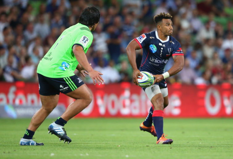
Rebels
Last year’s jersey rating: Mediocre.
Were the Rebels a team with a slightly longer history, then a plain, basic jersey could be sold as traditional.
Instead, one of the newer additions to Super Rugby will have to let their play provide the excitement because those jerseys are just bland.

(Mike Owen/Getty Images)
Sunwolves
Last year’s jersey rating: Mediocre.
First things first, the red on the Sunwolves jersey looks really, really nice.
The problem is if you take off the logo and sponsor, it looks like just another polo shirt.
It’s probably not the intention of the design but having three Ws on the front is also possibly representative of the number of games the Sunwovles are expecting to win in 2019.
Mediocre
Brumbies
Last year’s jersey rating: Mediocre.
A new supplier for the Brumbies and their first season with O’Neills has produced a set of jerseys that are almost spectacular.
The stripes on the all-blue jersey are phenomenal and you can’t beat the Brumbies classic look on the other jersey.
So why is this not ranked higher?
Well, we love a good sponsorship but the positioning of the Plus 500 logo on both shirts is really distracting and could have been a bit lower to showcase the three-bar look instead of covering it up.
Crusaders
Last year’s jersey rating: Good.
Get used to this Crusaders jersey, we’ll be seeing a lot of it this season come finals time.
It’s the same style as last season so they do get bonus points but in all honesty, it’s getting moved down because I’m sick of seeing them belt pretty much every other opponent.

(Marty Melville/AFP/Getty Images)
Is it a nice jersey? Absolutely! Is it being moved down for largely petty reasons? You bet.
Lions
Last year’s jersey rating: Bad.
The three-time runners-up will be hoping a jersey change will improve their fortunes in the decider, should they reach that far.
This season’s design is a step up from last year but it still just isn’t quite… good. As for their Marvel kit, we’ve seen Spider Man done before, why not honour Hawkeye?
Good
Chiefs
Last year’s jersey rating: Good to mediocre.
One of my favourites from last year, the Chiefs are – like pretty much every New Zealand side – recycling last year’s jersey and why would you change what works?
Highlanders
Last year’s jersey rating: Best.
Last year we called this the best of the New Zealand designs and… well it still is.
Hurricanes
Last year’s jersey rating: Good.
The Hurricanes are recycling a great uniform from last year, so why not recycle what we wrote about them in 2018.

(Photo by Michael Bradley/Getty Images)
“After popping up with one of the worst uniforms in the competition last season [2017], the Hurricanes have taken a huge step forward with this season’s offering.
“They have opted for a single base colour rather than trying to mash together yellow and black while finding a much better way to incorporate the wind stripes as well. As for their away uniform, in a word, class.”
Jaguares
Last year’s jersey rating: Mediocre.
What’s this? A bit of life in the Jaguares strip? Well knock me down with a feather!
The foliage look on the shoulders of the black jersey is superb and even though it is orange, that away jersey would look good on even the most loose-head of props.
Reds
Last year’s jersey rating: Good.
The Reds returning to their maroon strip is the best news to come out of Queensland and possibly Australian rugby in the last nine months.
(Photo by Ryan Pierse/Getty Images)
This actually came close to topping the pile but didn’t quite get there.
Stormers
Last year’s jersey rating: Mediocre.
BLK’s first up effort for the South African side is excellent and could very easily have been the best of the South African sides were it not for one other team.
Their home, away and Thor-style Marvel kits are all very, very nice.
Waratahs
Last year’s jersey rating: Mediocre.
Much like their Queensland counterparts, the Waratahs are going traditional this year and have upgraded their white away jersey with a pattern that I shouldn’t like but it is kind of appealing.
Best
Sharks
Last year’s jersey rating: Good.
The reigning champions of the Super Rugby jersey stakes take it out for another year with a superb home and away combination.
But what really makes their 2019 jerseys is the spectacular Black Panther-themed third jersey.
Sibusiso Nkosi sports the Sharks’ Black Panther-themed Marvel jersey. (Photo by Gordon Arons/Gallo Images/Getty Images)
Lano
Roar Guru
An enjoyable read and certainly innovative angle to add to rugby chronicles. The aesthetics of the jumper - who would have thought?
Emuarse
Roar Rookie
I would love to see a team in the competition with a harlequin pattern. And if the team was smart it would use a colour blend that had a camouflage effect like below. Then match officials wouldn't notice infringements as much. This might be why the Reds changed from Red to Maroon, a darker colour harder to spot.
Superba
Guest
I recall watching the Stormers v Lions and found it difficult to differentiate between the two teams . Funnily enough after halftime one of these teams returned wearing a different strip . The Bulls , Lions and Stormers jerseys are dreadful.
Loftus
Guest
What exactly is so spectacular about the black jersey, with a necklace design, of the Sharks? Your ratings are all upside down.
Carlin
Roar Rookie
The Jaguares orange and black combination is a winner for me. That colour match always looks so good together on a sports strip.
Carlin
Roar Rookie
Yep I would be keen to see more hooped jerseys in team strips. Hoops give use the traditional and also grassroots feel to the game.
liquorbox_
Roar Rookie
Hate the Reds jersey, should be red. I know there is an argument about tradition but if this is the case then do it properly and have red and black hoops. Red looks great and even matches the name of the team. Whats next, the Blues wear red and the Reds wear blue?
Rugbyrah
Roar Rookie
Seems like teams are either red or blue. It would be nice to have distinct colours. Australian teams have 1 red team and 3 blue. When the force were playing we have 4 blue teams! It was good seeing the highlanders in green and the jaguares in orange. Those colours stand out. The hurricanes stand out in yellow. It would be good to have other colours like purple for melbourne just like the storm and green for the ponies just like the raiders. Maroon for the reds was a good move as there already are other red teams.