Each A-League team has been busy launching a new home-and-away jersey, coinciding with the impending season launch on Friday, October 7.
As a fan of kits, I’ve often stood in Rebel Sport, gently inspecting the stitching, running a smooth finger over the fabric. All colourful strips tell a story, some more in-depth than others.
From my computer, I’m forever admiring Sydney FC’s new home shirt. On closer inspection, it’s a mosaic of interlocking tiles, inspired by the iconic Sydney Opera House.
However, unlike in the past, I’m holding off buying it online, until I can further review the blue textiles in person. I sheepishly implicate my generous wife for that paranoid decision.
On opening a surprise gift from my other half recently, I was amazed at the utter thinness of Celtic FC’s new top. I read the accompanying tag, and was intrigued about the supposed “advanced technology” behind the hooped, wearable wafer.
Nearly all football clothes are made from plastic. Granted, Celtic’s was recycled material, which is a bonus. However, the docket was laughable, showboating another so-called sportswear invention, via buzz words and copyrighted patents.

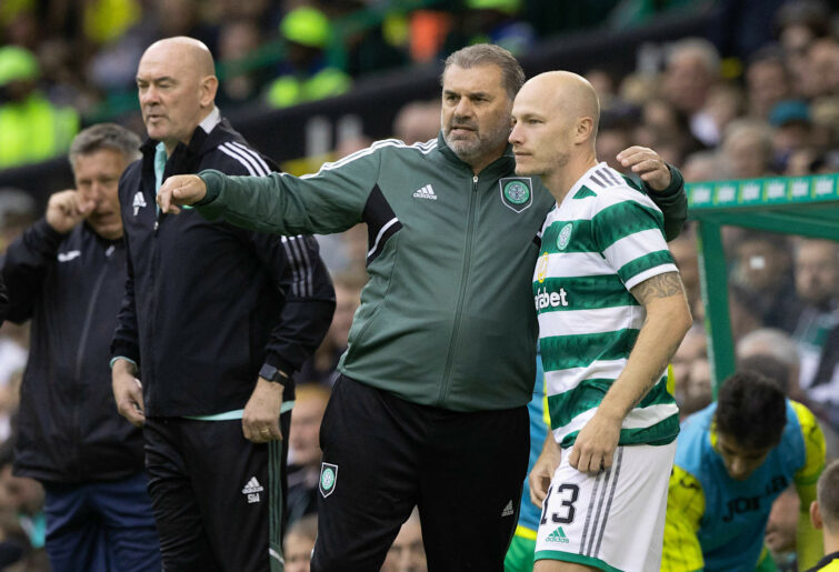
(Photo by Craig Williamson/SNS Group via Getty Images)
Let’s be honest, we’re talking about oil after all. It’s black gold turned into quality clothing, which is mass-produced.
When the A-League launched over 18 years ago, eight promotional jerseys stood shoulder-to-shoulder on stage, being modelled by players from their respective clubs.
In retrospect, nearly all of the original shirts followed a similar template, with most kits mirroring their rivals in pattern design.
That initial season, Mark Rudan was chosen to represent the Sky Blues. Towering over the other figures, his Sydney attire matched the Central Coast and New Zealand offering, with each shirt featuring a horizontal chest marking, sloping from the shoulder to opposing armpit.
I’m still undecided whether it’s an acquired taste or treasured piece of A-League history? This was back in 2005, when the Moore Park lads dared to add the colour orange to their former crest.
Long before the Opera House image took up half of their recent badge, the famous building was hiding behind a cartoon soccer ball, its white sails peeking from the top, simply alluding to the 1973 structure.
Admittedly, I do prefer the modern insignia. It’s bold, leaving nothing to suggestion, heralding that Sydney is truly a sky blue town.
Others might say otherwise, noting the calibre of shirt sponsors Steve Corica’s men attract in Sin City. The irony isn’t lost on the Opera House, its budget once being raised through state lotteries.
Everything is expensive these days. After thanking my wife, I immediately sent an SMS to a friend, reviewing my pristine Celtic strip to a kindred spirit. “I plan to get one in November,” Garry responded, referring to the Sydney Super Cup.
I wished him luck. Then Garry pondered the likelihood of seeing coach Ange Postecoglou at the pub. “An awesome possibility”, I texted back, “I’ll make sure to wear my jersey.”
Rellum
Roar Guru
They are wrong obviously. Roma 03/04 is the greatest strip ever with daylight second
At work
Roar Rookie
I'm waiting until I get can to the stadium store to buy my SydFC jersey so I can try it on and decide between the home or away top. Anyone know if the stadium store is open outside of game day?
At work
Roar Rookie
Too right, I don't really need to wear the newest technology in a replica kit. I'm not out there on the field so why do I need to be wearing some piece of polyester with air vents...
criag
Roar Rookie
You won't ever see me in an A-league jersey until they are made of cotton!
chris
Guest
Found the article: https://www.espn.com.au/football/blog-the-toe-poke/story/4096710/ranking-soccers-all-time-top-101-kits-from-man-united-and-liverpools-iconic-reds-to-arsenals-bruised-banana
chris
Guest
There was an article on a soccer website once and they ranked all of the best jerseys from 100 down to 1 I think it was. The Sampdoria blue kit was the number 1 choice.
Grem
Roar Rookie
Have my tickets to see Sydney FC play Celtic. Looking forward to Ange’s homecoming tour. I wonder how they are selling as they weren’t cheap.
Gaz
Roar Rookie
Sure there are many Celtic fans out there. Come on guys, let's make some noise! The team is coming down under soon. Can't wait to see them live in action!
Gaz
Roar Rookie
When the new logo first came into light, I was in denial ... So used to the old one. But me too reluctantly grew to accept the reality. Well said!
Brendan
Roar Pro
True, the advertising aspect is an appropriate concern, Grem. The “S” on Sydney’s jersey reminds me of Superman, although we all know it’s actually The Star (which incorporates a casino, theatre, hotel & shops). Remember Webjet? Great company, but the plastic computer mouse with wings sure looked funny on FC’s shirt. Unless I’m wrong, a few years ago, I think the Sky Blues used the same kit over two years. Maybe I’m dreaming?
Brendan
Roar Pro
I reluctantly grew to accept Sydney’s new logo, & admittedly, I quite fancy the crest now. It’s audacious. There are half a dozen other Sydney-based codes that incorporate the Opera House, but their wavy image is usually implied. Sydney’s, however, is far from subtle. It boarders on brutalist architecture, making a statement.
Marcel
Guest
Worst?.... That's a tough call, some of the truly awful kits have ended up with a strange charm about them. For me it's a greater crime to be ordinary...and the Socceroos at the RSA World cup was a profoundly ordinary strip. Best? Spurs 81.... The first of their LeCoq series... simple, beautiful...it looked like it came from the future compared to what everyone else was wearing. Boca produced a retro kit a few years back with a laced collar and washed/faded colours....I think it's just a fan issue and never actually worn....its brilliant.
Grem
Roar Rookie
My favourite Sydney jersey is still the black away jersey with the sky blue pin stripes from a few year ago. I prefer jersies to be as free from advertising as possible so when Sydney have been between sponsorships I have bought about 4 jersies. I am wanting to get to a Sydney store soon as I am keen to purchase their new jersey, but I am hoping an XL youth jersey may fit as that doesn’t have the sponsorship. You’re not the only fussy supporter. I have been amazed in the past how a club with sky blue and some white or dark blue can create a poor jersey, but they have for some seasons. I also enjoy wearing my Greek, Italian, etc jersies that I bought while overseas whenever I am out training or exercising. It will be interesting to hear about the best jersey so far and the worst.
Marcel
Guest
I preferred the old SFC logo...the new one is bland and amateurish...technically it lacks colour contrast and the font used is bleh....overall it looks like it was designed by Deidre from accounts in an office competition. It's good to see the Socceroos back in white socks!