A few days ago, I released an article on NRL jerseys. I have decided to continue this. Next in the jersey series comes the AFL.
Like last time, I will be revealing my picks in all four of the topics of the best, the worst, the most creative and the most original. You will get the chance to vote yourself below (in all the topics mentioned above), which the results will be revealed in an upcoming article.
Scroll down to see what I’ve chosen.
Best jersey: Adelaide Crows clash

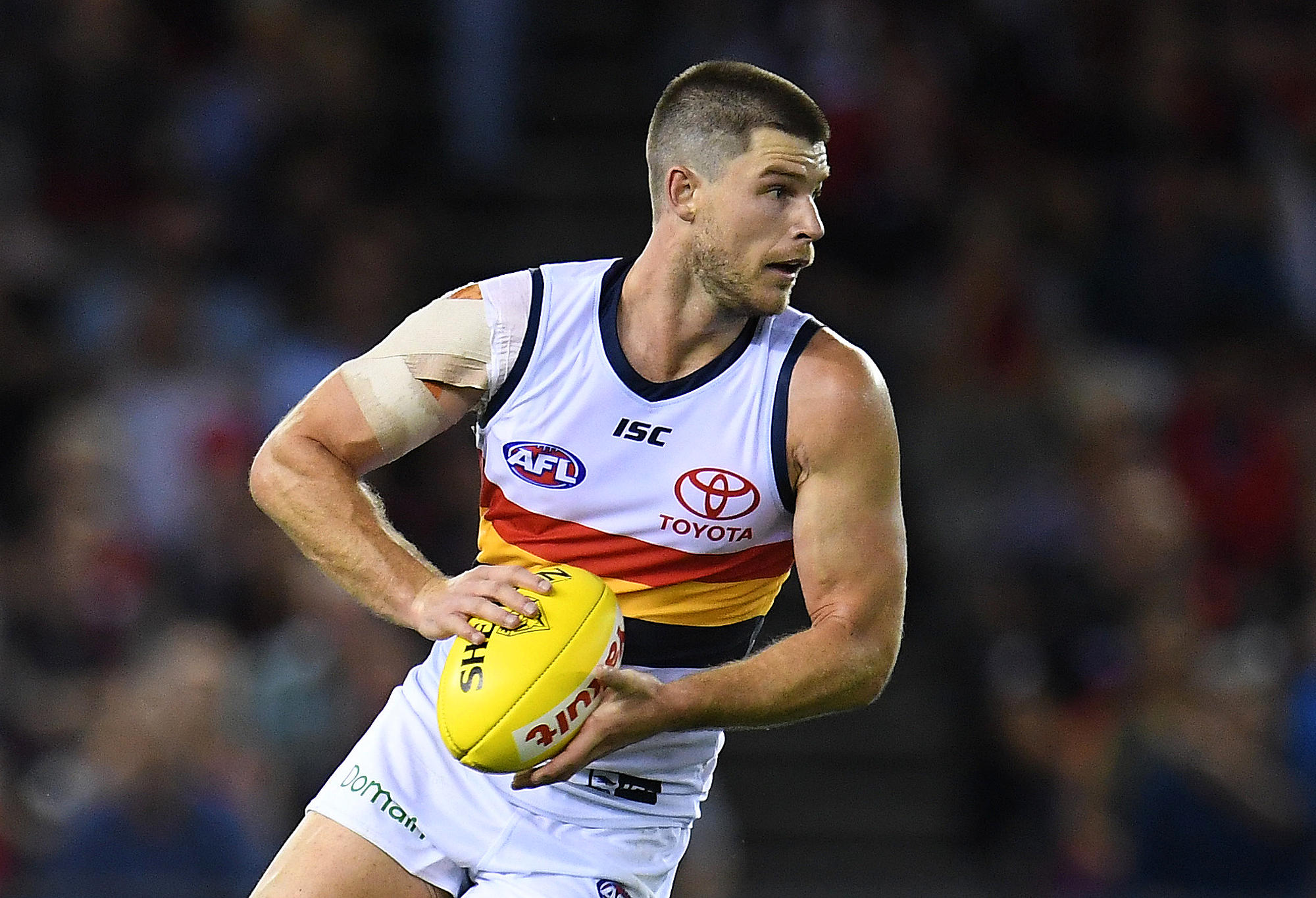
Simple. Clean. Effective. (AAP Image/Julian Smith)
Similar to what I said about the Panthers’ Alternate jersey in my previous article, I like it simply because of how clean it is, again ‘spicing’ it up with a three-colour combination.
Worst jersey: Essendon Bombers clash
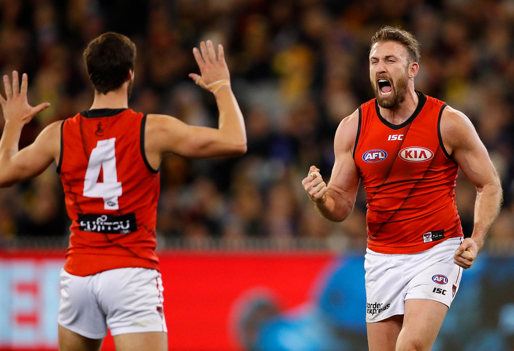
Essendon’s clash jumper isn’t very nice. (Photo: Adam Trafford/AFL Media/Getty Images)
I see what the Bombers were trying to do here; however, they just didn’t fully execute it correctly. For me, either get rid of the black line completely or just get rid of the shadow.
Most original jersey: Richmond Tigers home
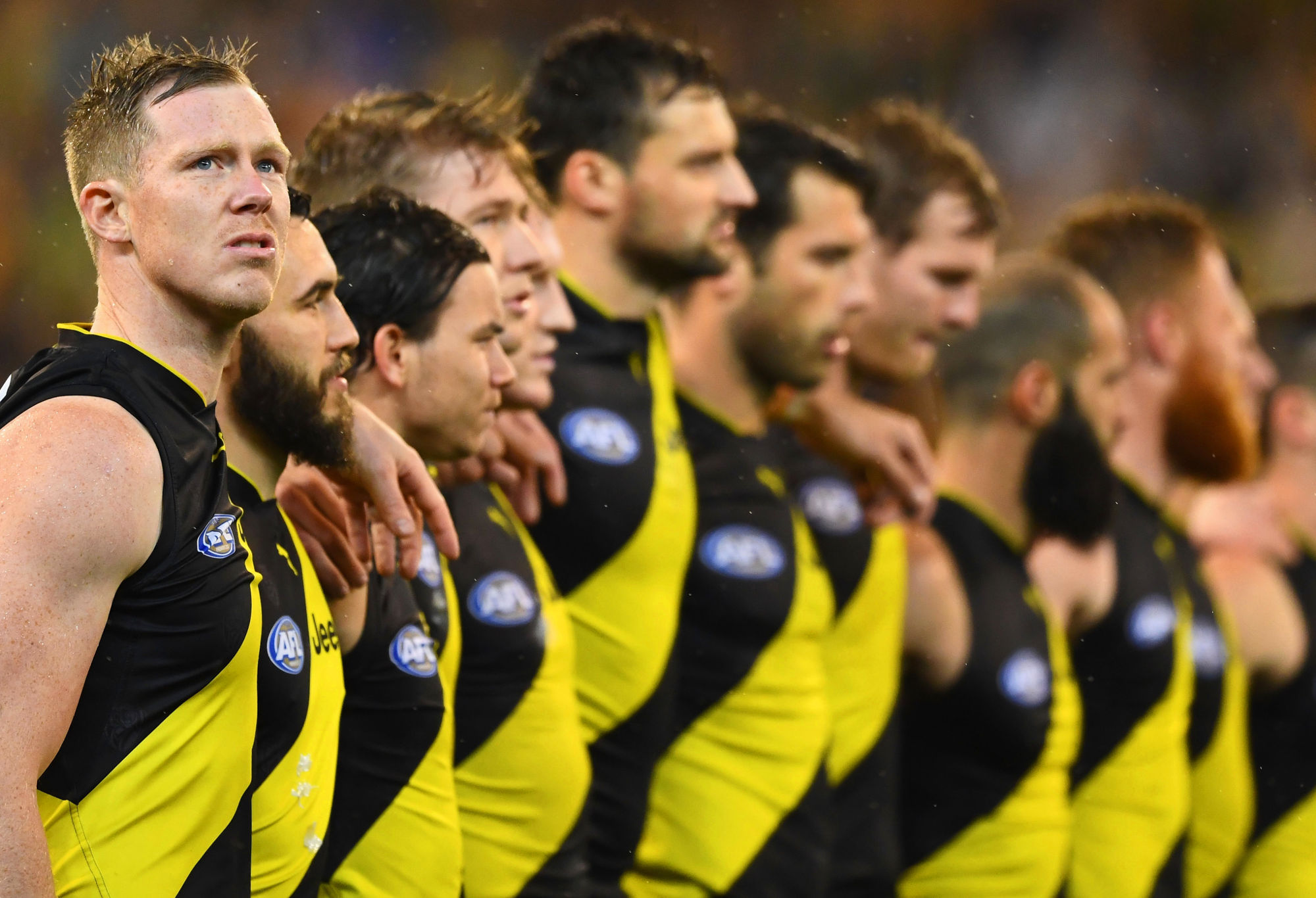
Richmond’s home jumper is a classic. (Photo by Quinn Rooney/Getty Images)
Simplicity plus age equals originality. This is exactly what’s happening here. Nothing more has to be said – it’s just a classic.
Most creative jersey: Essendon Bombers ‘Dreamtime’
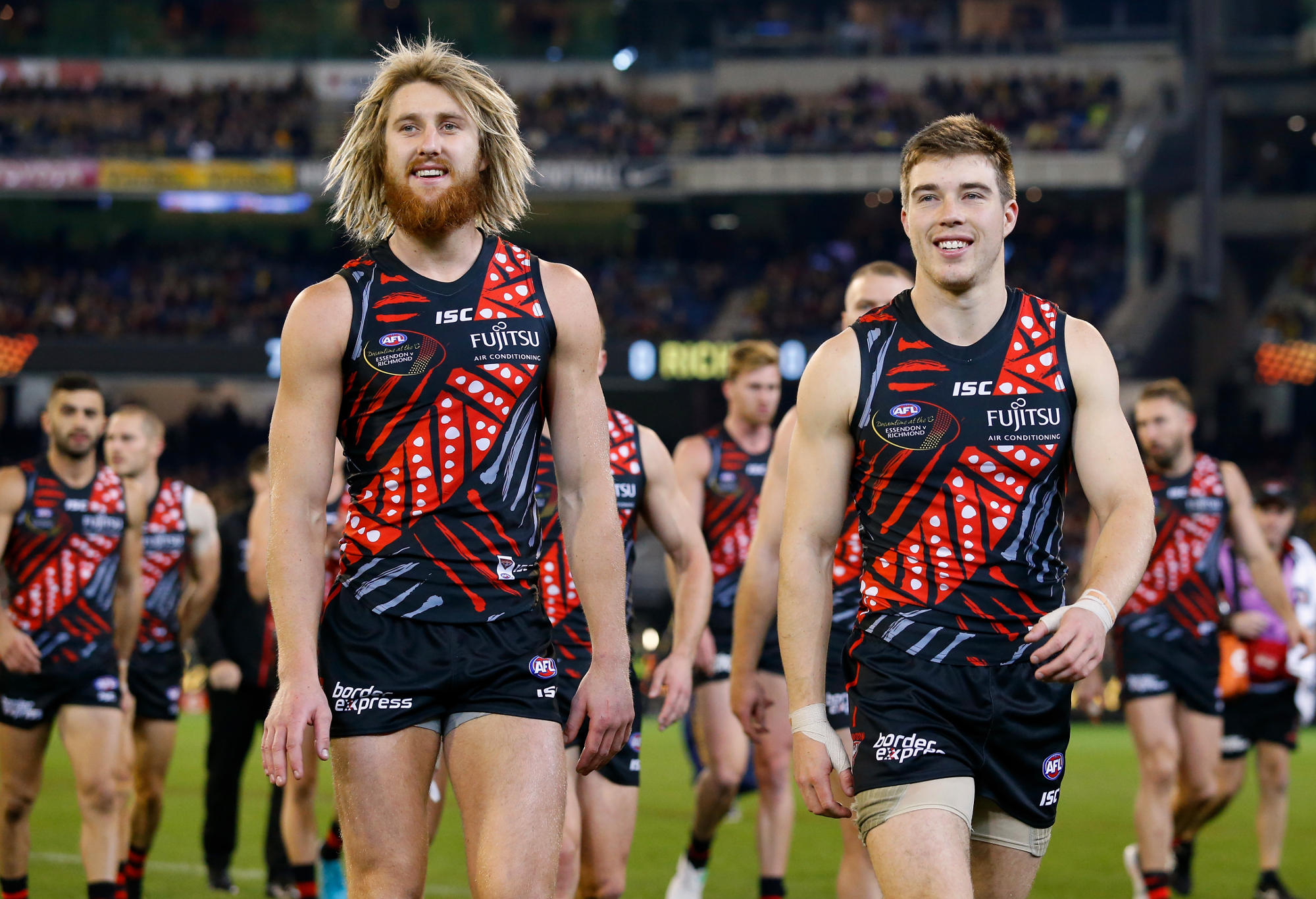
Essendon’s indigenous jumper, on the other hand… (Photo: Adam Trafford/AFL Media/Getty Images)
Another one from Essendon. This time though, they are recognised for a good jersey, rather than a bad one. They have successfully embedded Indigenous patterns and drawings with the design and colours of Essendon.
Roarers, remember to comment your opinion in all four topics above. The results will soon be revealed!
cheaprugbyjerseys
Guest
How do you feel that the AFL jerseys have not changed much every year
Papa Joe
Roar Rookie
Agree with another poster below that the Sun's jumper is an abomination - bright red, with yellow under the armpits, and with red shorts - shocker. A darker red (maybe even maroon) with a yellow V would be simpler and work better (if red and yellow is what they want to work with). That Lions jumper of a year or so ago with the gross Lion head was even worse. If clubs send players out in fancy dress, don't be too surprised when they start playing like clowns. Would the All Blacks be just as effective in an All Red outfit - maybe, but I doubt it.
Mister Football
Roar Guru
Simple strips are always the best. The great thing about footy jumpers is that on the whole, we strike a good balance between simplicity and interest (sashes, yokes, stripes, hoops, monograms, etc), whereas in many soccer comps around the world three-quarter of all teams appear to be either all red or all blue. The great development which has occurred over the past 15 years or so are some of the unique jumper designs various overseas club and national teams come up with. Always nice to see.
Mister Football
Roar Guru
He said it respectfully and he's right, we call them Guernseys or Jumpers.
peeeko
Roar Guru
chill out
J.T. Delacroix
Guest
The Richmond home ‘guernsey’ is striking because of its basic colour contrast. The almost highlighter yellow though has divided older supporters who preferred the deeper, almost gold/orange coloured sash. Obviously the new one fits in with the “yellow & black” refrain in the club song, so it’s here to stay. You have to keep in mind too, that they were originally known as the Wasps before the Tigers.
Downsey
Roar Pro
The Nollamara female WAAFL team's 2018 guernsey is outstanding. I'd love to get my hands on one.
Gary
Roar Rookie
The original Freo strip was a sight to give you sore eyes. However, the new strip - now several years old, of solid royal purple with 3 white chevrons on the chest is simply a beautiful sight to behold. I might be biased, but do honestly believe it is striking and classic design.... or it could be that the original strip is used as a baseline comparison. Quite a few of the indigenous designs are well done... and quite often look better than the traditional strip. GWS should have given it a bit more thought. Gold Coast is good. Carlton is good. The rest is ok. Collingwood has the laziest clash strip... it barely helps when they play North. West Coast have changed their strip more than any other club... hopefully they won't try and use navy blue again.
fractal pixie
Guest
The worst jerseys are 1) Gold Coast Suns, 2) GWS, and 3) Sydney Swans. The Gold Coast jersey looks like a technicolor yawn, and it needs a complete overhaul. Tomato Red and Gold are too loud. They would be better off having a blue jersey with a yellow and red V. GWS need to change their jersey to panels, like St Kilda. They could have a jersey that is grey on the back, and orange, white, and grey on the front. Sydney should ditch the opera house, and just have the old South Melbourne jersey, which was all white with a red V. The simplest jerseys are the best, and as Mark Fine says "if your nanna cannot knit it, it should not be a design". Jerseys should consist of either monograms, panels, vertical stripes, horizontal stripes, sashes, V's, or yokes. Cartoon birds, Big G's on an angle, and GC's in circles have to go. Hawthorn's jerseys are bad at the best of time, given their choice of colors, but the ridiculous shield like effect that exists at the moment, has to go. What was wrong with three equal vertical stripes? Carlton's away jersey is an abomination. White with a blue monogram is suffice. At least they fixed up their monogram, as the one they had in the last two seasons was asymmetrical, as one part of the F was thicker than the other, and the bottom part of the C was way too long.
SR1
Roar Pro
I wasn't sure so I just kept it consistent with the last 'jersey' article I wrote...
Toto
Guest
In Aussie Rules land we call them Guernseys. Jerseys are what rugby league & union players wear. Another example of Sydney-centric media!