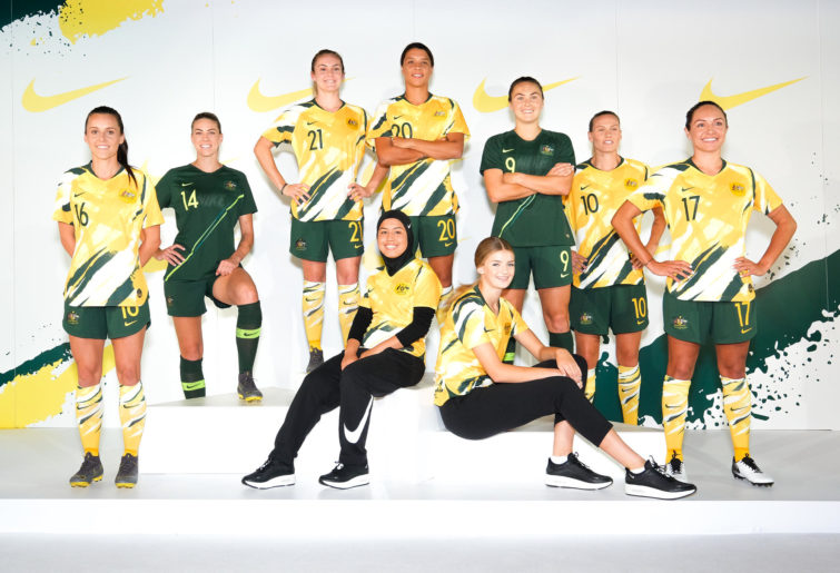
For the first time in their history, the Matildas will wear a unique jersey at this year’s World Cup – one different to the one worn by Australia’s national men’s teams – but the design itself has divided fans.
One of 14 World Cup kits unveiled by Nike overnight in Paris, the Matildas jersey evokes memories of the most infamous Socceroos kit in history – the 1990s spew shirt. But there’s no player revolt over the new design.
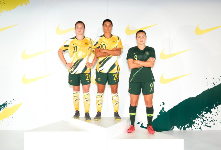
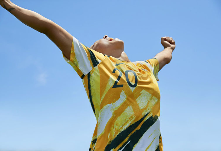
The home shirt is predominantly gold, with splashes of green and white that bare comparison with Ken Done’s famous paintings. It also features green shorts, and socks which reflect the design of the shirt.
While the home kit is a brand-new design, the away kit has remained as the all-green affair which was unveiled for both the men’s and women’s teams last year in the lead-up to the men’s World Cup.

(Image: Supplied, Nike)
(Image: Supplied, Nike)
(Image: Supplied, Nike)
Sam Kerr is clearly a big fan of the new shirt, saying it represents the side’s spirit as an “out there and bold” team.
“The kit is unreal, it’s such a different take on what we’ve seen in the past and we couldn’t have hoped for a better looking home jersey,” she said.
“To have a kit designed just for the Matildas to play in, it’s a dream come true, and we are honoured to be pulling on the green and gold.”
Nike’s Cassie Looker said the design team wanted to create a “marriage between urban street culture and the amazing countryside in Australia”.
However, reaction on social media to the new kit has been mixed, some lauding the design, others far from impressed with it.
The Matildas will first wear their new shirts against the world’s No.1 team, the United States, in a friendly in April before the World Cup starts in June.
So, Roarers, what do you think of the new jerseys?
With AAP
Statler and Waldorf
Roar Guru
It's a shocker
RogerTA
Roar Rookie
!
Ado Potato
Roar Rookie
My first thought upon seeing the image of the Matildas in their new shirts, before I had read anything else, was the Socceroos spew shirt. I couldn't believe what had been designed. However, looking in comparison, it isn't. The spew shirt is still seriously ugly; the Matildas' new strip more nuanced. If the players are happy playing in it - and Captain Kerr clearly is - then "Go the Matildas!".
josh
Roar Rookie
Sold.
Midfielder
Roar Guru
I love it an going to buy one...
jupiter53
Roar Pro
It's fine. Mind you, I am the proud owner of a "jungle/spew" shirt, so what would I know?
Paul2
Guest
Presumably we make an exception for the Australian Test team.
surfside66
Roar Rookie
White is a colour that should NEVER appear on any Australian sporting uniform in any sport. White belongs to England, France, Russia, Czech Rep, Poland, Slovakia, Croatia etc etc etc. The claim that white socks should be worn because the 1974 Socceroos wore them is utterly infantile. The reason the 1974 Socceroos wore white socks is because they were CHEAP and the whole team and administration were BROKE !!! Personally I would have preferred an ABORIGINAL patterned gold with green strip but since the team members appear happy with it, I am happy for them. But a memo to all other Australian sport federations - NO WHITE EVER!
Griffo
Roar Guru
I wasn't a fan just seeing the shirt on its own, but it is okay as an entire kit. Not sure if this an an attempt at not looking like Jamaica who have yellow shirt, green shorts, yellow socks. Also wondering, after attempts at uniting players under the one national team colours, this undoes that work? Regardless you still support your team. If they can take out the World Cup it could become the most famous shirt in our history, maybe even influence the men's team design 8-) . At least there is white in the socks, of sorts...
Nick Symonds
Guest
Australia World Cup 2018 concept - http://thirdkit.co/2018/04/02/australia-world-cup-2018-concept/
Ben
Roar Guru
Horrible looking uniform. Why change from the original.
Eden
Guest
Love that they've gone for something Australian, but not sure they've succeeded. On a practical level, it will distinguish us visually from Brazil and Jamaica for casual fans - both teams with yellow shirts who we are playing in the group stage.
JuBe
Guest
I don't love it - I reckon it could do without the white, especially the socks, but when you look at the shot of all the uniforms together the others are so boring in comparison. So a pass but could do better.
Jack George
Roar Guru
Honestly, it's cool! It's unique and it will help the Matildas become easily identifiable over the world cup.
Redondo
Roar Rookie
A Dulux ad, a screen saver, combat camouflage, an identity crisis?? Who knows...and then the socks
Jordan Klingsporn
Roar Guru
I'm getting one of those. It reminds of a Aussie Paddelpop
Lionheart
Roar Rookie
yep, looks good I like it, and good for the Matildas and fans they now have their own shirt