


- Video
-
Club Roar
Captured a great grassroots sporting moment? We want to see it!Content Collections
The Roar Community
- Join
- Login

Some of you may be familiar with the Foxtel Premiership Indicator, or the ‘186 Hot Plot’ as it’s also called.
It’s a tool that Champion Data updates and makes available at the end of each round, which – as the name suggests – plots each of the 18 AFL teams within four quadrants based on their average for and against to date.
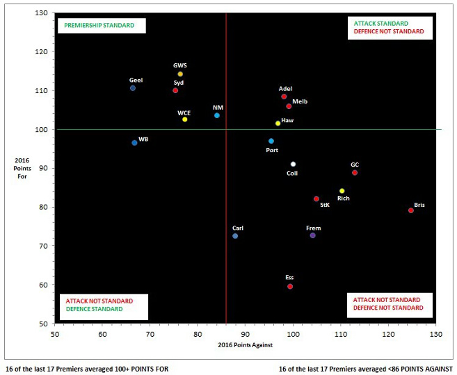
The top left quadrant is considered top-billing status, where fans aspire to see their team by season’s end – ideally, even earlier.
It indicates scoring an average of greater than 100 points per game, as well as conceding an average of fewer than 86 points. It’s known as ‘Premiership Ready’ or ‘Contention Corner’, having both an attack and defence up to the so-called premiership standard.
I’ll say from the outset that following a bit of research, the Hot Plot is flawed. Any graphic containing data that can have a team in the desirable quadrant, while that team is actually ineligible to win the premiership, is farcical.
Conversely, a team can sit in the least desirable quadrant, yet be very much in premiership contention, as North Melbourne fans will attest to last September.
Despite its relatively unknown flaws, the Hot Plot apparently has a keen and loyal following among coaches and AFL analysts. A scan of comments from Champion Data’s Twitter followers also indicates its popularity with fans.
The premise of the value of the Hot Plot is that the vast majority of recent premiership teams have ended up in the top-left quadrant at the conclusion of the home-and-away season.
The 2015 (when it was devised) model stated that 14 of the last 15 premiers averaged greater than 100 points for, and the same strike rate for defensive efforts with 14 from 15 premiers conceding fewer than 86 points.
The updated 2016 model appears to now go back one year to include 1999 and claims that “16 of the last 17 premiers averaged more than 100 points for – and 16 of 17 averaged less than 86 points against”.
This sales pitch is incorrect.
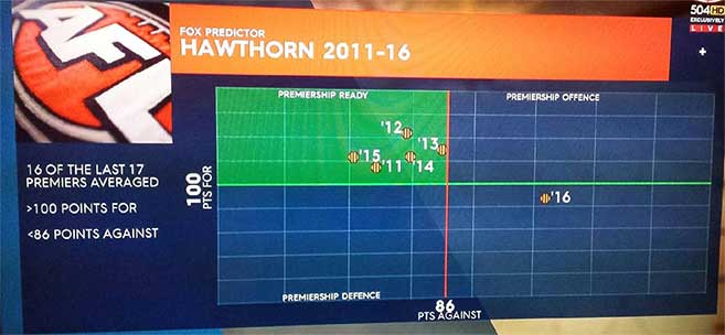
On May 2, during On the Couch, while David King was commenting about the graphic and explaining Hawthorn’s plight to Jason Dunstall after its loss to GWS, he stated that “15 of the past 17 premiers have come from the top left” and while noting that the Hawks sat in the bottom right (see pic 2 below – Hawks attack and defence, not of premiership standard) said “you can’t win the premiership from there”.
More on that claim later, but the correct strike rate of premiership success for the top-left quadrant, which I’ve never heard stated, is actually 14 from the past 17 years (Sydney 2005, Brisbane 2001 and North Melbourn 1999 the exceptions). And it is 15 (not 16) of 17, ticking the 86 defence box.
‘Hot Plot produces again’ was the claim of Champion Data a week prior to last year’s Grand Final as Hawthorn and West Coast were the only two in the premiership ready quadrant, ensuring the success of the table once again.
Following Round 8 this year, West Coast and North Melbourne joined the Cats, Sydney and GWS in the premiership contender corner (think about that and try telling Brad Scott his team wasn’t considered to be in contention before Round 8, but suddenly now are, following a shaky performance against Essendon).
The deeper one digs, the more interesting it becomes. Not surprisingly there is a catch regarding the Indicator’s so-called strike rate. If one looks back to also include the few years prior to 1999, say from the introduction of the final eight in 1994 (when 20-minute quarters were also introduced), there are periods that Champion Data would prefer the typical fan did not know about. Like for example 1994 to 2001, when the system failed to deliver in six of eight seasons.
1994 West Coast 94 for, 71 against – no
1995 Carlton 107-79 – yes
1996 North Melb 115-90 – no
1997 Adelaide 98-80 – no
1998 Adelaide 99-80 – no
1999 North Melb 112-97 – no
2000 Essendon 128-80 – yes
2001 Brisbane 115-90 – no
That’s right – teams coached by Mick Malthouse, Denis Pagan, Malcolm Blight and Leight Matthews either failed to average 100+ points or conceded more than 86 points, yet still managed to hoist the premiership cup!
In devising the system, Champion Data has cleverly but sneakily looked retrospectively at a set of ladders from season’s end and crunched some numbers with the intention of capturing the largest set of numbers practicable within a given list. Last year, when selecting their parameters at the outset, you may ask why the fascination with 100 points (attack) and the unusual number of 86 (defence)?
Let me explain. In ascending order (best defence to worst), the following is a set of numbers representing the average points per home-and-away game conceded by the 15 premiership teams for the years 2000 to 2014: 71, 71, 74, 75, 76, 77, 79, 80, 83, 84, 84, 84.5, 85.2, 85.55, 90.
Note that the biggest gap is between the two highest numbers (85.55 and 90), and just after the heavy congestion around 83 to 85. So by culling the 90-point defence of Brisbane in 2001 and setting the defence at what appears to be a quite attainable less than 86, Champion Data has captured 14 of 15 premiership teams – remarkable! That was easy. If less than 84 or less than 85 had been selected, you can see how many times it wouldn’t have captured premiership teams’ defences.
Now for the attack parameter. Same again – this time in descending order: 128, 116, 115, 115, 115, 112, 111, 110, 109, 109, 107, 104, 104, 102.6, 90.
Now you can see how easy it is. To have captured or included every number in the list of average scores and say a team only needs to score more than 89 points to become a ‘contender’ would make it unviable.
So while importantly making the attack parameter very achievable, Champion Data has again simply captured all but one in the sequence and drawn a line under the 102.6 points conceded by West Coast in 2006, thus settling on a standard of under 100 points – which also happens to be the nice and even milestone that many commentators and fans obsess about teams reaching first in order to maximise chances of victory (not that that bothered Sam Lloyd last Saturday night).
Success or an excellent strike rate with this retrospective set of results was very easily achieved, because the premiers from 2000 to 2014 had all completed their home-and-away seasons well before the system was designed.
Yet people marvel at the results and possibly give a little fist pump when their team makes its way towards or lands in the greater than 100/less than 86 quadrant. Some have said they find it more useful than the ladder!
Here are some further facts to digest before you get too excited (or forlorn as the case may be) about your team’s premiership or grand final chances:
– Of the 44 grand finalists from 1994 to 2015, 21 have come from outside the desired top-left quadrant.
– Similarly, from 1994 to 2001, 14 of 16 grand finalists came from outside the top-left quadrant.
– Furthermore, during the similar period of 1996 to 2001, on four occasions no teams finished in the ‘premiership ready’ space (thankfully, especially for Crows supporters, the premiership cup was still awarded).
Now before you say that the game has changed since the mid-90s and that the five years of data prior to 1999 shouldn’t be used, research actually indicates that aggregate scores of games from that era are almost identical to current day.
It was in fact 1994 when playing time per quarter was reduced from 25 to 20 minutes (plus additional stoppages), resulting in approximately 10 per cent less playing time.
It is no coincidence that average scores of 210 points per game during 1992 and 1993 decreased to 189 in both 1994 and 1995. Current season average match scores are at a very comparable 187 points. So using 1994 to 2015 in measuring success is fair and easily defendable.
Here are some other peculiarities to ponder in regards to making the top-left quadrant:
– In 2013, Fremantle’s percentage of 134 saw them miss out, yet Sydney made it with a percentage of 132.5.
– Despite making it in 2013 with that percentage of 132.5, Sydney failed to make it in 2014 with a far superior percentage of 142.8 – go figure!
– In 2005, Adelaide (136.5%) finished top and averaged 94-69 yet didn’t make it – West Coast did (average 103-83, percentage of 124).
In such a fallacious system, there are too many quirky examples like this to list. But here’s another!
– In 1999, Brisbane spent 21 of a maximum 22 weeks inside the top-left quadrant and ultimately came up against North Melbourne in a preliminary final, North supposedly not up to ‘premiership standard’ as they hadn’t spent one week in the best quadrant. Nevertheless, North Melbourne fans will fondly recall the result of the preliminary final, and grand final to follow.
As you’ll see from the examples, it is completely random as to whether well-credentialed sides in the top echelon of the league also meet the criteria required to land in the ‘premiership ready’ quadrant.
Proponents of the Premiership Indicator will be disappointed to learn that between 1996 and 1999, the eventual premier spent only 12 out of a possible 88 weeks in the desired area!
But while on North Melbourne, I’ve saved the best until last. Three years ago during a so-called successful period for the system, 20 matches into the season North Melbourne’s for and against was 2079-1699 and it sat comfortably within the ‘premiership ready’ quadrant with an attack and defence meeting the required standard.
Sorry Roos fans! Unfortunately and embarrassingly for the brains trust behind the Premiership Indicator, North sat in tenth position at the time and three games outside the eight, with only two matches remaining. That’s right – a team can actually land in the best quadrant by losing more games than it wins, and be ineligible to compete for the premiership for which it’s supposed to be ready to contend.
Similarly, at the end of the 2012 season, St Kilda had averaged 107 for and 86.5 against with a healthy percentage of 123.3. It only missed qualifying for the desired quadrant by a whisker yet missed the finals in ninth position, albeit with a higher percentage than four of the finalists.
If you still don’t think scenarios like these make a mockery of the system, then consider the following irony from as recently as last season. When North Melbourne led West Coast by 20 points at quarter-time of the preliminary final (having already won two finals), it was considered by the system to have both an attack and defence ‘not up to premiership standard’, having finished the season in the bottom-right quadrant.
So sorry to quote you Kingy, but yes a team can make the eight, contend and win the premiership from there!
In summary, follow the Premiership Indicator tool at your peril, or better still, just take it with a pinch of salt. Teams will drift into a quadrant, and they will drift out. The system doesn’t always recognise the core goal of a team – winning. It illogically ranks a team that far exceeds in one category and just misses in the other, below a team that squeezes into both.
Champion Data and Fox analysts will be crossing their fingers and hoping that up to five or more teams (as per 2012 and 2013) make the grade, thus giving them an exceptional chance to sing its praises. But backing five of the final eight is akin to having a few dollars on 15 chances in the Melbourne Cup.
Is there a chance that no-one will end up in the premiership quadrant, causing slight embarrassment again? Probably not this season as the stronger teams hand out regular thrashings, but it has happened before. Better still, could one team make the cut, but not make the eight? Not impossible!
Over to you, Roarers – anyone agree or disagree with my debunking?
Who’s in your ultimate team? Pick the best team and compete with other fans for daily prizes on Draftstars. For the best odds on the game try out Aussie bookmaker PlayUp. Think. Is this a bet you really want to place? Set a deposit limit.