


- Video
-
Club Roar
Captured a great grassroots sporting moment? We want to see it!Content Collections
The Roar Community
- Join
- Login
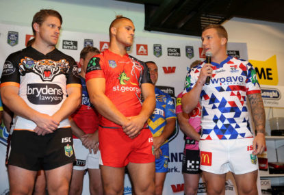
The 2016 Auckland Nines jerseys have been released, and that means it’s time for the footy fashion police to come out in force. So join me as I channel my inner Joan Rivers in assessing who wore it best.
WANT TO LIVE STREAM THE AUCKLAND NINES? HERE’S HOW
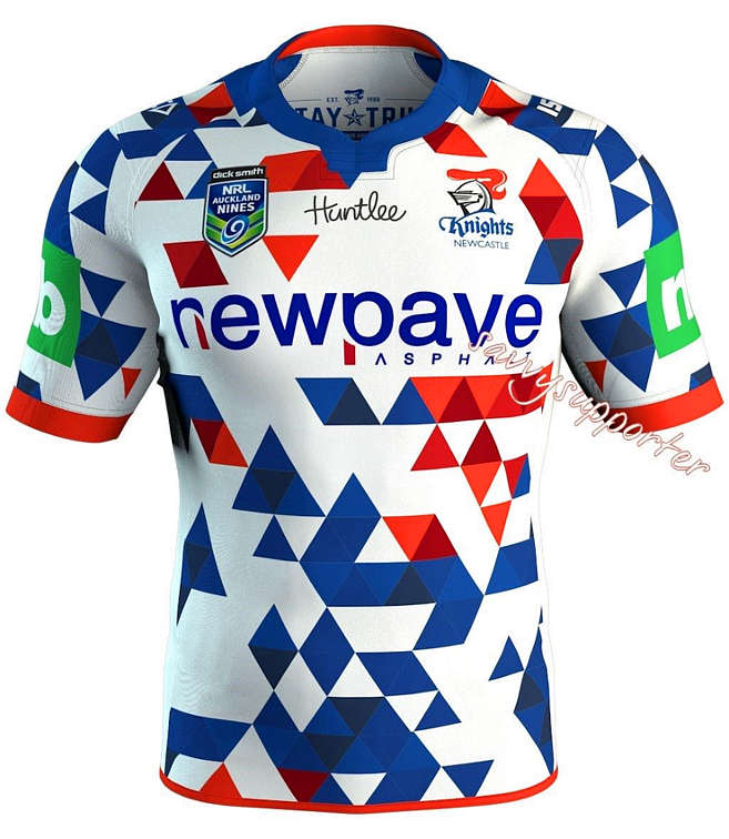
Without a doubt, the Newcastle Knights have the worst jersey.
The blue and red checkers on a white background looks completely out of place on a rugby league field, yet would suit a pre-NRL Billy Slater or 1980s John Daly to a tee. I can only imagine ISC were channeling a jester from an era where Knights were commonplace, but this jersey is beyond a joke.
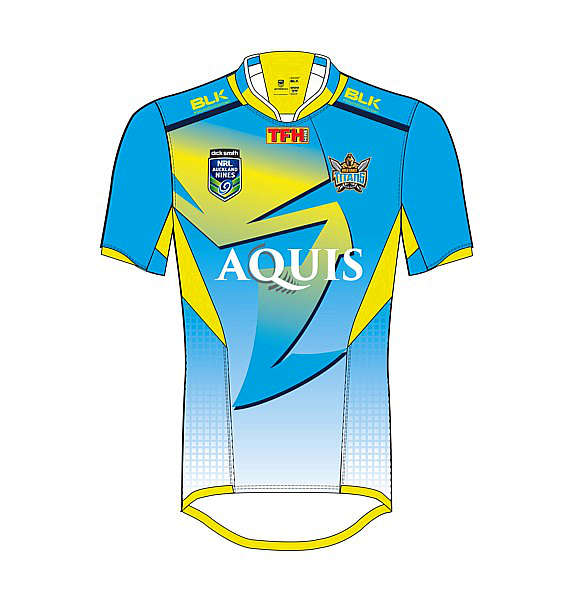
The Gold Coast have gone for a jersey that is reminiscent of Miami Vice, yet have interestingly opted for Greg Bird to model it. I’ll leave that one to you.
Fortunately, no teams have opted for the singlet-guernsey this time around – which is sure to displease the thousands of basketball and AFL fans who will be attending the tournament on February 6 and 7.
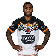
The Tigers were one team to don sleeveless apparel in 2015, and their 2016 design similarly leaves much to be desired. It remains a mystery as to why this club still hasn’t discovered that their mascot actually has stripes.
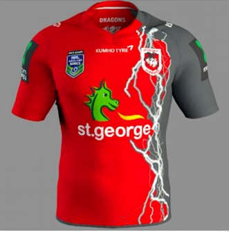
I don’t really have a clue as to what is happening with the Dragons’ jersey. If they were attempting to promote Toby McGuire’s Spiderman 3 they would have done a fantastic job, with the seeping-from-the-left black attempting to overrun their traditional red. It’s confusing and needlessly complicated.
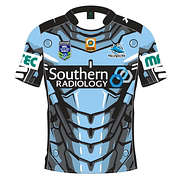
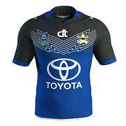
Also in the needlessly complicated category we have the Sharks, with their blue, white and an absurd number of black lines jersey, while the Cowboys are doing their best to imitate the Eels by utilising a predominantly blue strip.
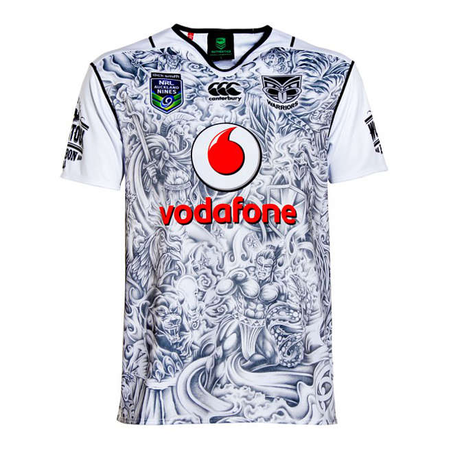
The Warriors have added their 37th jersey option for season 2016, with a tribal-tattoo-inspired top, utilising shades of black and white only.
The Eels’ jersey offers the bare minimum change to the standard attire, except with the addition of a star (“But she’s got a new hat!”).
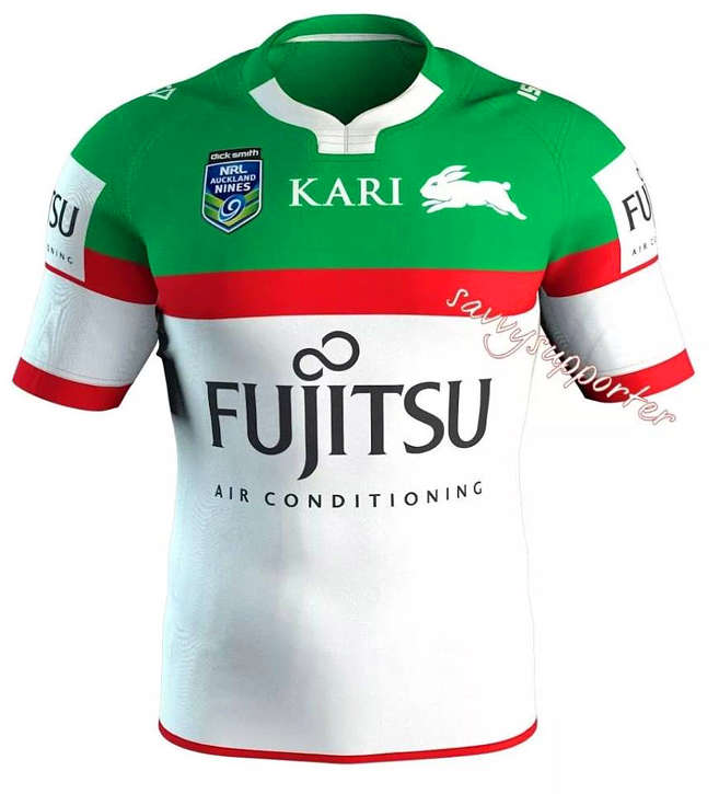
South Sydney’s predominantly white jersey looks eerily similar to their alternative strip of the early 2000s (why would anyone want to replicate this?)
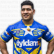
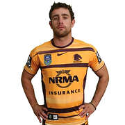
The Broncos have reversed their colour coding to feature more yellow than maroon and again fall into the playing safe category.
The Bulldogs have ‘creatively’ added a number of dots to their v along with some horizontal lines across the stomach – which is essentially 2015’s alternate strip.
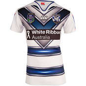
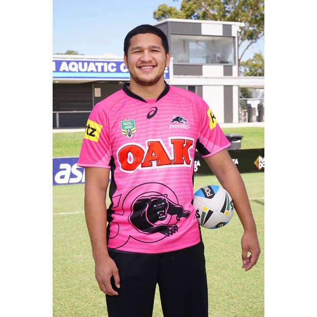
The Panthers have played it safe by choosing the pink panther strip, which has acted as their alternative for a while now. The Raiders have also played things relatively safely, with a near carbon-copy of their 2015 away jersey.
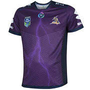
The Storm obviously did not receive the memo that nines jerseys are supposed to be more ‘exciting’ than traditional jerseys, opting for a predominantly purple number with a large sponsorship panel in the middle and minimal amounts of sublimated lightning.
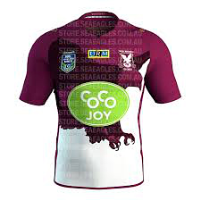
The code’s two big birds – the Sea Eagles and the Roosters – have done well. Manly have incorporated a fearsome eagle design into their choice, with deep maroon and black tones, which actually looks quite cool.
Sydney have opted for royal tones of blue and red that evoke memories of their popular Captain America strip used earlier in 2015.
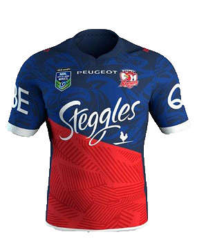
These are two jerseys worth snapping up.
What are you thoughts Roarers? Who wore it best?
All images supplied.
Reckon you can pick the winning team? Build your own dream team with Draftstars daily fantasy and compete on any match. For great odds on the NRL head on over to PlayUp. Imagine what you could be buying instead. Set a deposit limit.