


- Video
-
Club Roar
Captured a great grassroots sporting moment? We want to see it!Content Collections
The Roar Community
- Join
- Login
When beginning a piece that asks ‘can stats predict NRL games?’ it’s worth reviewing Betteridge’s Law of Headlines, which states that “any headline that ends in a question mark can be answered by the word ‘no’.”
If I could predict results, I probably wouldn’t be writing for a living, but that isn’t really the point here. The point is more: can stats project NRL games?
As anyone who consumes Australian advertising knows, past performance is not an indicator of future performance.
But in sports, there’s a whole category of analytics that tries to work out what aspects of performance can be relied upon to reflect future results, and indeed, which stats can be used to give a read on whether the result was actually, for want of a better phrase, the proper result.
The point is sustainability: if you won this week and the stats say you deserved it, it’s a much better read on the underlying performance than just knowing that you won. That, I would suggest, is not controversial.
The next step is to ask whether the stats that indicated that result are still valid even if you didn’t win. Logically, that should be the case too.
Lots of sports do this, but it’s been a fairly nuggety one to crack in rugby league. There’s a lot of variables at play.
Anything that involves shooting at a target tends to go alright in this regard, because you can rank how good or otherwise each shot was, and from that deduce who had the most chances to score independent of how many they did actually score.
Soccer has expected goals (xG), which measures how well you got into positions to score, and conversely, how much the opposition did that to you. ShotQuality (SQ) does something similar in basketball and there’s an AFL version too, Expected Score.
(Photo by Ezra Shaw/Getty Images)
The purpose of an xG-type stat is that it tells you who should have won, but (and any soccer analytics person should preface it with this at all times) it doesn’t really work in a one-game stat. At that level, it’s a guide and nothing more.
Where it comes into its own is as a measure of sustainability over time. The underlying numbers can prove that performances are good even when results aren’t (and vice versa), with the implication that, over a large enough sample size, they will eventually match up.
Anyone following the career of Aussie coach Ange Postecoglou might have noticed this last year: his Celtic team regularly underperformed their underlying numbers in results and rivals Rangers overperformed theirs, so at the midway point of the season, Rangers were six competition points ahead.
But the cold wind of regression waits for no man: Celtic continued to produce numbers that were good, and results began to match them, whereas Rangers continued to produce numbers that weren’t as good, and their results began to match too.
By the time the 38-game season had played out, Celtic were well clear. Celtic’s performances were sustainable and Rangers’ weren’t, just like the underlying data had suggested all along.
I’ve discussed at length the issues of creating an xG model for rugby league, as has friend of the column League Eye Test, who went as far to create a model before the publicly available stats suddenly weren’t publicly available anymore.
The short answer is that yes, getting into position to score helps, but it’s not everything. There’s plenty of ways to skin the cat in rugby league and an xG-like stat doesn’t really cut it.
Another friend of the column, PythagoNRL, used stats to work out who might have won most of the time, too, with a ‘Production Per Game’ metric that worked out what RL stats matched up well with winning and then developed probability based off that.
What we’re going to do stands in the shadow of those two. We’ve ascertained that an xG/ShotQuality model doesn’t exist in RL, but there is certainly a way of creating an xLadder – an expected ladder based on statistical production – that can help us to see performances independent of results.

(Photo by Ian MacNicol/Getty Images)
We should be able to see who is performing sustainably well, who is underperforming their output and should be expected to improve, who is overperforming output and might fall away. We can see who is Celtic, and who is Rangers.
Here’s the process. I ran a correlation analysis to discern which of all the publicly available stats are most linked to winning.
This is fairly simple stuff, because we want to cover all bases of things that win you matches of rugby league. There’s how well you attack, how well you defend, how much ball you have and where you have it. They’re the four key aspects of the game, at least at this level of modelling.
Run metres (RM) and line breaks (LB) are great indicators of attacking ability, and their negatives – run metres conceded (RMC), line breaks conceded (LBC) – tell you the opposite.
Possession is a bit more gnarly because the possession stat you see on telly is bunkum: it’s a measure of time in possession, which doesn’t really link to what you do with the ball.
Run it in slowly and take ages playing the ball and you’ll get a high possession number, but also score no points.
Instead, it makes sense to use Total Sets (TS), because (FAO Anthony Griffin) completed sets are far less an indicator of winning than simply how many attempts with the footy you had. I don’t need to go into that here other than to say that completion rate still being mentioned shows how little impact data has had on the rugby league consciousness.
Alongside that goes Tackles Inside 20m (T20), giving us an idea of field position. Note that I only include red zone tackles here, not all attacking half tackles, in order to reward ‘good ball’ sets rather than just territory.
This is a controversial move, as a perfect team would score on their first tackle within 20m, or even better, not even have one as they’d score from further out, and doubly, a perfect defensive team might be able to withstand lots of T20 from the opposition without them scoring, and have that be a positive.
Ditto a bad team (Hi, Baz!) might accumulate lots of field position without ever scoring. Still, averaged out over 16 teams and 175 games with the goal of weighting for field position, T20 is the best measure of who built the most attacking pressure across a game.
First caveat: this is model 1.0 and I fully expect to have to change this last one at a later date.
I’ve used the differentials between those four stats throughout because we want to know who won each relevant battle. Remember: teams that lose key battles statistically can still win football matches, so negatives are important there.
Next, I ran a linear regression that tests the hypothesis that these things matter and correlate to our score.
After a lot (a lot a lot) of model building all the potential combinations of these stats and others, we can say that yes, these four aspects of the game are really very related to winning.
I know you could probably have guessed as much, but hey: we’re not doing guesswork here. Double and triple check everything.
Throw in all of those stats from a decent amount of games – in this case, Round 1-10 of last year’s NRL, 80 total, and then weight the differentials to generate a score between 0 and 2 that corresponds to how likely the stats say a team was to win the game.
Put those totals in order and hey presto – we have now created an alternative NRL ladder that rewards winning the stats battle – the expected win ladder, or xLadder for short.

(Photo by Mark Kolbe/Getty Images)
Note: there were no draws in the NRL in 2022 and our model is calculated solely off full time totals, with Golden Point disregarded. This allowed for statistical comparability, and reflects how much variance is at play in extra time field goalathons.
It’s possible that future models might take this into account, but for now, we don’t. If a team wins in Golden Point in the NRL, they get two points on the real ladder, but on ours, we count differently.
The NRL ladder goes up in increments of two and ours doesn’t, because ours is designed to reflect the probability of winning based on statistical output, which can be 100% – in which case we’d award the maximum 2 points – and can be 0% – worth no points – but is almost always somewhere in between.
If the stats suggest a 50% probability of either team winning, we give a point apiece. If it’s 25%, they get 0.5, and so on.
In this lies the ability a team to under or overperform their real points on the xLadder, which should suggest where regression to the mean is likely as the sample size increase (aka the season goes on).
Guess what that means? We’re going to need a bigger sample size. I painstakingly enter the relevant statistics from every game of the 2022 NRL regular season, all 175 of them, and see where we end up.
And what does the xLadder tell us? Well, it tells us the model works, at least: we get a really clear split between the sides that finished in the top eight and those that didn’t, much wider than it was in the real ladder.
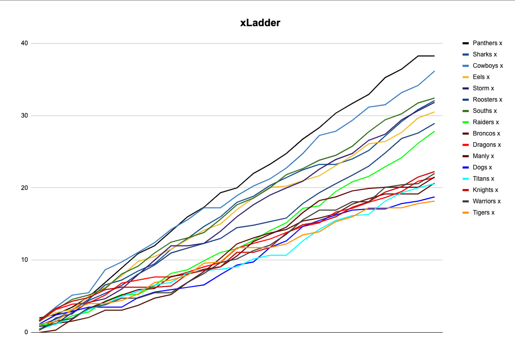
There was the Panthers, then daylight, then the Cowboys, then more daylight, then a cluster of the other finals teams, then a gaping chasm to another cluster of everyone else.
The model naturally moves teams closer together, because where the real table gives 0 or 2, it gives somewhere in between, but the spacings between the clusters are indicative.
It shows the disparity in results that, crucially match the eye test throughout. The Broncos were never as good as they looked, but benefited from a fair wind of luck, jagging several results that they didn’t really deserve. It wasn’t sustainable and regressed badly.
By the end of the year, they were about as good as the Dragons: the xLadder would have told us that in May.
Cronulla, too, prove this. They were consistently above their xPoints in real life, but when it came to finals, they bombed out in straight sets. You wouldn’t use the xLadder to pick individual games, but it certainly could have given you the steer that the Sharks weren’t quite on the level that the Cowboys and Souths were.
Parramatta, for example, showed the futility of single-game expectations, by the way, defeating North Queensland in the Prelim in a game that, on xPoints, they lost comfortably.
The Bunnies are the big winners of the xLadder. They consistently underperformed their production throughout the year and never actually caught it up – if they had, they would have made the top four. This graphic shows how they fared in comparison to the Broncos, whom they trailed for most of the year on real points, but ended up well clear of when the regression kicked in.
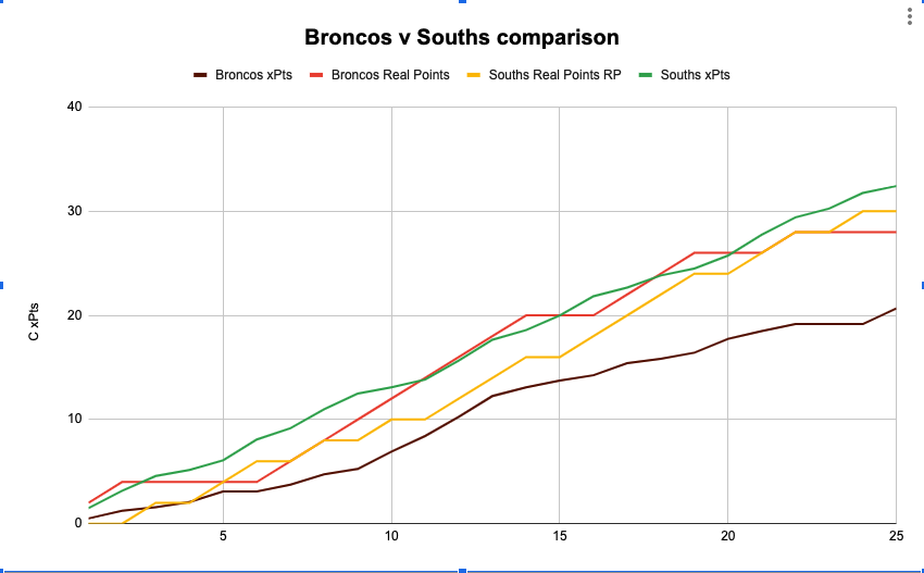
This speaks to two things. Firstly, it shows that their fundamentals were always good and their execution was what faltered, proving that Jason Demetriou was right to trust the process and wait for results to change. I’d be amazed if Souths don’t have some sort of modelling that suggested they were onto a winner prior to results matching the performances.
Secondly, it shows that stats are only one part of the story, because the impact of individuals is what turns theoretical wins into real ones.
The point of attacking systems in rugby league is to deliver the best quality ball to the best players at the best moment: when Latrell Mitchell returned, Souths had the man to ice the moments they had been consistently and sustainably creating all along.
The lower end of the table backs this up too. You could throw a blanket over the bottom eight, but the order is interesting.
The Knights were largely in lockstep with their xPoints until Kalyn Ponga got injured, whereupon they won just one more game despite creating enough production that, according to the model, should have delivered three wins. They were the best performing xPoints side to miss the finals, by the way.
Poor execution destroyed them, because the stats say that they were putting themselves in the position to win. I’m looking at you, Adam Clune and Anthony Milford.
Plain dumb luck comes into this as well. The Titans had five games where they ‘should’ have won based on stats, but didn’t, while also having three of their actual wins be games they ‘should’ have lost. Notably, all of those came against other rubbish teams.
Part of this is execution again, but on the other side: they continually undermined their best efforts through poor defence, even when they had ample ball, territory and opportunity to score themselves. But a substantial part is also just variance going against them.
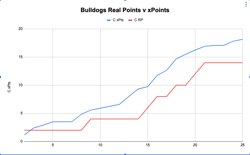
The Dragons and Dogs make an interesting case in point, too. Prior to sacking Trent Barrett, the Dogs produced neither ladder points nor xPoints, but under Mick Potter, there was an almost immediate upsurge in performance.
They lost their first game to the Tigers and their second to Penrith but thereafter, exploded in production and eventually almost caught their xPoints.
When Barrett departed, they were a clear bottom on the xLadder, and by the end, they were only second last, but had the season continued the Dogs might have well ended up yet higher, such was their trajectory.
The Dragons, masters of efficiency, did the opposite: they bumbled along, doing about as well as could have been expected, but continued to jag results when they didn’t really deserve to. Ben Hunt executed well and they did just about enough and nothing more. It’s a skill, I suppose, but not one that I’d want to be banking on going into 2022.
This is a limitation of the xLadder, too. NRL clubs play 24 regular season games a year, which is a pitifully small sample size compared to the 38 in the Premier League, 82 in the NBA and NHL and 162 in Major League Baseball.
The potential for regression increases as the sample size grows, so the NRL season can run out before the results catch up with performances. If you’re Kevin Walters or Anthony Griffin, that should be worrying, but if you’re Adam O’Brien or Jason Demetriou, it might feel alright.
We should also acknowledge the general lack of sample size: the rules within the NRL have changed so much in the last two years that any data prior to 2022 is functionally not that useful. 2021 was the asterisk year, 2020 was half a season and 2019 was totally different rules.
That brings us back to predictions and probabilities. I’ve set out that there is a clear link between underlying data and results, and how that can be modelled.
I’ve then built the model, explained it (I hope) and showed how, using last year, it identified several key things that did actually occur. The next step is 2023 and looking into how it tells us the season will unfold. After all – we might not be able to predict the NRL, but we might be able to project it.