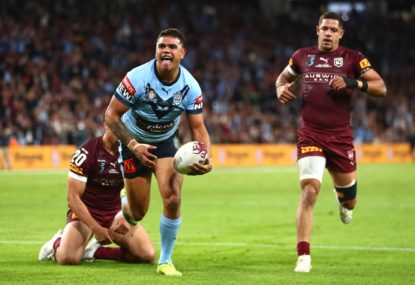
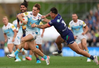
NRL Round 9 Teams: Manly set to fight for star, Injuries could force Broncos reshuffle, Roosters sweat on stars
All the team list information for Round 9.

At last the protracted Origin campaign is over for another year and we can move on from the predicted teams, the teams that should have been picked, which side were the bigger grubs and poorer sports to things significantly more important to the NRL.
I’m not talking about player behaviour, their rights to privacy, salary cap or incompetent boards I’m talking about retro round, a throwback to a time where mullets and moustaches ruled, where an elbow was considered a dominant tackle and sports science was the revelation to smoke a cigarette after the game instead of before.
The most exciting part of retro round is the jerseys. NRL history is littered with numerous designs and even more sponsors many of them extinct. Today, we’ll have a look back at some of the good jerseys, the outstanding jerseys, and the outright horrendous jerseys.
The Good
Panthers, 1991 Panthers
Perhaps it was the fact that this was Penrith’s first premiership win over a team that was arguably one of the most dominant teams of their era (the Raiders, who were going for a third-straight premiership). Many a Panthers fan would look at the jersey and feel a great dose of sentimentality.
Sea Eagles, 1996 Sea Eagles Jersey
As a young Sea Eagles fan, the Manly jersey emblazoned with the Pepsi logo epitomised success for this side in the 90s.
Raiders, late 80s/early 90’s
As mentioned above this was one of the most dominant teams in NRL history with their impact still being felt in the coaching ranks today (think Kevin Walters, Mal Meninga, Laurie Daley and Craig Bellamy). Thanks to my late grandfather, I have an original Woodgers Raiders jersey at home. How they played footy in these jerseys defies belief.
Souths and Dragons
Despite having no love or borderline hatred for these teams, depending on their success or failure, respect to them for keeping to tradition, as foundation teams could be forgiven for changing up the design of the jersey at some point. However, with the exception of a few rounds every couple of seasons, the jersey design has largely remained the same.
The Outstanding
Knights, late 80s and early 90s
Maybe it’s the current condition of the Knights, but my friends who have the horrible fate of being a Newcastle supporter love the Henny Penny jersey of the late 80s and early 90s. This design just pipped out the BP sponsor jersey.
Broncos, 1988
The Broncos came on board to a lot of fanfare in the late 80s and, for the first five to six years, kept their jersey largely the same while winning back to back premierships. However, disaster was waiting for them in the 90s.
Eel, 1982 Eels
After such a successful run in the 70s, the 80s were filled with optimism for Eels fans, on for them to suffer an extended premiership drought.
80s jerseys in particular
A common thread here seems to be that the 80s had some great jerseys. Be it the Wormald Sea Eagles, HFC finance Bulldogs or BHP Steel Steelers, you would be hard pressed to find a supporter who disliked their team’s jersey from the 80s.
The Horrendous
Broncos, 1995 and late 90s
As mentioned above, disaster struck for the Broncos in the 90s. I’m not referring to the four premierships they won (three NRL and one Super League) but for some reason they decided to move away from their traditional jersey and go with the 95 one which looks like a rejected design for a golfing shirt. The late 90s away jersey, when they went for an aqua-like colour despite having no connection whatsoever to the original Brisbane colours, also wasn’t great.
Panthers, 2003 away jersey
The Panthers tarnished their 2003 premiership with their away jersey where, like the Broncos, they went with the aqua and purple combo even though there was no connection to their original colours. Thankfully they played the grand final in their home strip.
Storm, late 90s
The yellow away jersey for the Storm is almost as offensive as their systematic salary cap cheating. The definition of winning ugly
Any Super League jersey
The photo said it all. Given the ARL wouldn’t let the teams who defected have jerseys looking anything like their traditional strips, we were served up these absolute disasters.
I know I have just scratched the surface so feel free to take a trip down memory lane and comment on which jersey was your favourite or most hated.
Reckon you can pick the winning team? Build your own dream team with Draftstars daily fantasy and compete on any match. For great odds on the NRL head on over to PlayUp. Imagine what you could be buying instead. Set a deposit limit.
All the team list information for Round 9.

Anzac Round is done and another NRL touchpoint is ticked off amid the onward march of the 2024 season. It helps to see things…
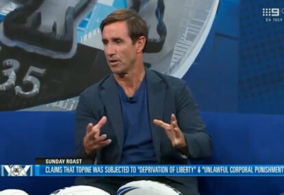
The Sydney Roosters have been dealt another major blow with club legend Luke Keary announcing that he will retire from the NRL at the…
The Bulldogs are facing a $4 million lawsuit from former player Jackson Topine, after allegedly being forced to wrestle his teammates as punishment for…
Brad Arthur's future as Eels coach is looking more bleak by the round after revelations that club officials refused to allow star signing Zac…
New coach Michael Maguire is considering as many as 50 players for the State of Origin series opener with not even captain James Tedesco…