


- Video
-
Club Roar
Captured a great grassroots sporting moment? We want to see it!Content Collections
The Roar Community
- Join
- Login
Opinion
It’s that time of year again. Players coming off poor seasons have spent summer ‘training the house down’ and are in ‘the best shape of their careers’, many folk are overreacting wildly to trial results and predictions of glory and gloom abound. Calm the farm, folks.
Almost everything remains to be seen, except one thing: we do know what our teams will be wearing in season 2023. Well, mostly.
While we’d all gladly accept a premiership won in an ugly jersey, there’s no reason why we can’t have it all, and designing a good jersey is, or should be, the easy bit.
So, who are the NRL’s fashion leaders and fashion disasters in 2023?
This year I decided to ask a selection of Roar readers to review and rate their team’s 2023 jerseys, with reader ratings and my ratings used to arrive at a score out of 100. A big thank you to everybody who responded to my survey.
Here are the results, from worst to first, with a brief detour to Redcliffe, or wherever the Dolphins reside these days.
David Fifita. (Photo by Bradley Kanaris/Getty Images)
Down in the gutter looking up at the stars are the Gold Coast Titans (41), who continue to drape themselves in jerseys that look like they were lifted from the bargain bin at a factory seconds sporting goods outlet. There’s clearly not much thought going on here.
I’d describe the Titans’ garb as insipid, while Gold Coast resident and keen observer of his local club, Andrew, chose “bland”. Same thing, and we could be describing much more than what the Titans wear.
Brisbane Broncos (52) have at least been predictably bad in recent years but have seemingly decided to resurrect their experimental spirit of the mid-1990s (who can forget those diamonds?) with a truly bizarre home strip which looks like two different jerseys have been sewn together.
Broncos tragic and noted fashionista Nat was also unimpressed, quipping that “fashion has always been a priority of mine as my ‘wall-o-flanno’ can [attest]. The maroon and gold are comfortably familiar, but the offset stripes don’t do a lot for me. It’s okay”. It’s not okay, Nat. It really isn’t.
Wests Tigers (54) have spent nearly 25 years trying to reconcile not quite being the Magpies or Balmain anymore, and they’re still trying.
Their main fashion contribution in 2023 is a hideous and even more prevalent shade of orange on the away jersey, which long-suffering supporters Greg and Birdy both disliked, with Birdy giving it a resounding fail and advocating a return to the richer, more golden shade of the 2005 Tigers.
I agree, and it’s time for theTigers to wipe the slate clean and start afresh in 2024. If they need some inspiration, there’s plenty around.
Newcastle (56) are, as usual, wearing jerseys that are the hotel room art of the NRL – colours splashed onto a canvas with no thought or creativity. Not even the artist currently known as Choppy Zezers could muster much enthusiasm or even opprobrium, only offering that “I’m not too fussed either way, just so long as we don’t finish the last round with a wooden spoon”.
Think of it this way, Choppy: there’s a fair chance the Knights and Dragons will be competing for 13th place in 2023. At the least the Dragons will look stylish.
I got a bit more than I bargained for with the Dolphins (52). Five supporters of other clubs felt compelled to offer their thoughts about the inaugural strips, and they were not complimentary.
Should we cut the Dolphins some slack given it’s their first season and things can only get better? They’ll get better, right?
For a view from the Peninsula, I consulted long-time Redcliffe supporter and Roar author, Matth, who presented a thoughtful argument, including “I would’ve preferred the traditional red with white V, but the Dragons would’ve objected. So given the constraints, it’s as good as could be expected”.
Taking this point a step further, you could argue that adding a more traditional colour to Redcliffe’s existing strip could conflict with even more clubs, for example Newcastle, North Sydney, Souths and Wynnum-Manly.
No, sorry Matth, constraints or not they’re just terrible jerseys. There’s no excuse for the new shade of puke, or for making it so prominent. There were other options.
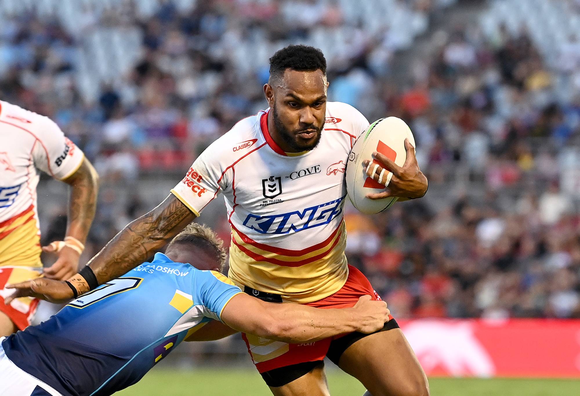
Hamiso Tabuai-Fidow. (Photo by Bradley Kanaris/Getty Images)
There are three clubs at tipping points and it’s not clear which way they’re headed.
New Zealand Warriors (57) avoided the basement because they’ve retained their interesting colour scheme, albeit in a disappointing design, and because it’s not their fault that the major sponsor has rebranded in NZ, with very distracting results.
Mikey, a New Zealand native and Warriors supporter was certainly distracted, remarking that “the circle on the front looks like they’ve forgotten to put something smack-bang in the middle”. It’s understandable. What’s the first thing you see when you look at the Warriors’ jersey – their colours or the yawning inter-dimensional portal at the centre of things?
Parramatta (67) have no such excuses and despite a history of good jerseys have again trotted out the crass fading hoops on their home jersey and a predominantly white away strip that makes no sense unless the Eels expect to play a similarly confused Leeds Rhinos team in 2023.
The white jersey got mixed reviews, with the Sporacle adamant “they should only use base blue or gold unless it’s Anzac or Indigenous round”. Conversely, Brett Allen was happy, remarking that “I love it and I like the idea of [having a] a completely different colour scheme, like in European [football], though I think it should be the alternate not the away jersey”.
Melbourne (68) have surprisingly come up with a decent away strip in 2023, but the home strip is still horrid and should be cause for the Storm to be charged with bringing the game into disrepute.
Storm supporter Cam admired the “minimalist approach” of the away jersey while acknowledging that “there’s only so much you can do with purple, and the Storm have stuck to their roots”. I’m all for tradition, Cam, but only if it’s worth preserving.
While there’s plenty of good here, there’s also something slightly wrong or missing or both for each club, and it’s kept them out of consideration for the top gong.
Penrith (73) are back with identical home and away jerseys, along with an alternate strip honouring their 2003 premiership team.
Penrith legend Albo, who I understand has been attending Penrith Park since day dot in 1967, is impressed, “I had always thought the Balmain jumper was the best in the league. Now I reckon the Panthers home jumper is the best, and their pink away jumper is probably smart for merchandising”.
That pink jersey is indeed a clever ploy, but it could use something more, a little black trim on the shoulders or the chest to break things up a little. It’s too monochromatic.
Souths (77) will probably never stray from the cardinal and myrtle hoops, which is not to say they’re doing them right.
First, I don’t like the inverted pattern on the shoulder which stems from the unnecessary black/white trim. Second, they should at least attempt an original away jersey for trips to Redcliffe, Canberra or Brisbane. There are some good ideas around.
St George Illawarra (79) have one of the classics of the genre, with Tony summing it up nicely, “There’s just no better nor more recognisable rugby league jersey than the big Red V of the Dragons, and the 2023 design looks great”, and Andrew adding that “the big Red V is history and… synonymous with the great Dragons teams from the past”.
But the lack of an Illawarra Steelers-style jersey has been a bugbear for supporters like Andrew, who remarked that “I’d prefer the original Steelers jersey, red with [two] white hoops as the away jersey”. Amen, Andrew.
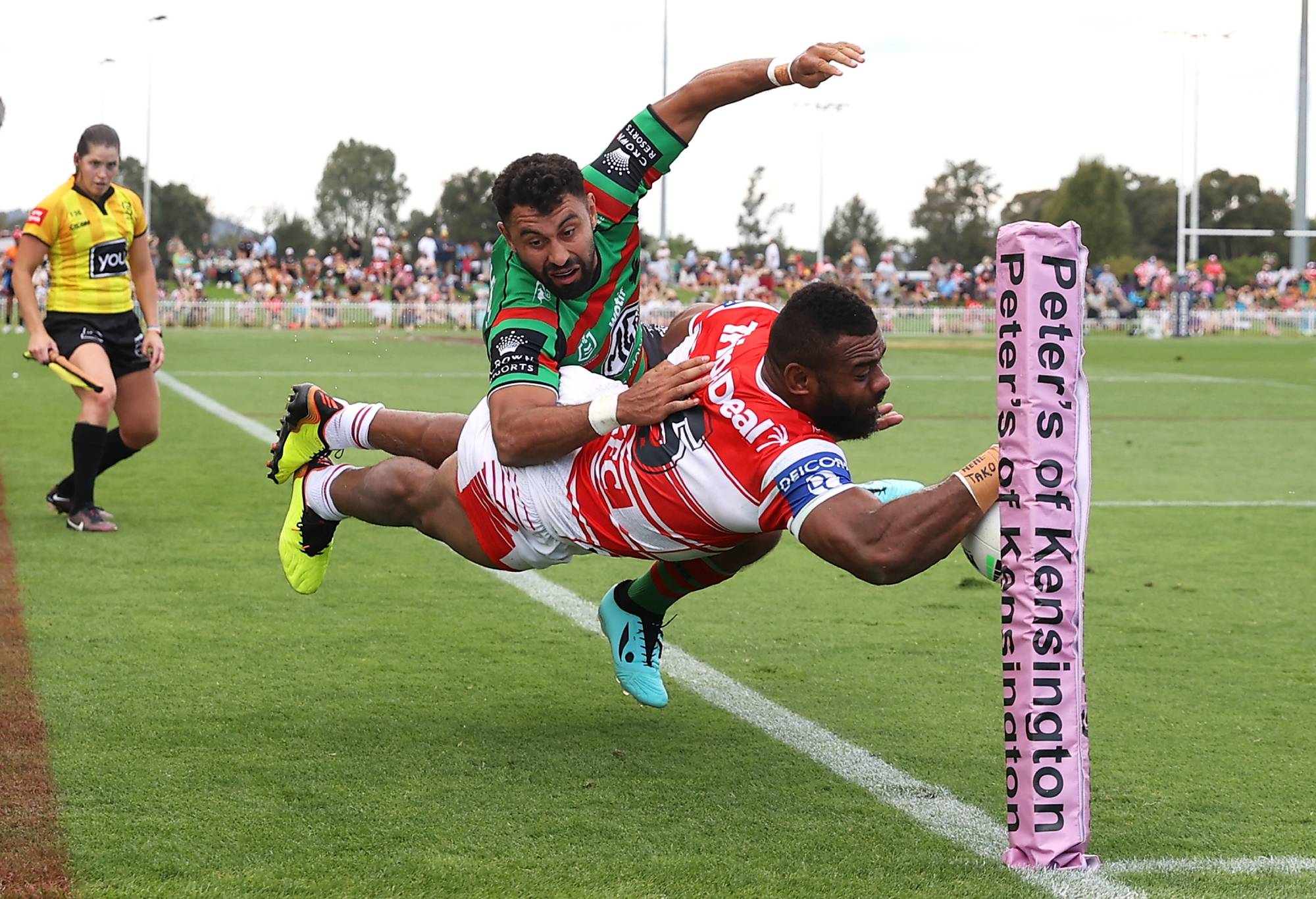
Mikaele Ravalawa tries to score during the Charity Shield in Mudgee. (Photo by Mark Kolbe/Getty Images)
North Queensland (79) have ditched a very good home shirt for something lesser, though I’ll admit the away strip is an improvement.
North Queensland’s finest, Jimmmy, is more enthusiastic, telling me that “I’m certainly not well known for my aesthetic discernment, but I like both jerseys. Simple design, not too busy and instant recognition as a Cowboys jersey. I am buying the away one”.
Some years ago, Cronulla (84) reverted to the home strip they wore prior to super league and haven’t fiddled much with it since. But the black away number still grates given it’s so dominant against otherwise soft colours.
Whatever, Cronulla champion Souvalis isn’t bothered, telling me that “It’s typical of every club’s ‘23 jersey design, no need for a daring fashion statement here. [I’m] getting myself a ’23 Classic warm-up shirt.”. Boring can be good.
Up in the clouds reside four clubs who all deserve an award, but only one can win the Paramount, so named in honour of Newtown’s simple but elegant designs of the early 1980s.
Who’d have thought last season’s winners Manly (89) would see their season derailed by, of all things, a jersey? But let’s not revisit that sorry saga. The classics are back for 2023, with the designs so redolent of the club’s glory days of the 1970s and ‘80s.
Manly legend Hard Yards has strong feelings, arguing that that “[the] home jersey is good. Not as clean as the ‘Wormalds’ jersey from the mid-1980s, but the world moves on. The home jumper should be worn at home, or away, or at Disneyland. It’s not a Paris runway populated by frail glamours. One team; one jumper”!
Sydney Roosters (93) have again done themselves proud, with a slight improvement to the away jersey and an identical home jersey. Let’s hope they reprise their superb ANZAC Day jersey in ’23 and lose to the Dragons again.
However, Roosters supporter Mushi wasn’t enamoured of that slight change and subsequently refused to give the Tricolours full marks. But fellow supporter Dutski was very happy, noting that “the Roosters know the value in the existing, recognisable jersey. [It’s] familiar and exactly what the fans expect to see “.
I suspect there are fans of a few clubs who’d like to say that.
Canterbury (93) have outdone themselves. The Barry put it better than I could with, “I love this jersey. The royal blue and white is a classic combination. I like the simplicity and neatness of the double V. The sponsors logo fits the jersey well without [clashing]. [It’s] only the third Bulldogs jersey I’ve owned [after] the 1988 and 2004 jerseys – both premiership years. Not saying that will happen again, but…”
But wait, there was a dissenting view from the kennel. KK weighed in with a historical perspective, “First preference has always been for the blue and white hoops of 1935-1942 and 1946-1962”.
Canterbury’s home jersey is my pick of 2023, but the kennel has spoken.
Which means the winner is: Canberra Raiders (95). Having tried some different shades in 2022, the green machine has seen the light in ‘23. ‘Keep it simple’ is a message that shouldn’t need repetition, but clearly does (looking at you Broncos) and the Raiders have heeded the message.
Canberra supporter Jammel is also impressed and had quite a bit to say, including, “I like the Raiders’ jerseys – nice and simple and differentiated from the other clubs. The home jersey retains the lime green from the good old days, true to the club’s history – which is important”.
Hear, hear! In an era when so many clubs change for the sake of change, it’s great to see the Raiders hark back to something simple and evocative. They’ll look very stylish while narrowly missing out on the top eight this year.
Reckon you can pick the winning team? Build your own dream team with Draftstars daily fantasy and compete on any match. For great odds on the NRL head on over to PlayUp. Imagine what you could be buying instead. Set a deposit limit.